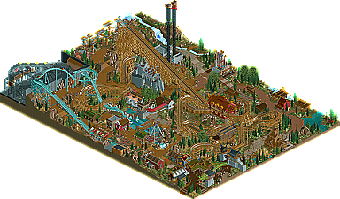
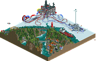
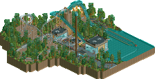
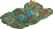
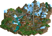
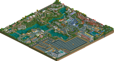
congrats to both teams for great parks but:seriously??? :D8th wonders layout seemed off?the ferris wheel looked DUMB?the scenic railway looked ATROCIOUS?
The ferris wheel restaurant part didn't seem to fit in well. The 8th wonder layout would of killed someone and I am pretty sure it was a realistic park. The scenic railway most definately looked atrocious. The concept was alright but the execution was below the level of other parts.
Yeah I'm also interested... Sure if you thought it didn't look brilliant, but atrocious? Dumb? Nah, I don't think that's quite justified.I'd also like to see a few more detailed comments about the Germans park!
YES THE 1K RUINS LOOKED VERY BAD. I have said it three times now. And Edda park had brilliant trackitecture in the entrance area.
Tivoli might have been technically superior in the sense that it was completely finished and very well executed, it was just too 'safe' for my taste. The more I went through it, the more bored I was. Aside from being another 'park inside a city square'...there was nothing that really grabbed my attention. On the other hand, Edna just kept me exploring the entire time I had it open. Even if it had unfinished parts, I kept saying "that's fucking cool" as I looked around.....Tivoli just had me saying "that was well built...just like the last thing I looked at". Nothing more.
I won't dwell on the negatives here...I'd rather focus on the positives. And, I'm positive that Park Edna gets my vote.
OK. i've given both parks a good look, and i would have to say this:
Tivoli: There is a lot of this I really liked. The archy was well made and I like most of the rides. however, this citypark concept is far from original not even for H2H6. Tivoli Gardens is another unoriginal concept. Going on with Tivoli, I really didn't think you've captured the essence of tivoli. While there were inspired bits, the I felt like the park was too clustered in some places to truly do so. Park Edda: i am dissappoint. ya'll went for the feel of parc asterix while remaining original, but this didn't live up to such parc. As many had said above the quality in some places was great while in others it lack dearly. the building holding the spinner ride was atrocious, sorry to say.
For the better execution ill go with Tivoli Gardens.
I'll just give a quick rundown on my thoughts toward park edda.
Its such a shame that this park ultimately got rushed. There are flashes of brilliance all over the park, notably the two custom rides (the swinger and the ship- man, someone should get cena or some other whizz to actually turn them into custom rides), and also the woodie station. Also that iced river was an amusing touch. Occassionally the archy was good too, although a lot of the time it left me wanting more. There were bare sections that really needed detailing and fleshing out, and some objects were used in silly ways that just didn't work for me. Especially that weird curvy path thing near the castle and yggdrasil, and the awful grey crazy paving used all over the park. That is such an ugly object and you used it as rooves and stuff, which made no sense imo. Its mostly just confusing, because of how accustomed we are the specifics of rct2, to see that path as a roof, and its hard to stop imagining it being a path. Also, I feel like flat rooves have no place in a scandinavian themed park.
I disliked the way that the park is really similair in layout to parc asterix. It feels to me that you guys saw how popular that park was and decided to copy it, which I disapproe of.
Overall, I can see touches of greatness in the park, but it didn't really fit together as a whole because of bare spots and unfinished stuff that really take you out of the experience and distract you from the nice bits.
Man...people from the "other" team shouldn't come in here and diss their opposition. No one from our team, as far as I know, has done anything like that. And, we're allegedly the "bad guys".
Wait until the fucking voting is over and then point out any "flaws" you see in your opponents park. Don't try to influence the voting while it's up for grabs.
I'm reviewing the park with the exact same scrutiny that I review every other park in h2h so far (if you don't believe, you can read through my posts in every topic). I have no intention of swaying any voters and I'm pretty sure no one is going to be peer-pressured by my opinion. Every park deserves comments and I'm sure the builders will find my thoughts useful and valid, or at least interesting. I would give my thoughts on the replacement park too if I could, but obviously I can't (at least in public)
Wow! that was the first thing that popped into my head when I saw both parks. They are both perfect,
"Tivoli Gardens" This park offers so much new inspiration!, It has some nice attractions.
8th Wonder was a great attraction, the good things about this attraction were the lift section, the roll, and the first drop, after that it wasn't that good , it became a bit messy.
My eyes widened when I saw scenic railway!, Wow, the attractions rocks, perfect from all sides. My choice was increasingly confirmed, it got that really nice theme park feeling that i really like.
"Park Edda" When I saw this, it was difficult tog, to whom do I vote? There were some great attractions, details, and buildings. I began to doubt. there were a few glitches and 1 attraction that I did not like the rest was amazing! I want to congratulate both teams! Through you, a new era of rct2 begun. My vote goes to .... rampampam 1 ... 2 .... 3 ..... Fack my heart hurts, PARK EDDA!!.
It was really hard to vote they are both that good, i really can't vote !
I'm reviewing the park with the exact same scrutiny that I review every other park in h2h so far (if you don't believe, you can read through my posts in every topic). I have no intention of swaying any voters and I'm pretty sure no one is going to be peer-pressured by my opinion. Every park deserves comments and I'm sure the builders will find my thoughts useful and valid, or at least interesting. I would give my thoughts on the replacement park too if I could, but obviously I can't (at least in public)
How about you cut the crap and just don't? However humble your intentions might be, they're incredibly unrealistic and not achievable. If it's gonna get read, it's gonna influence. So, as I said already, how about you just don't?
sorry about that if you think its offensive, I really want to remain friendly and not cause any riots its just a bit of friendly criticism. if you guys really want I can delete my comment... but that doesn't seem fair, I've done nothing to break the rules.
my post is just as influential as anyone else's. we really shouldn't allow any comments at all then.
I didn't think it would be so controversial... geez. let's just drop it
179 Comments
Casimir Offline
olddtfan51 Offline
rct2isboss Offline
The ferris wheel restaurant part didn't seem to fit in well. The 8th wonder layout would of killed someone and I am pretty sure it was a realistic park. The scenic railway most definately looked atrocious. The concept was alright but the execution was below the level of other parts.
YES THE 1K RUINS LOOKED VERY BAD. I have said it three times now. And Edda park had brilliant trackitecture in the entrance area.
Ling Offline
Fizzix Offline
rct2isboss Offline
At least someone understands.
K0NG Offline
Tivoli might have been technically superior in the sense that it was completely finished and very well executed, it was just too 'safe' for my taste. The more I went through it, the more bored I was. Aside from being another 'park inside a city square'...there was nothing that really grabbed my attention. On the other hand, Edna just kept me exploring the entire time I had it open. Even if it had unfinished parts, I kept saying "that's fucking cool" as I looked around.....Tivoli just had me saying "that was well built...just like the last thing I looked at". Nothing more.
I won't dwell on the negatives here...I'd rather focus on the positives. And, I'm positive that Park Edna gets my vote.
3:06
Xeccah Offline
Tivoli: There is a lot of this I really liked. The archy was well made and I like most of the rides. however, this citypark concept is far from original not even for H2H6. Tivoli Gardens is another unoriginal concept. Going on with Tivoli, I really didn't think you've captured the essence of tivoli. While there were inspired bits, the I felt like the park was too clustered in some places to truly do so.
Park Edda: i am dissappoint. ya'll went for the feel of parc asterix while remaining original, but this didn't live up to such parc. As many had said above the quality in some places was great while in others it lack dearly. the building holding the spinner ride was atrocious, sorry to say.
For the better execution ill go with Tivoli Gardens.
Cocoa Fan Offline
Its such a shame that this park ultimately got rushed. There are flashes of brilliance all over the park, notably the two custom rides (the swinger and the ship- man, someone should get cena or some other whizz to actually turn them into custom rides), and also the woodie station. Also that iced river was an amusing touch. Occassionally the archy was good too, although a lot of the time it left me wanting more. There were bare sections that really needed detailing and fleshing out, and some objects were used in silly ways that just didn't work for me. Especially that weird curvy path thing near the castle and yggdrasil, and the awful grey crazy paving used all over the park. That is such an ugly object and you used it as rooves and stuff, which made no sense imo. Its mostly just confusing, because of how accustomed we are the specifics of rct2, to see that path as a roof, and its hard to stop imagining it being a path. Also, I feel like flat rooves have no place in a scandinavian themed park.
I disliked the way that the park is really similair in layout to parc asterix. It feels to me that you guys saw how popular that park was and decided to copy it, which I disapproe of.
Overall, I can see touches of greatness in the park, but it didn't really fit together as a whole because of bare spots and unfinished stuff that really take you out of the experience and distract you from the nice bits.
K0NG Offline
Wait until the fucking voting is over and then point out any "flaws" you see in your opponents park. Don't try to influence the voting while it's up for grabs.
3:06
Cocoa Fan Offline
gijssie1234 Offline
"Tivoli Gardens" This park offers so much new inspiration!, It has some nice attractions.
8th Wonder was a great attraction, the good things about this attraction were the lift section, the roll, and the first drop, after that it wasn't that good , it became a bit messy.
My eyes widened when I saw scenic railway!, Wow, the attractions rocks, perfect from all sides. My choice was increasingly confirmed, it got that really nice theme park feeling that i really like.
"Park Edda" When I saw this, it was difficult tog, to whom do I vote? There were some great attractions, details, and buildings. I began to doubt. there were a few glitches and 1 attraction that I did not like the rest was amazing! I want to congratulate both teams! Through you, a new era of rct2 begun. My vote goes to .... rampampam 1 ... 2 .... 3 ..... Fack my heart hurts, PARK EDDA!!.
It was really hard to vote they are both that good, i really can't vote !
Ruben Offline
This goes for me too. For now I'll only say it looks like a great matchup, and imo was worth the (longish) wait.
Good luck Germans! And go us!
Turtle Offline
Pacificoaster Offline
MikaRCT2 Offline
Liampie Offline
Thoughts later.
Arjan v l Offline
Park Edda: It wasn't finished ,that's for sure. Nice park ,but no atmosphere (it really felt 'empty'). It just didn't give a pleasant feeling.
Vote: TIVOLI GARDENS
Casimir Offline
How about you cut the crap and just don't? However humble your intentions might be, they're incredibly unrealistic and not achievable. If it's gonna get read, it's gonna influence.
So, as I said already, how about you just don't?
Cocoa Fan Offline
my post is just as influential as anyone else's. we really shouldn't allow any comments at all then.
I didn't think it would be so controversial... geez. let's just drop it