That's like saying 'I'm not voting for this park because it's too realistic' though.
I'm not saying vote for our park or anything, I'd just like people to realise that the park is supposed to have only small rides to be realistic, in case they don't know of Tivoli parks or anything like that.
Oh and Casimir, I haven't said anything negative about your park so I'd ask you refrain from doing so, thx.
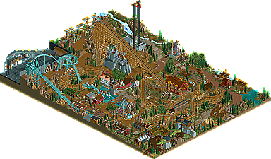
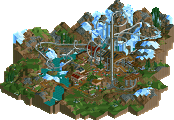
Edda was very nice, but felt very half & half. The castle at the center was a great example. The front half with the buttresses was amazing, looks fantastic, but it was ruined by the back, which was under-detailed with an ugly roof. Alot of buildings had amazing details on the roofs with boring and poorly textured bottoms. there were some amazing details, loved the custom swinging ship, probably my favorite swinging-ship ever. The station for the woodie was all around beautiful, as was the supports of the water ride. overall, i think this park needed peeps to bring it to life, and just a little more refinement. Some ideas were odd, like the metal supports on the back of the mountain, they hold no proof in this case, unless the point is to remind the viewer the park isn't real. a very good park, but with some small issues.
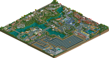
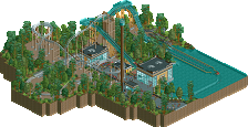
Trivoli was like a better version of the hurricanes "park in a city" idea, though not about the Olympics. This just made me realize, i really don't like the whole idea. Theme parks in the middle of cities just don't work, and it makes the theme-park weird and out of place. I enjoyed the park in this, but it wasn't what won me over. I was won over by the amazing archy. Alittle repetitive at times, but So beautiful and atmospheric. The brick and glass work in this are top notch, especially the concert hall and entrance. The interiors were as good as interiors can be done on such a small scale, and better done then hurricane's park IMO. I think my main criticism of this park was the lack of rides. It needed more movement to it then 2 crammed coasters and a side-friction train thing.
Both very good parks, alot of nice things, but i just felt Trivoli was on a higher level of quality and cohesion. Congrants to both.
I didn't say anything bad about Tivoli. I like it, it reminds me of my stay in Copenhagen.
All I expressed was that RCT always was about what you personally like better in a park.
Be it RCT2 vs. LL, fantasy vs. realism or small vs. big coasters.
There's nothing wrong with it. It's basically the only principle basen on which one can rate RCT work. "Do I like it? Did it work for me?"
Knowing about design decisions from the park making process is highly unlikely to really influence this subconscious decision. If it doesn't work, understanding why it is what it is, still doesn't make it work.
I tend to dislike realistic parks; not my style. What's wrong with voting for something that is of a style that I personally enjoy more?
Again, I didn't say that you can't vote for the other park. I'm just saying I don't see how you can have one of your main points for voting against a park because it's too realistic, because that just makes it sound like being too realistic is a negative, when it's actually just your personal preference.
For example, instead of saying 'There were no big coasters so that's too realistic', you could say 'I prefer the style of Park Edda over the realism of Tivoli' so that the parkmakers don't take it in a negative way.
I mean really, can you imagine a big B&M looper fitting anywhere in our park or anything? A coaster on the same scale as Daemonen would be similar to 8th Wonder so it would obviously have to be bigger than that, and I just don't see where it would fit.
This is interesting. What ideas in 'Trivoli' had issues?
And I think for those who are complaining about Tivoli not having larger rides, you should really look up real Tivoli parks...
8th Wonder--The layout seemed a bit off. Also, I'm not a huge fan of any theming near it. The ferris wheel-- This looked really dumb because of the trams. The scenic railway-- Looked atrocious with the 1k ruins.
seriously???
8th wonders layout seemed off? the ferris wheel looked DUMB? the scenic railway looked ATROCIOUS?
Yeah, considering the ferris wheel was part of a RESTAURANT and they represented dining cars (weren't they even ;labeled that way?) I fail to see how that didn't make sense. The 1k ruins I sort of get, but that's just because it was pretty repetitive-looking on that scale. And 8th Wonder was fine... compact and good pacing.
trav, please stop promoting/defending your team's park all the time. It's annoying. Let people just have their opinion.
If you find what I'm doing annoying, then simply don't read my posts. I'm not stopping anyone from having their own opinions, as I've stated many times, but I'm also trying to protect my teams morale and help us grow by trying to see what people are liking and disliking about our parks.
179 Comments
Casimir Offline
trav Offline
I'm not saying vote for our park or anything, I'd just like people to realise that the park is supposed to have only small rides to be realistic, in case they don't know of Tivoli parks or anything like that.
Oh and Casimir, I haven't said anything negative about your park so I'd ask you refrain from doing so, thx.
FK+Coastermind Offline
Edda was very nice, but felt very half & half. The castle at the center was a great example. The front half with the buttresses was amazing, looks fantastic, but it was ruined by the back, which was under-detailed with an ugly roof. Alot of buildings had amazing details on the roofs with boring and poorly textured bottoms. there were some amazing details, loved the custom swinging ship, probably my favorite swinging-ship ever. The station for the woodie was all around beautiful, as was the supports of the water ride. overall, i think this park needed peeps to bring it to life, and just a little more refinement. Some ideas were odd, like the metal supports on the back of the mountain, they hold no proof in this case, unless the point is to remind the viewer the park isn't real. a very good park, but with some small issues.
Trivoli was like a better version of the hurricanes "park in a city" idea, though not about the Olympics. This just made me realize, i really don't like the whole idea. Theme parks in the middle of cities just don't work, and it makes the theme-park weird and out of place. I enjoyed the park in this, but it wasn't what won me over. I was won over by the amazing archy. Alittle repetitive at times, but So beautiful and atmospheric. The brick and glass work in this are top notch, especially the concert hall and entrance. The interiors were as good as interiors can be done on such a small scale, and better done then hurricane's park IMO. I think my main criticism of this park was the lack of rides. It needed more movement to it then 2 crammed coasters and a side-friction train thing.
Both very good parks, alot of nice things, but i just felt Trivoli was on a higher level of quality and cohesion. Congrants to both.
FK
Casimir Offline
All I expressed was that RCT always was about what you personally like better in a park.
Be it RCT2 vs. LL, fantasy vs. realism or small vs. big coasters.
Gwazi Offline
Casimir Offline
Knowing about design decisions from the park making process is highly unlikely to really influence this subconscious decision. If it doesn't work, understanding why it is what it is, still doesn't make it work.
trav Offline
Again, I didn't say that you can't vote for the other park. I'm just saying I don't see how you can have one of your main points for voting against a park because it's too realistic, because that just makes it sound like being too realistic is a negative, when it's actually just your personal preference.
For example, instead of saying 'There were no big coasters so that's too realistic', you could say 'I prefer the style of Park Edda over the realism of Tivoli' so that the parkmakers don't take it in a negative way.
I mean really, can you imagine a big B&M looper fitting anywhere in our park or anything? A coaster on the same scale as Daemonen would be similar to 8th Wonder so it would obviously have to be bigger than that, and I just don't see where it would fit.
Gwazi Offline
trav Offline
gijssie1234 Offline
rct2isboss Offline
8th Wonder--The layout seemed a bit off. Also, I'm not a huge fan of any theming near it.
The ferris wheel-- This looked really dumb because of the trams.
The scenic railway-- Looked atrocious with the 1k ruins.
Fisch Offline
seriously???
8th wonders layout seemed off?
the ferris wheel looked DUMB?
the scenic railway looked ATROCIOUS?
Casimir Offline
trav Offline
I'd also like to see a few more detailed comments about the Germans park!
Ling Offline
RMM Offline
Six Frags Offline
Casimir Offline
trav Offline
If you find what I'm doing annoying, then simply don't read my posts. I'm not stopping anyone from having their own opinions, as I've stated many times, but I'm also trying to protect my teams morale and help us grow by trying to see what people are liking and disliking about our parks.
RMM Offline
lmao. very good.
in my defense, that was on schedule.