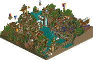
Park / RobinHood

Park_2391 RobinHood

13 Comments

  • Comment System%s's Photo
  • Hex%s's Photo
    I always love your queue lines And stations and how they all interact so nicely with the coaster. But you need to try a different theme. You always have medieval or western or something in that nature. Don't be afraid to try something else. :)
  • Rhynos%s's Photo
    This is definitely providing me with inspiration for my architecture since I'm going along with the same theme.

    I'd ask if you ever want to do a duo with myself for a NSCO project, but I've never been reliable as far as turning out (any) projects.

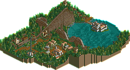
    Still, very nice scenery - not too repetitive, but it all flows very well together. If I were to offer any criticism, I would say that the grey church in the middle looked a bit odd and naked on the side opposite the tower. Other than that, excellent usage of detail given the parameters of NCSO.
  • MCI%s's Photo
    Thaks you two!

    @SuicideCarz: Yeah, I´ll try something different with my next solo-project. But unfortunatly the design I´m currently working on is medival again^^ But that was BigB´s idea :party:
    @Rhynos: Well, you could star a project and let someone else finish it :p
  • Jonny93%s's Photo
    I liked this coaster and i enjoyed to view it. Some places are really good like the queue of the coaster, the drawbridge of the castle or the small village with the church. The layout of the coaster is good but not outstanding. I also found some parts of the foilage a bit boring. All in all its nice to see this finished. Its definetely a good NCSO themed coaster. I am looking forward on your future projects and releases.
  • Xeccah%s's Photo
    I respect K0NG because of his high vote, even though he hates NCSO.
  • RWE%s's Photo
    I like the Layout of the coaster really much. Respect for this work. Theming is just theming. Its good but I think Its time for something new for you. But Im sure there will come something.

    All in All a very good coaster. Well done!

    Also I respect everybody gives a vote over than 50% for this.

    Gruß RWE
  • posix%s's Photo
    I just think it's way too basic. You've had several competitive submissions ever since late 2010 and never cracked the 50% mark. I don't think you lack the ability, it just doesn't seem as though you have the necessary drive to go higher score-wise.

    You need way more ideas so you can build more interesting stuff. You also need more creative solutions to realise your ideas in-game. I get the feeling you're playing randomly and with little consciousness, choosing whatever object may just look nice at a certain moment. Put more mind to your creations and make them speak of your ideas so people get sucked into your parks.
  • Xeccah%s's Photo
    NCSO leads to most people using obvious and basic themes (castle, western, etc.) and not many break those bonds. Try CSO or a more complex theme. You have the skill I believe to get an accolade,but you need the great idea to base your skill on.
  • Hex%s's Photo
    ^ Actually not quite. People do use themes other than medieval and western. I've seen jungle, space, mechanical, etc. I've talked with the people that build with only NCSO (for example Corkscrewy, MCI, Myself, funkeymon and so on) and we all have tried to build with CSO in the past. We get frustrated too easily with it. There are too many walls to choose from and too many deco blocks and we just like the old school game scenery. It's our way of expressing our love and imagination to the game.
  • MCI%s's Photo
    @posix: Thank you so much, I really appreciate this! I always thought I would just lack the ability and the panelist had a very good day when voting for "Blackbeard Revenge", but I never thought about what you just said. While building Blackbeard we had so many ideas and we got a couple of them into the design, wich now explains the "high" votes to me even if my "skill"-level back then was far below the point I see myself now. But thats something I can improve on and I cant thank you enough for pointing it out :) Sometimes I feel like somebody needs to point out the obviously to me, because I´m searching at the wrong end while the solutions is directly in front of me -.-

    @SuizideCarz: I agree with you 100%. And as I said I´ll try something totally different on my next solo-project...
  • Hex%s's Photo

    @SuizideCarz: I agree with you 100%. And as I said I´ll try something totally different on my next solo-project...


    Looking forward to it man! Your work inspires me most so if you try something different chances are I will as well!
  • Fizzix%s's Photo
    I think for a creative NCSO theme, abandon the names of the Scenery Tabs. Try to see where other themes could use certain pieces, such as barrels or ruins. The quarter tile objects one clearance high have a lot of great uses, flower beds, deco pieces, etc.

    This was nice, but nothing special. Good layout, good archy, but nothing special. Try to make each and every building unique and interesting. It is better to build, and to view. Also, more interaction is always a good thing. The queue was great, but try integrating a ride to the actual town. For example, have the ride dive down into a spot where a building could go, and have it pop out at another similar area. Give the impression to the peeps that they don't know where it will go next. Just some tips to hopefully help you break that Design barrier! Hope these help!
  • MCI%s's Photo
    @Fizzix: It does! Thanks man ;)