Park / [H2H6] R2 - The Replacements - Tivoli Gardens
-
 09-June 12
- Views 46,272
- Downloads 1,528
- Fans 8
- Comments 179
-
 76.88%(required: 70%)
 Gold
Gold

Austin55 80% inthemanual 80% Liampie 80% Sulakke 80% Xeccah 80% FredD 75% MCI 75% wheres_walto 75% chorkiel 70% Ling 70% 76.88% -
8 fans
 Fans of this park
-
 Full-Size Map
-
 Download Park
1,528
-
 Objects
431
-
 Tags
Tags
![Park_2390 [H2H6] R2 - The Replacements - Tivoli Gardens](https://www.nedesigns.com/uploads/parks/2390/aerialm2133.png)


Also thanks to Jonny, Nin and Magnus&Robbie for the matchup!
I wished I could have done more on this but I was pretty busy and the park being pushed forward to week 2 didn't help this at all.
Great matchup!
"MFG"
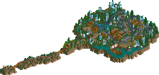
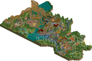
I really loved the idea, the concept of norse/germanic mythology as a theme for a park might not be the most creative but it's something very enjoyable nonetheless. There were parts in this park that just blew me away, like the trackitecture used to create the ''serpent'' in the entrance area (meant to resemble Jormungand I hope? Would be a shame if it'd only represent a ''random'' serpent). Another example of course is the custom pirate ship. It's a shame it doesn't function in any way but it's one of the most likeable custom flatrides ever.
So far for what blew me away. There were also some things I quite enjoyed but that weren't that spectacular to me. In that case I'm especially talking about the Wooden coaster and the water coaster. Both had fine layouts, and the surroundings of the water coaster were enjoyable, but they missed wow-factor imho. As I believe coaster layouts are so limited in rct2 that they shouldn't be considered as if extremely valuable tools on their own, and actually need extra content. I was missing that extra content in the form of surroundings/interaction/archy etc. in the case of the wooden.
Then some troublesome points. First of all the park could've been more diverse. Why not make a more inhabited area v.s. a forest? Or some nice shores/cliffs. Just something to diversify (more) to keep it lively. Same with the archy, there were for example three buildings that all more or less resembled stavekirkes, which I found a bit too much. Then there's the seemingly unfinished map edges, but those have been touched upon elaborately already.
Overall a park with great concept, some great details, overall decent architecture/landscaping, but lacking finishing touches. It might very well have won from Tivoli if the details/finishing touches were just a tad better. Nonetheless, it's still a very enjoyable park!
You know, Posix, having listened to me rant quite a few times on AIM over this whole situation, please understand that I'm heavily censoring myself on these issues. The time spent working on this park was the most miserable I've had since on NE since I joined. However, I respect what my partners contributed, and I'm glad for the support from my team, fellow opponents on AIM, and from the voters/community as a whole. It's positive responses and understanding that keeps me sane here, and what honestly kept me in the competition long after I gave up wanting to deal with everything.
About the park, the intentions were for this to be much more themed than it ended up being. The general theme of it all is Norse mythology. The entrance area is Midgard, the land of the humans; Ragnarok circles Asgard, the realm of the gods. The back area with the ropes course is the wilderness mountain home of the giants, and the spinner was going to be a journey through the cave dwellings of the dwarf kingdom. Ideally, the themes would have been a lot clearer and more precise. Instead, due to time limits, we ended up filling the spaces we could with landscaping to make it feel as if it were in a tundra-like setting. Due to some extended absences by players and some harbored resentment from myself, the park ended up not nearly as good as it could've been. In the end though, I'm still proud of most of my work in the park, and I'd consider portions like the water coaster station and Ragnarok's station, Valhalla, to be my best architecture I've had the pleasure to release.
While the overall outcome of this was unfortunate, I'm glad I was able to release something, and I'm genuinely surprised and delighted that the match was as close as it ended up being. Ruben, consider that the power of a good coaster layout
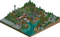
Thanks for the heads-up. I'm kinda surprised many wanted to see a larger coaster in Tivoli, as the park was aimed towards atmosphere and realism mainly. And we were kinda afraid people were bored with a city park after they saw the Olympics park. Traffic would have been too much here imo.
You got it right. It's a classic Ferris wheel which has many different cabins. Like the one in Vienna you can dine, marry, etc in a cabin if you want to.
I really don't see how it didn't fit. I thought people will get the complex is built around the old Ferris wheel but I guess it wasn't clear enough. About the pacing of 8th wonder - Maurer Söhne XCars have their brakes in the lifthill structure (or at least Abismo has) and so they tend to go through the station pretty fast. I know the helix might look a bit too narrow and I'd loved to somehow fit in an OBT but the limitations of RCT didn't allow me to do this. That's something I wish I could change looking back at it. I also can see why you didn't like the ruins. We were sceptical ourselves about them but I think looking at them at one single structure it works really well. nin did a great job theming it there.
See above.
As I said to SF above, we were bummed there was a city park in the same week but meh. And if you could show me at least 2 other European city parks in RCT anywhere on the internet I'd be more than happy. Also I think we captured the feel quite well in the Asian area. Sure it's not as narrow and playful as the real Tivoli in Copenhagen but still it was a nice approach imo. Also with the Steel Expo theme around 8th wonder and the boardwalk we had nice additions to the theme IMO. Looking back at this, a readme might have helped to let people understand the theme better.
Glad to get an opinion from someone who actually was at the park. We really wanted to create a little bit of Tivoli atmosphere and we're happy you got this feeling too. Jonny really did a great job and I really loved the fact you thought I did the outskirts instead of him.
Yeah and here the atmosphere really didn't won you over it seems. haha.
While the park was based on the real Tivoli we tried to integrate new stuff in the park too. Again I feel a readme would have helped clarify it a bit more.
Again it wasn't our intention to make a 200 ft coaster with 10 inversions and whatnot. We wanted to make a believable Tivoli park with nice atmosphere and realistic rides. Also I'm eager to know what you didn't like about the layouts?
Yeah we wanted to include the most atmospheric Tivoli area to the park which was the Asian area. Yeah the Ferris wheel supporting was kinda hard for me to do and I'm still not happy with how it turned out. Thanks for your feedback!
"MFG"
"MFG"
As for Park Edda, its sad to see that the process for this park was not so pleasent... I really want to see some great work from you, Robbie, so keep at it I guess
BTW, why is that beer smiley thing called mantis? any the stoner one is SA? was SAcoasterfreak a stoner?
As to the coasters, I think I mistyped or changed my opinion. The grey coaster wasn't dislikable not quite memorable either but it had it's moments.
I didn't like this coaster;
©Kumba for the picture ; )
Imo it just looked messy. I just didn't like it actually.
While most people won't purposely do this, I hope. It takes away from the surprise. If another team brings out a park in black and white as well, even if they have thougt about it before the release of frankenstein and the park is way better than frankenstein, the black/white would still do his work less because it's not as new anymore. This goes the same for city-based parks, I think, especially if they've been released in the same week.
"MFG"
I always assumed it was because they made them?
Seeing now, I do take back what I said about capturing the essence of tivoli gardens. I think now that it is damn accurate, especially the Asian area
This was neither a park nor did it seem to tell me any stories or myths or anything. It didn't feel to me as if the park actually was an Edda with deep background stories.
Oh, and, had we had time, the stories would've been much more obvious. It was a better option than the title "Norse Park" that we used for the majority of construction.
I could also say that Sea of Sagas is a poor name because that is a lake, not a sea, and you highlighted mainly stories, not sagas, but at the end of the day, it's a name, and it works well enough for the function of a RCT contest.
Besides, Trav, this is nothing out of the realm of any other response to a complaint anyone has done, especially from someone from your team within this round.
Whatever... I can be bitter if I want.
wiki says:
Sagas are stories about ancient Scandinavian and Germanic history, about early Viking voyages, the battles that took place during the voyages, about migration to Iceland and of feuds between Icelandic families.
We had the Völsunga saga to a large extent in there with the Andvaranaut, Fafnir, Otr, Sigurd, and the Vinland Saga as well.
I don't think you could possibly argue we didn't actually portray sagas or norse stories and myths.
Also sea is not only the word we used because it's a nice alliteration with the word saga but also it makes sense as you could interpret the lake as our Baltic and Norse Sea.
But this topic isn't about Sea of Sagas anyway, I didn't bring it up, you did.
I don't think that your points really defy my criticism, so my points still stand.
edit:
Oh I've got lots of criticism for this park actually. And it just starts with really basic things like the naming that actually is part of the planning and overall the planning was what really brought it down for me. I felt the whole layout and the whole composition of your ideas along with the missing depth were my main concern. While your technical ability is so amazing, you certainly could've done the most basic things about parkmaking better in this one.
I even waited till this was over, don't think I'm influencing anyone, the voting is closed. I'm sorry if I don't have praise for it but honestly knowing what you can do, I was quite disappointed with this.
If you're bitter then that's your problem not mine, and the only reason I only talked about the name there is because I didn't think you wanted to hear more criticism.
Which we've all been shot down for by the whole community, including your self.