How to vote - This season vote is by reply only. - Everyone but players belonging to either team in the match may vote. - We will check the topic frequently to update the vote counts. - Until your vote has been added to the count you may edit your post to change your vote.
Two things: - We kindly request you to not vote if you haven't seen both maps in game. Please. - Make your vote bold or underlined to make it easier to count.
great park! I certainly love the original themes and I think the slightly risky choice paid off. There's a couple places where architecture and detailing seems a bit rushed or sparse but it's to a generally good quality throughout. Lots of little details really pulled me into this park, like the two jaws sculptures, the underwater tentacles, the werewolf face, etc. The entrance area was imo the best area, with some lovely atmospheric architecture and ride detailing. My main problem with this park though, is that it feels quite fractured, and that the areas are layed out awkwardly and I think it's clear when the builders change (as in the park doesn't flow as a whole unit, rather a collection of distinguishable works). But overall, I thought it was quite nice.
RevoLLutionists:
I was really expecting another great park from the overview, but the in game park left me unsatisfied. Landscaping was bare and awkward, architecture was boring and repetetive. The left side of the park is just a big wall with that pagoda structure repeated, and some bare walls and open paths. The other side had some random green walls and a different pagoda structure repeated. The only part I really liked was that tiny island in the foreground. There were certainly some nice spots if you look at them individually but altogether I felt that the park lacked content, and was bare and awkward in too many places.
Lovely park from Heavens kitchen. I agree with Cocoa about obvious change in styles but all the ideas were there. Overall a really good park with some really nice details. I loved the frightened horse, a wow factor for me and some of the sculptures in the park were fantastic. I thought jaws really could have been done better though. Really great matchup!
There is so much cool stuff to look at in these parks. The architecture in the RevoLLutionist's park, and just the ideas in Heaven's Kitchen's... There is nothing wrong with The Lost Samurai at all - the rides are good, the atmosphere is good, the hacks are cool. But it feels awkward somehow. Like the premise was not really given any thought. I read the readme, and it seemed to just not have that much creativity to it. Admittedly, Monstrocity is only using others' ideas, but the blend is done so well, each individual monster executed in such a satisfying way... And the monsters are fantastic. The spider, Godzilla, the tentacles under the water, Jaws... I don't know if I can think of any criticism for Monstrocity. I'm having so much fun looking at it.
Samurai (the flyer) was great. Probably design-worthy in its own right. Truly fantastic work, both teams. But as a whole piece, and in such a stiff competition, my vote has to go to Heaven's Kitchen.
EDIT: Ah, yes, can't forget the frightened horse or dismembered bodies The subway was brilliant too.
HK had me somewhat disappointed with their Atlantean Ark, but my lord, what a comeback! Monstrocity looks and feels amazing, and the amount of subtle details is insane. Very well done.
Wow another match after looking at both parks in game my Vote has to go to Heaven's Kitchen I really wanted to give the vote to the revoLLutionists but there wasn't enough there to hold my interest I know it takes a lot of skill to build in RCT 1 and thit park is good just not for me.
The RevoLLutionists Park was great as well, but it was very repetitive, and seemed to have the less content out of the two, so obviously, my hunger was not fulfilled, haha.
I don't have LL, so I can't open your park i'm afraid guys, but from the overview it looks like a bloody excellent oriental theme! Awesome landscape, great colours and atmosphere. Should be a good match up, nice work all.
No vote from me, no LL. I did take a nice look around Monstrocity, and I enjoyed it. I did'nt like the layouts for the most part, the beginning of Werewolf was far too fast(I mean the first few elements, not launch), and the other two were too concealed for me to follow and enjoy, especially Dracula. The Birds were a nice addition, and most of the archy was really nice. Nice park, very solid, but I don't know how it would fair against The Lost Samurai.
87 Comments
posix Offline
Round Robin
__________________________________________________________________________________________________________________________
Round 2 | Match 3
Voting Closed
(Voting duration: 120 hours)
___VS ___
__________________________________________________________________________________________________________________________
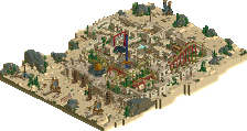
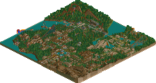
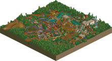
Click maps for fullscale resolution
"Monstrocity"
by Heaven's Kitchen (Download now in Database)
VS
"The Lost Samurai"
by the RevoLLutionists (Download now in Database)
__________________________________________________________________________________________________________________________
Voting Closed
Heaven's Kitchen beat revoLLutionists
Monstrocity was made by FK+Coastermind, Camcorder22 and Turtle. Lost Samurai was made by Louis!, Gwazi and Ride6.
Heaven's Kitchen vote count: 13
Voters: Cocoa, olddtfan51, djbrcace1234, RCTER2, rct2isboss, Xtreme97, Kumba, RHCPepperfan, snas, Roomie, RCTMASTA, 5Dave, Dimi, Six Frags
RevoLLutionists vote count: 8
Voters: XCars, dr dirt, MCI, Maverix, posix, prodigy, Dr_Dude, JJ
How to vote
- This season vote is by reply only.
- Everyone but players belonging to either team in the match may vote.
- We will check the topic frequently to update the vote counts.
- Until your vote has been added to the count you may edit your post to change your vote.
Attached Files
downloads: 457
downloads: 491
Liampie Offline
Two things:
- We kindly request you to not vote if you haven't seen both maps in game. Please.
- Make your vote bold or underlined to make it easier to count.
Thanks you.
J K Offline
ScOtLaNdS_FiNeSt Offline
Milo Offline
Nice work, HK.
Hex Offline
5dave Offline
There wasn't any weak park yet. Kudos to you all!
Will post my thoughts on those two gems soon.
"MFG"
Cocoa Offline
great park! I certainly love the original themes and I think the slightly risky choice paid off. There's a couple places where architecture and detailing seems a bit rushed or sparse but it's to a generally good quality throughout. Lots of little details really pulled me into this park, like the two jaws sculptures, the underwater tentacles, the werewolf face, etc. The entrance area was imo the best area, with some lovely atmospheric architecture and ride detailing. My main problem with this park though, is that it feels quite fractured, and that the areas are layed out awkwardly and I think it's clear when the builders change (as in the park doesn't flow as a whole unit, rather a collection of distinguishable works). But overall, I thought it was quite nice.
RevoLLutionists:
I was really expecting another great park from the overview, but the in game park left me unsatisfied. Landscaping was bare and awkward, architecture was boring and repetetive. The left side of the park is just a big wall with that pagoda structure repeated, and some bare walls and open paths. The other side had some random green walls and a different pagoda structure repeated. The only part I really liked was that tiny island in the foreground. There were certainly some nice spots if you look at them individually but altogether I felt that the park lacked content, and was bare and awkward in too many places.
My vote goes to Heaven's Kitchen
J K Offline
Ling Offline
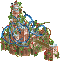
Samurai (the flyer) was great. Probably design-worthy in its own right. Truly fantastic work, both teams. But as a whole piece, and in such a stiff competition, my vote has to go to Heaven's Kitchen.
EDIT: Ah, yes, can't forget the frightened horse or dismembered bodies The subway was brilliant too.
verti Offline
No LL, no vote.
olddtfan51 Offline
Dr_Dude Offline
djbrcace1234 Offline
The RevoLLutionists Park was great as well, but it was very repetitive, and seemed to have the less content out of the two, so obviously, my hunger was not fulfilled, haha.
XCars Offline
RCTER2 Offline
My fav park so far
Turtle Offline
dr dirt Offline
Fizzix Offline
MCI Offline