Park / [H2H6] R2 - Reservoir Dogs - Pixar Animation Studios
-
 24-May 12
- Views 41,995
- Downloads 1,285
- Fans 0
- Comments 124
-
 63.00%(required: 60%)
 Silver

Kumba 80% chorkiel 70% Scoop 70% bigshootergill 65% Cocoa 65% saxman1089 65% CoasterCreator9 60% Ling 60% RWE 60% Xeccah 60% G Force 55% Liampie 55% 63.00% -
 No fans of this park
-
 Full-Size Map
-
 Download Park
1,285
-
 Objects
460
-
 Tags
Tags
![Park_2387 [H2H6] R2 - Reservoir Dogs - Pixar Animation Studios](https://www.nedesigns.com/uploads/parks/2387/aerialm2130.png)


![park_2420 [H2H6] R4 - Reservoir Dogs - Atlantis Resort](https://www.nedesigns.com/uploads/parks/2420/aerialt2160.png)
![park_2432 [H2H6] R5 - Reservoir Dogs - Galaxy Geeland](https://www.nedesigns.com/uploads/parks/2432/aerialt2182.png)

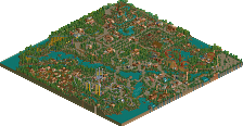
Some parts of Pixar were good and atmospheric, like the little Ants Hill Restaurant, the Ratatouille coaster itself and the little Cars zone. Overall the ideas were there but the execution lacked, like the turtle shows. Naming a coaster to a movie isn't enough. Many parts were recycled (...) and the huge structures (like the Incredibles building) ruined the park's atmosphere, which could have been great. Although I have to admit that the shark and the manta were pretty awesome, most hacks didn't add anything and were there just for the sake of it. For example, why put so much effort in the special lift if it doesn't work properly? The Monsters interior was full of difficult hacks but there wasn't anything interesting too look at. The park shows a lot of technic skill, but not enough artistic skill. I think you just took the wrong approach to the theme.
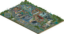
I liked London 2012 much better. It somehow gave off a lovely British atmosphere, not the stereotypical London atmosphere, but the real modern britishness. The architecture were good, the stadiums were great, the little details everywhere (especialy the traffic) were awesome. I loved the Olympia coaster (probably a better Eurofighter execution than in Sea of Sagas). The hacks were very functional here. The other rides were good as well, but I agree that I looked like you placed amusement park attractions just because 'you had to'. The sparse foliage isn't very good either, I think you had to do more with it (made it more realistic/detailled or extravagant) or just leave it away. Other than that this was an awesome park, probably even better than Zombieland.
Airtime Offline
A tough match. Both very good parks. Again will have to write a decent review later when I have time
RMM Offline
Pixar Animation Studios equally has a brilliant concept and more various colors.
but It didn't blend well, It looks rather rushed and messy for my eyes.
Edit: Looking at the last vote counted being Pierrot and adding 5 days to Liam's post. I think the counting has already been done correctly. The admins just need to end this matchup I guess.
Airtime Offline
Pixar Studios. Funny really because in round 1 one I proposed to Loopy a pixar studios park but we choose cars land instead. Some great ideas in here but I think the execution wasn't as good in some areas, maybe it's because I had a lot of ideas for each of these themes myself that was more fitting to the theme. The other main issue I had was the park felt a little over scaled for example the montser's inc building and the random building infront of the incredables coaster and the worst offender here being the finding nemo's water ride. The monsters inc building was real good but a bit large and the indoor idea was brilliant, maybe rushed for time here so scarifcies where made? I still really liked it though. The ratatouille area, the coaster, station, architecture and folliage were perfect. The mural was good but I thought it felt quite forced. Nice idea for Wall-e but the up attraction, cars and bugs lfie were lacking. Shame the toy story land wasn't finished but good save leaving it a grassy area. Nice park, interesting to see who the other creators are...
London 2012 Olympics. I enjoyed a lot more because it was just easier on the eye. There was some really awesome architecture in there, maybe not very British which was the main problem for this. I know it was more of take on what the London games could of been but still why name it London? I was sad to see no Olympic stadium but instead something that wasn't that spectacular. I remember reading about no images of the stadium were about when the park was being created, there was loads around because it's been completed for quite a while now. Also a USA flag and a not a mention of anywhere else? Nice idea with the observation carriages on the wheel. Some great little details such as the press confrence in the buildings. I loved the rapids ride so simple but great layout and execution. I didn't understand the trams on the road? London doesn't have trams
(I'm in a rush so they'll be mistakes in there
I enjoyed a lot of the architecture in Pixar (The go-kart building is fantastic, the entrance bridge with the lamp on top is great too!) and many of the concepts were well represented, especially Monsters INC., the Incredibles and Nemo. Ratatouille, my favorite pixar film, got shafted though and I'm sure I've seen that mural from a year or two ago... The unfinished portion of the park was not pleasing/covered up, so it detracted from the whole. Overall the park felt disjointed, the atmosphere wasn't convincing or cohesive. While each individual section was great, the whole didn't impress.
Hurricanes was very very impressive. I loved the interiors of each building and the amount of detail that went into the park. I didn't enjoy the coaster or the buildings in the middle of the park as much as it felt more like an after thought than a centerpiece. The cars and streets were great, and although I know this is the best we can do in RCT, having frozen peeps everywhere killed the atmosphere for me in the large stadiums. Overall though, I really enjoyed the incredible work put into the architecture here!
Voting for Hurricanes.
RD's park-You have a very hard customer in me, as i've been building (OH SO SLOWLY) my own pixar park for years, and thus i have evaluated time and again how to do each movie. I really think the problem here is that you decided to do them all, but on a small scale. I think you should have choose a few and done them fully, or do them all on a huge scale (that's what i'm doing, and is obviously hard to do in H2H). For example, Toy Story is the pinnacle of Pixar's films. there most successful and most cherish, obviously why pizza express vans are their easter eggs. Yet, in this park, even if the toy story area was finished (i hope it isn't) it would still be SO small, like an afterthought. The park seems generally split in quality between the front and back. The entrance is gorgeous with the entrance building, the bugs life area and incredible stations and such. then you have the back where the ideas are great, but not well executed. i mean, the monster inc buildings looks so bulky and the UP house just doesn't look like the house from Up. the ideas were there, like the water ride and the WALL-E ship, but then you had weird things. Like the GIANT tower in incredibles that mostly blocks things and is empty. Or the rattatoille building that was enormous compared to other things, and seemed really just an excuse to have a full wall with remy's face on it. I really enjoyed this park, but i felt like it wasn't cohesive. had it been the same quality as the entrance throughout it would have been an easy vote, but the changes in quality made it hard.
Hurricanes: This park is also hard for me as i really don't like the look of a park inside a city. I mean, it just made the theme park like an afterthought to the city. and really, i didn't like the coaster, and while the rest was nice it wasn't that entertaining. I think the whole thought about the city wasn't that it looked like the netherlands, but rather that it looks like the dutch style of RCT. It DEF doesn't look like London. Maybe the problem is that London really isn't on a conventional grid, thus this perfectly laid out grid looks weird. The traffic was very cool, even if it kept running through itself. I loved all the different ideas of sports and arenas. the interiors were impressive in attempt, though not always very well done. Alot of kool ideas, really loved all the different flags. That all being said, there was ALOT of cement in this park, which made it feel more like a spaced out American city then a crammed European one. The winner for me was the ideas and play-ins with Olympics and the quality which was generally cohesive across the park.
FK
Six Frags, it was great to see new work by you again, and I'm very happy that it's not a rushed effort like in H2H5. After EPWS, which still looked a bit like your H2H5 parks (because of the object limit I guess?), you finally showed again why you were a NE Parkmaker. It's the most technical thing you've done and your style has really progressed it seems. Can't wait to see what's next. EPWS is your best work, but for how much longer? Great job. Congratulations Hurricanes.