Park / [H2H6] R2 - Reservoir Dogs - Pixar Animation Studios
-
 24-May 12
- Views 40,985
- Downloads 1,267
- Fans 0
- Comments 124
-
 63.00%(required: 60%)
 Silver

Kumba 80% chorkiel 70% Scoop 70% bigshootergill 65% Cocoa 65% saxman1089 65% CoasterCreator9 60% Ling 60% RWE 60% Xeccah 60% G Force 55% Liampie 55% 63.00% -
 No fans of this park
-
 Full-Size Map
-
 Download Park
1,267
-
 Objects
460
-
 Tags
Tags
![Park_2387 [H2H6] R2 - Reservoir Dogs - Pixar Animation Studios](https://www.nedesigns.com/uploads/parks/2387/aerialm2130.png)


![park_2432 [H2H6] R5 - Reservoir Dogs - Galaxy Geeland](https://www.nedesigns.com/uploads/parks/2432/aerialt2182.png)

![park_2420 [H2H6] R4 - Reservoir Dogs - Atlantis Resort](https://www.nedesigns.com/uploads/parks/2420/aerialt2160.png)
There was an over focus on some areas, like nemo and the Incredibles, while other, more known pixar movies got little to no usage of area, for example, the Cars area deserved more I believe.
I also felt that a lot of the hacks were just for the sake of hacking, and really didn't wow me like most others would. I appreciate the effort, though.
And like others have said, Some idea in here have be seen in the dump-place in the past (not sure if this is the same map though)and the dump-place pictures looked a lot better.
Hurricanes--I liked it! See, here, I thought the hacks had more purpose, and were not used as a means to wow the viewer, but enhance the atmosphere.
My vote--Hurricanes.
I'm seriously hoping that "when I have the time" doesn't mean "when I actually get to see these in game".
Your rumored loss of RCT isn't exactly a secret. So, I'm really hoping that you didn't vote off of the
aerials. That would be rather hypocritical.
No offense.
3:06
Wait a second...
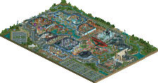
Pixar Studios could have been a way better park than it is now. We were had the idea of making a Pixar park too, but I'm happy we didn't do that. My biggest complain with this park are the huge buildings. Monsters Inc., Axiom, Incredibles HQ, the lift of the Nemo ride and the wall painting - which seemed to be there just for the sake of that painting - were all way too big and really ruined the park. The park layout is very ugly, which can be seen from the overview before even opening it. I didn't like any of the rides either. Ratatouille could have been themed, Monsters Inc. was empty and weird, Up could have been themed a lot more, the Nemo ride was too high and the station was ugly, Steve Jobs felt really out of place, A Bug's Life could have been a lot more, Toy Story was unfinished and the Axiom wasn't working for me either. There is just so much potential for this concept and you didn't execute it well in my opinion. There were some parts I really liked though. The entrance building is very nice, the queues were perfect. I really liked the Cars area too. And the hidden Pizza Planet cars were just a brilliant idea!
Hurricanes
I have a full response, but not the time to write it presently, and I don't wanna miss the voting period. I'll be back.
FK
I just found it to be more cohesive and enjoyable. All the components I loved of Pixar were outweighed by the things I didn't like, the areas overlapping, the unfinishedness. I want to say that this has been the closest one for me yet, Pixar's rides were all very well thought out, with great concepts(except for Ratatouille and Toy Story). However, not all of them were executed very well, Incredible's coaster didn't do it for me after watching it for awhile, and Up was terrible. London only got better as I viewed it. The archy was really nice, even if not completely selling the theme. Olympic Looping was great, I enjoyed it more and more as I watched it. The convention and fitness centers were my favorites on this map. The marching band was a great idea also. Overall, 2 really strong parks, and a tough choice.
What a beautiful park you have submitted here, great work.
I have seen more park with this kind of theme, but I see some nice things in this park. When I look ingame I saw a few flaws and poor finishes. On the borderline I can still see the vertical ground and a entrée from a ride into the black blocks, the supersplash have a bad synchronization. The elevator is faster than the boats. The side with the freefal is empty and the monster building is missing details and looks like a shed. The inside of this ride isn’t very special and the only nice thing there is the colorful wall.
As I said there are also fantastic things in this park. I’m fan of that big fish and the underwater area you created. Also the tutle is cool, but his head is in ratio too small.
It’s a great park, but the final touch could be better.
Hurricanes – London 2012 Olympic Village:
This is also a wonderful submission. The theme is actual and original.
I love it that we can watch into all the houses on the edge of the map. They are filled with funny details (like the cooking oil at the mc donalds). I also like the roads with auto traffic. It’s give this park a lively and urban feeling.
The green is the weak point of this park. Tree-lines are missing and there is no green structure. I also miss the lower plants and gardens. It’s now very gritty. A good point is the tree grates. They are very nice.
The stadiums are beautiful and fit very well into this park. But some of the attractions don’t. I have the idea they were place because there must place some attractions.
But after all a very nice park.
My vote goes to the Hurricanes.
Not sure if anybody answered this yet -- didn't feel like looking through 4 pages for it. Cena posted a similar (if not the same) Ratatouille mural in one of his Disney parks.
I'm gonna have to give this one to the Hurricanes, even though I absolutely loved both. It was a tough choice, but I felt more of a vibe from the 'Canes -- perhaps it was the massive amount of peeps chillin' around the park?
The rumors would be false, otherwise I wouldn't even be in the competition. Besides, after all the shit I've given people for voting too quickly or voting off of the aerials, I wouldn't vote without looking at them in-game. The "when I have more time" referred to me having the time to type out paragraphs explaining my decision.
I haven't lost RCT at all; maybe interest in it, yes, but not the actual game. Whoever started and spread those rumors is a dumbass.
-I really like the concept of a pixar park, and some of the areas/rides were really amusing. Clearly some great hacking in this park and a lot of hours put in. However the archy was rather mediocre at times, the park had no flow any whatsoever, and just wasn't logical at times. For example the ratatouille ride where there's a huge sign&building, and a rather mediocre ride next to it. Why build such a building if you don't wanna use it anyways? Furthermore, the hacking seemed like a useless show of muscle at times rather than as something adding to the concept of the park and the rides. Sure, the fish hacks were superb, but others just didn't add anything but lag. There's no shame in having one or two rides without hacks in a park if you can also create a similar ride without you know.
Hurricanes:
-Didn't really like the concept, and I didn't really like some of the rides either. The centerpiece coaster was very nice though, and there were some very interesting details in here. The hacks used in this park really added to the atmosphere, although they mostly took attention away from the rides instead of drawing it to them. You could have done more with the supporters, now there were just some standard flags and one or two big signs. This could have been wáy more creative. On the upside this lack of detail was not always a problem, and at times the opposite was in fact true. I have looked at the deepfrying going on in the McDonalds for at least 2 minutes, simply because I was só amazed with how much such a little (and really simple) detail can add to a park.
Difficult choice. There were good things to both parks, but there were bad things to them too. I feel like the canes had a park that was more interesting/pleasing to look at though, so my vote goes to the Hurricanes!!
(P.s. KONG, don't worry, believe it or not, even though I'm not voting for your team I've seen both parks ingame. Just saying.
captain to make sure their questions get satisfactory answers
And Ruben, I actually worry much less than you might think.
3:06
Pixar Animation Studios was great in the idea and concept, the architecture and coaster layouts, the little details, it was all great, but the whole thing didn't come together well and just looked a mess. There was no atmosphere, and everything seemed to be a jumble. It was a great park, but it just didn't feel right. I thought the park was a lot stronger than the R1 park though, there was more to look at and in my opinion, was built at a higher standard. It was a great park, I just felt the Hurricanes' was slightly better.
London 2012 was a great concept, the architecture was brilliant, whilst it didn't feel like London or represent anything accurately, the whole idea of the park was great. The details were great, the rides in the fair left me wanting more though. I thought the eurofighter would have been better as a clone of their smaller model (Rage) or should have just been the real 'Olympia Looping' but still, the only thing that would have impressed me more was if the stadiums were more like the actual stadiums and if it felt more like London, but still, great park, not as good as your R1 park, but still great.
I'm not nit-picking, I was just wondering why you chose to call it Olympia Looping and then not build the original?