Park / London 2012 Olympic Village
-
 24-May 12
- Views 42,517
- Downloads 1,373
- Fans 3
- Comments 124
-
 74.38%(required: 70%)
 Gold
Gold

Jaguar 80% Kumba 80% Sulakke 80% bigshootergill 75% Coasterbill 75% G Force 75% chorkiel 70% Cocoa 70% Liampie 70% trav 70% 74.38% -
3 fans
 Fans of this park
-
 Full-Size Map
-
 Download Park
1,373
-
 Objects
425
-
 Tags
Tags
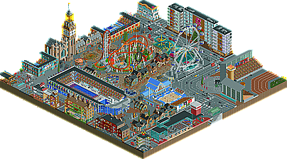
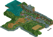
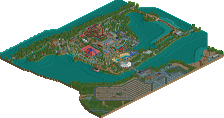
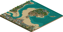
Thanks, C-F
3:06
The olymnpic park looks fun but my vote is going to the pixar park.
it means theres a pedestrian crossing coming up
Anyway, nice to see another good matchup, I guess now's not the time to share my opinion on these parks considering it's my teams matchup and that seems to be frowned upon now. I'm just glad to see us get another good match
this park could have been great if it was finished. The actual content that is there is incredible... the ant hill, cars gas station, entrance gate, up house, and the finding nemo aquarium were all very great and chalk full of details and cool hacks and things. But I just can't seem to look past the ultimate rushing of the park... there is one french building (and that could have made a grea theme) and its shoehorned into an awkward tan structure that exists only for a giant mural (which I've seen before, haha). Then there's the awkward unfinished grassy plains... sorry guys, I know this must be a shame for you
Hurricanes:
I was really impressed by this park, specifically the sheer amount of content. You guys are known for consistently amazing parks, and you really get them done
So my vote goes to the Hurricanes, congrats on the great work and maybe you can regain some dignity after we crushed you last round
Wicksteed Offline
Both parks are packed with lovely ideas, have great atmosphere and are technichally very well executed. The Entrance area of Pixar is really brilliant, it's a pity things become so rushed to the other side of the park. This is also why I vote for the Hurricanes. Olympic village has consistent quality throughout, and very high quality that is.
I really like the idea of a Pixar Park and I think that some of the ideas were executed really well....and others not so much. For example I love the Luxo Jr atop the entrance, the Steve Jobs reference, the Shark and Turtle, the Ratatouille fresco, etc but overall you could have executed half the ideas in the park and submitted a polished park. I feel that the Toy Story area is a casualty of trying to do too much.
Hurricanes submitted a technically superior park and, of course, I loved all the details and realistic touches. My problem is with ride "area" itself, it just juxtaposition feels completely disjointed... and I can't figure out if its the physical proximity of the rides and surroundings or if its the fulfillment of the idea.....I can't believe in it because I live in England and have seen the Olympic Park. Maybe if I was a different nationality my views would change.
In a way I guess I'm adding to the debate of voting for a park which, for me personally, where the quality of the idea overrides the quantity of the execution.
Gareth
My initial feeling was to go with the Pixar park. But the Canes park grew and grew on me. Just good effort and feeling throughout. While the pixar park did the opposite.
Pixar park was almost excellent. Some flashes of absolute brilliance, like the lamp on the entrance, the underwater section of the EAC, the inside of the Monsters Inc ride, and the little Cars section, really good atmosphere there. However, the park as a whole didn't come together, and there was almost no atmosphere throughout the park, something which Pixar films are absolutely brilliant at evoking. Too many themes and areas in close proximity, none of which were really themed strongly or fully enough. For example, you had the opportunity to make an absolutely lush tropical paradise for the Incredibles (the main coaster), and the whole setting just feels nothing like the film.
The Hurricanes' park really hit home with me for some reason. The custom music added a lot, loved hearing God Save Our Queen belting out of the athletics track! Maybe it's just because I feel a part of this Olympic build up, but it felt plausible, and all the little details were there, but not in your face. The films crews at the press conference, the stadiums, the traffic, the Olympic sign on the hotel, it was all there. It was by no means perfect, again maybe too many things in one place, but it didn't feel too crowded and everything fit in well.
Vote goes to the Hurricanes.
p.s. please could people from both teams show some class and refrain from promoting their own park, or ripping the other team's park to shreds before the voting has closed?
It would obviously be a nightmare, but I would have loved to see someone attempt it.
I hope you're kidding. Someone, who says things like this, should get a voting ban for the whole season, if you ask me.
My vote goes to RESERVOIR DOGS.
Although the hacks werent working perfectly, they are extremely amazing, good job on whoever did that.
I prefer a amusement park over a city. The olympics park doesn't felt like London.
Congratulations on two great parks, though!
After going through this park a first time. I went around another time with google by my side. I found all the references that were on the tip of my tongue, the first round.
I loved the hacked rides. Especially the water animals.
On the other hand, and I feel nitpicky saying this. I got annoyed by the unclean look of the edges with all the wood and dirt still being visible. And I didn't really like the toy story part. It felt like it was more of a filler than an actual piece of the park.
Hurricanes:
I'm not gettin why people feel like this is looking like holland. It's obviously english architecture. I've been in london once and I quite noticed how parts of the city are really modern and how some aren't. The streets immediately gave me a london feel, and so did the bigger buildings on the side. I also really liked eastminster abbey. I didn't like the old-style architecture pubs and such in the middle of everything. It makes it seem like they took an old part of london and nearly completely destroyed everything except for some buildings all for the olympic games. I liked the archy but it felt out of place.
I also didn't really like your readme, this doesn't make me grade you lower because for some people it might come in handy but to me it felt like a bunch of excuses for not building everything you wanted to build.
The Cena and K0NG references were quite funny though.
Edit:
I won't vote untill tomorrow. Like music, good parks are timeless. Which means I would be able to think the same about my opinion now, tomorrow. I feel as if when I vote, suddenly my opinion about the other park greatly changes.
I live about 15 minutes away from London, if that. It doesn't look like London.
Wicksteed Offline
Honestly, it looks like RCT...