Park / London 2012 Olympic Village
-
 24-May 12
- Views 42,086
- Downloads 1,369
- Fans 3
- Comments 124
-
 74.38%(required: 70%)
 Gold
Gold

Jaguar 80% Kumba 80% Sulakke 80% bigshootergill 75% Coasterbill 75% G Force 75% chorkiel 70% Cocoa 70% Liampie 70% trav 70% 74.38% -
3 fans
 Fans of this park
-
 Full-Size Map
-
 Download Park
1,369
-
 Objects
425
-
 Tags
Tags
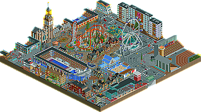
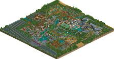
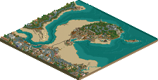
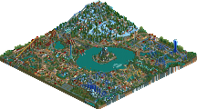
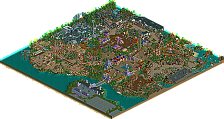
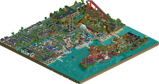
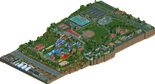
EDIT: I'll keep it short and sweet. The worst thing about Pixar studios was that there wasn't enough of it. I think Antz and Toy Story deserved more, but the map just couldn't hold all the ideas. Some imperfect hacks, a good atmosphere, and some great rides here. The worst thing about the London Olympics is that, despite some impressive stuff throughout the park, it didn't come together really at all. The best thing is easily the eurofighter, maybe Little Ben close behind, but the rest just didn't hold my attention. Lots of nice little touches, but it just didn't come together, and was rather boring. This one was pretty damn close, but I'm gonna have to give it to the Reservoir Dogs.
Colorado-Fan Offline
Hurricanes: I had the same idea for this H2H. Like, almost exactly the same idea. Glad we didn't go with this. That would've been awkward.
Vote: Hurricanes
Good matchup.
edit: Nice one, Kumba!
No one was.
3:06
K0NG to be honest it kinda bothers me that for the second time you explain stuff as soon as the matchup is posted before people actually say anything. I think whatever a park doesn't bring over is just the way it is. If you need to explain things about your park then generally you've done something wrong when making a park. So please next time don't explain stuff once the matchup is posted and just let things take their way.
To your credit, apparently some people did mistakenly think this was a Disney Park which it's so obviously not. But a simple this is not a disney park would really suffice in my opinion.
That said the Dogs Park does bring over what it's meant to be.
It's basically a collection of ideas. VERY cool ideas that is to be exact.
Cons:
The first thing that struck me, be it from the overview or ingame, was that this park is not picturesque. To be fair it doesn't seem like it's meant to be. But it just bothers me. When I look at art, no matter how incredible the idea is, in my opinion art should always look good. This park though didn't really go by any kind of rules when it comes to park planning or matching certain things. As a whole it just lacks any flow whatsoever. As I already said, it seems like a collection of different ideas on a big board. In the whole park, there's nothing that makes it seem like an actual park aside of the monorail going around the map and having stations on either side.
Man I don't even have any idea how to explain this point better which fits very well to the park.
It's like an Enigma...I'm looking at it and thinking to myself: "Where do I start looking?" "Where's the route that I can follow through the park to catch everything?"
So yeah, it starts at the entrance and then there's just a whole bunch of stuff that could all be absolutely anywhere on the map. There's no reason for why things are where they are and there are just no beautiful quaint spots in the park in my opinion where one just wants to sit down and chill.
________________
Another thing is your main coaster. Obviously it's inspired by Maverick but sadly I could instantly tell that neither one of you has ever been on Maverick. You totally missed the point of Maverick in my opinion. Maverick is about being extreme and your ride, while it kinda is, yet again really isn't. Obviously you have a vertical drop, a launch, two inversions, and some bunny hills but all of those are features of Maverick that fall short of the INCREDIBLE overbanks and the turns everywhere on the ride that throw you from one side to the other. You guys should've (re)watched a couple onride videos of Maverick before doing the layout for this. In comparison to Maverick this would simply be boring.
________________
Last thing is that you have a bunch of EXTREMELY huge structures that just don't work in my opinion. Yet given the fact that it's just a collection of ideas and not a park that's intended to flow it kinda works. But generally that is always a negative for me.
Those were really my main gripes with this
afterthought:
I forgot the glitches on the water ride.
Also there were just too many baloons.
Pros:
ALL the rides have great ideas behind them really.
I said how much I hated that the park doesn't flow but is just a collection of ideas but I have to admit: It's an incredibly good collection of ideas! It really is. And man you had cool ideas in there:
- the shark
- the turtle
- the water tank in general
- the Ferris Wheel
- Monsters Inc
- the Ratatouille restaurant
- the space ship
- the Piston Cup
- the cam over the entrance
- the Ratatouille banner
- ...
I really really loved those things!
Also the monorail was awesome! The two stations were incredibly believable and the monorail in general was the only thing that gave the park some kind of a layout.
Also the entrance was VERY well done! I loved that as well.
afterthought:
I forgot to say that in general the archy and the skill level in this were very good!
hmm I think that's all for now. Overall I did like this park a lot though.
_______________________________________________________________________________________
London 2012 Olympic Village:
Well generally I think at first glance this was very cool. My first impression I got from the overview was that this would probably easily win because it didn't seem as much of a mess though it seemed very busy too, but there seemed to be a general layout.
But when I took a closer look at the overview and when I looked at it ingame later I wasn't all that impressed. For how good my first impression instantly was I felt that this park was a little disappointing for how cool it could've been.
Cons:
It was way too busy in my opinion. Most of the time the view was blocked and I had no idea where to look.
The more I looked around the more it kinda felt a little thrown together as well! It's not that it lacked a layout now that I think about it but it definitely did lack believability in my opinion. Some things just seemed so forced and didn't convince me that they could ever be like that in real life. (now obviously the Dogs' park wouldn't be like that in real life but it doesn't seem like it's meant to be completely realistic whereas this one does with the cars and all)
I think that's also why it looked busy. It was busy because it was a little unbelievable. Just too many ideas that kind of didn't seem to be right for this park.
The cars where kind of a negative as well as they glitched so bad with eachother all the time...then again I will probably have to list them again at pros again as well as they were very cool and the cabs you designed and the busses are pretty awesome!
The tram while being super cool didn't fit somehow. It probably was due to the facts that the road didn't have any details that suggested a tram would be on it and that it constantly went through cars.
The architecture generally didn't really appeal to me. It felt underdetailed in my opinion and didn't stand out which it really really should for something as big as the Olympics!
I study architecture and never would the archy for modern stadiums like these be so plain and well...boring.
The main stadium really architecturally sucked in my opinion. It just wasn't interesting at all which for the Olympics 1950 you'd have got away with. But 2012 is a different thing. Look at stadiums that are being built around the world now, especially considering the money that's behind the Olympics.
I think for something like this you could've really included WAY more interesting names for entertainers and staff. Some were cool but there are so many ideas that come to my mind that would've been amazing here!
I didn't really care much for the rides but the water ride just felt like a filler for the sense of having a water ride.
Why would there be ANOTHER huge ferris wheel in London? I think I got that you kinda took a lot of London's main tourist spots and put them in the park but considering the realism behind that it didn't really fit.
It did look VERY VERY dutch and not really British in my opinion. Not only the parkmaking style but also the buildings in general didn't look British.
In general the park also seemed like it was the same thing OVER and OVER again. Different to the dogs' park I looked through this and didn't feel like seeing anything new. It was basically all the same thing and with the peep objects at the barricades even reminded me of your week 1 park a bit.
Pros:
the Ferris Wheel was actually really cool though. The cabins were pretty amazing!
the Marching band is a cool idea...but it could've also been done better! Still cool idea.
the secret agents and the drug testing are also cool ideas.
the cars were a cool idea
Little Ben was nice and so was Eastminster Abbey
the custom music was one of my favorite things!
all the double deckers and British telephone booths were nice!
I really liked the beach volleyball area. It's easily my favorite sports field in this park.
the trampoline was cool even though I've seen it done before.
the barricades and that march were nice.
the handball game was pretty sweet.
the swimming was done nicely.
the boxing was also nice.
Generally though a lot of those things are kind of similar ideas. Overall your park just didn't feel very diverse to me.
Considering all of the above I will vote for
Reservoir Dogs - Pixar Animation Studios
It kept my attention longer and even though London 2012 was cool I thought the Pixar park had even better ideas.
The lamp! I forgot to mention it. In my opinion, one of the few really good ideas, with nice execution.
Can someone explain to me why the Olympics Park looks Dutch? I'm puzzled.
...Eh. I didn't like this nearly as much as I thought I would, thought the Finding Nemo ride was neat. The Toy Story "area" (read: empty grass patch with launch tower-named one of the main character's catchphrases, no less-plopped down on it) was really quite poor, but what really killed this whole thing for me was the complete botching of the Monsters, Inc. interior. For one thing, you could have used the Monsters, Inc. Mini Suspended Doors that were created for exactly this type of theme/ride, rather than the standard Mini Susp. Cars, and two:
...Seriously, it's like you hardly even tried on it. I understand that you've got a really small window of time to build these parks, but couldn't you have at least added a few other lines above the ride that also have doors/cars running on them to give it the feeling of being the factory that it's supposed to be?
Hurricanes:
After all that I've said about the Dogs' park, and from how consistent this is in terms of both theme and detail (aside from the giant "USA" banner in the stadium, which would probably be cheering for Britain-the Olympics' host country-instead of one of their largest competitors)...
My vote goes to the Hurricanes.
It's just kinda...idk it's such typical Dutch parkmaking and it doesn't look thaaat British in my opinion...so maybe it's my instincts that told me it's dutch. It doesn't look like Dutch architecture, I agree. But it doesn't look British either and it does have that Dutch rct style. That's rather what I meant.
___________________
having said that though...
K0NG you brought this upon yourself with your "this-is-not-disney-talk".
You know I'm not trying to trash you guys cause I actually voted for you after a huge analysis. But I just saw this on the overview:
On that note, both parks were brilliant and I'll post a vote once I decide.
But when I actually viewed this in game, I was very very disappointed. For one, it was very crowded and didn't have much 'breathing room' [except the Toy Story area]. That took away a lot for me, simply because the layout in general was bad.
Also, it was extremely sloppy. The water ride is so awesome, but the fact that all the effort was taken to make it in the first place and it still wasn't synced up correctly really is a turn off.
I could go on and on about what I don't like about this park, but out of respect to the creator and the team I'll stop now. It was by no means a bad park in any regard. Just not to my personal taste. I guess I'm going so hard on it because I have plans for a Pixar Park that I've been sketching/writing/drawing up, and this failed to meet those expectations personally.
I'm really not trying to come off as a dick. I'm just a little disappointed, thats all.
Now in regards to my team's park, WOW. I have never been so impressed with a park in a long time. Seeing the progression from start to finish is truly incredible. And the fact that it is so clean and doesn't have too many technical flaws and errors is a huge plus for me.
Great job Reservoir Dogs on this matchup. You guys are truly a force to be reckoned with, and I am still very much impressed with your park. I just don't think its on par with the quality shown by ours.
-Josh
Anyway grats to both teams for actually getting up a good matchup
Colorado-Fan Offline
In my opinion both sides should stop "promoting" their own parks.