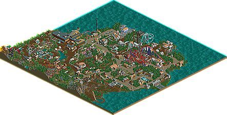
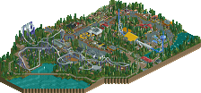
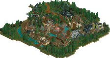
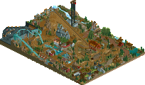
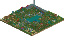
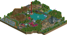
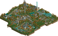
Park / Castello dal Mare

35 Comments

  • Comment System%s's Photo
  • trav%s's Photo
    Just realised I used the actual in game name for the park rather than what's on the release page, sorry about that!

    But yeah, I enjoyed this, it had a really nice atmosphere.
  • Arjan v l%s's Photo
    Nice park Ling, especially for ncso.
    Nice coaster layouts too.
    I'm not a fan of ncso, but i do like this.
  • MikaRCT2%s's Photo
    Great layouts, good atmosphere, good NCSO.
    Congrats on the accolade!
  • Ling%s's Photo
    Thanks guys. And I don't blame you trav, the mess up was my fault anyway from the get-go :p

    I'm just glad to have won something after all these years.
  • JJ%s's Photo
    Seems like a fun little park, great work and congrats on first NE accolade Ling :)
  • Hex%s's Photo
    Nice job on the park man! Really enjoyed the coasters and landscaping.
  • Xtreme97%s's Photo
    Really good work Ling. The park had so much atmosphere and I loved alot of the coasters (despite a few messy layouts). I really enjoyed the quaint, clean architecture and I think the low number of peeps in the park actually created a quiet atmosphere which I liked. However, the Waterpark didn't look very appealing to me, mainly because it seemed quite dark and not very colourful or lively, as I expect a waterpark to be. Anyway, congrats on your first accolade and I hope to see many more from you in the future :mantis:
  • RCT2day%s's Photo
    This was a fantastic park, first off. Great architecture, great atmosphere, great theme, fewer people (as Xtreme97 said, this gave it a more quiet atosphere), decent foliage, overall very solid work. Some of the layouts (the Intamin launch, the flyer) I didn't really like and I thought you needed some foliage under the B&M. Also, add fences on some of the paths where the coaster is within reach for guests (look at the top-right of the last picture at the top of this page). Loved the Italian.
  • Ling%s's Photo

    This was a fantastic park, first off. Great architecture, great atmosphere, great theme, fewer people (as Xtreme97 said, this gave it a more quiet atosphere), decent foliage, overall very solid work. Some of the layouts (the Intamin launch, the flyer) I didn't really like and I thought you needed some foliage under the B&M. Also, add fences on some of the paths where the coaster is within reach for guests (look at the top-right of the last picture at the top of this page). Loved the Italian.

    Thanks. On reflection the fencing was an oversight, and while I considered putting foliage underneath Draghetto, I felt the park as a whole was getting too tree-heavy... Tried to envision it from ground level and ended up deciding to leave it while I finished the rest of the park. And the Intamin accelerator is probably my favorite thing in the park, but no one else likes it :p Would have benefited from more custom support work and a more fully developed theme, though, I think (you know, rather than just "hey let's rip off Air").

    Hopefully new stuff is right around the corner :D
  • Cocoa%s's Photo
    not too bad. I find I get bored by ncso parks like this quite easily. It was all just square architecture without much of a purpose beyond what the sign said it was. try and use barrels or something to make tables or shop interiors. make more interesting structurers with track and whatever. dont confine yourself just to those standard grey/tan castle pieces that are ugly as shit. NCSO shouldn't be an excuse for minimalism, it should be a challenge. Look at your LL buddies and see how minimalist their works are nowadays. RCT2 ncso should be above and beyond what is going on there. Hack the shit out of your scenery and trackitecture and come back to me when you have done something that took more than a few minutes. And for the love of god, please no more pirate themes. (this was more of a general comment, not directed specificly at ling and his park)

    That said, your park is decent. A few spots of nice-ish atmosphere but overall nothing really caught my eye. You should have themed your coasters or at least put interesting terrain under them.
  • Bolliger & Mabillard%s's Photo
    Another fantastic NCSO park, congrats Ling on your first accolade!
  • Ling%s's Photo

    not too bad. I find I get bored by ncso parks like this quite easily. It was all just square architecture without much of a purpose beyond what the sign said it was. try and use barrels or something to make tables or shop interiors. make more interesting structurers with track and whatever. dont confine yourself just to those standard grey/tan castle pieces that are ugly as shit. NCSO shouldn't be an excuse for minimalism, it should be a challenge. Look at your LL buddies and see how minimalist their works are nowadays. RCT2 ncso should be above and beyond what is going on there. Hack the shit out of your scenery and trackitecture and come back to me when you have done something that took more than a few minutes. And for the love of god, please no more pirate themes. (this was more of a general comment, not directed specificly at ling and his park)

    That said, your park is decent. A few spots of nice-ish atmosphere but overall nothing really caught my eye. You should have themed your coasters or at least put interesting terrain under them.

    Sorry it wasn't to your liking. Trackitecture is extremely arduous for me at the moment, because actually building in a virtual machine is a nightmare due to an issue with the in-game camera, and constantly switching back and forth is a huge strain on my patience. And I'm not really sure what you mean by minimalism - you then make it sound as though it's a bad thing and tell me to look at that in LL to improve? I personally don't really compare any kind of RCT2 and LL, because the styles and mindsets are too distinct. My main sources of inspiration were probably X250 and Turtle, applied to NCSO. Some of the stuff I have seen in the AD over the past few months factored in as well, giving me ideas for detailing.

    I do kind of resent the "more than a few minutes" comment though, you can ask anyone I was talking to through the build process, and I spent a good 45 hours of solid build time on it over the course of about eight days. That might not be crazy, but I had to push myself to be fast so that I would actually finish it. And yeah, I know it kind of shows in places, like Draghetto and the lack of fencing and perhaps a lack of detail here and there. But really, I don't see much more that can be done with NCSO scenery alone.
  • Version1%s's Photo
    Sorry to say that, but I don't like the park one bit. It isn't that it's ugly per se, but it looks like it could have been build by a total NCSO newby.

    First of all: Your buildings are just square with the same Wall/Detail combination all over again. Things like that are just not good NCSO, it's just boring. Every RCT2 player could build like that. It's just ininspired. The big brown building at the top (I don't know what it should be) is one of the most ugly buildings I've ever seen.

    The layouts aren't very good as well, though they are not bad either. Overall, I don't get how this park deserved bronze, it's just full of ugly buildings and has only a medieval area.
  • Cocoa%s's Photo
    I didn't mean that specifically to you, Ling. just in general I find the thought process behind ncso is lacking. people use it as an easy way out when they should be exploiting everything the vanilla game offers in the same way that LL is exploited. vanilla RCT2 has everything that LL has and more, so why are ncso parks less detailed and groundbreaking than LL parks?

    I completely understand if you have computer issues, though.
  • Xeccah%s's Photo
    I am just surprised Ling earned something.
  • Fizzix%s's Photo
    Finally got a look at this. Overall I liked it, but it seems to me that you're very inexperienced with NCSO. A lot of the buildings were bland(the big brown one especially), and there were very repetitive details. I liked the Intamin, Draghetto, and the SLC, but couldn't get into the other rides very much. The foliage seemed very lazy and empty to me. I understand if you can't 0-clearance everytime you want to do foliage, but at least cover up the ground texture by wrapping the trees in the 2 available hedges. It does wonders. I think I would've voted this at 50%. Not bad, but could've been a lot better.
  • Scott.S%s's Photo

    Sorry to say that, but I don't like the park one bit. It isn't that it's ugly per se, but it looks like it could have been build by a total NCSO newby.

    First of all: Your buildings are just square with the same Wall/Detail combination all over again. Things like that are just not good NCSO, it's just boring. Every RCT2 player could build like that. It's just ininspired. The big brown building at the top (I don't know what it should be) is one of the most ugly buildings I've ever seen.

    The layouts aren't very good as well, though they are not bad either. Overall, I don't get how this park deserved bronze, it's just full of ugly buildings and has only a medieval area.


    Signed in just to rebuke this.

    There's a difference between constructive criticism and being an insufferable asshole. Learn that difference. The main one I see here is "Every RCT2 player could build like that", the response to which would be, "Yeah but you fucking didn't."

    I would go ahead and now strengthen my argument by pointing out similar such flaws in all the material you've submitted, but you have nothing to show for it. So hold your fucking tongue next time you want to dish out harsh advice in which you posit that everyone can build like this and then subsequently have absolutely nothing to back it up with.
  • RMM%s's Photo
    even with the apparent lack of constructive criticism, simply stating his opinion doesn't make him an insufferable asshole.
  • Sephiroth%s's Photo
    RMM, you are correct in saying a raw opinion alone does not by itself pass judgement onto the person that stated it. However the manner in which you state your opinion (or rather how you state your opinion) CAN make you an insufferable asshole.

    Example:

    Case 1:

    "That looks bad."

    Could use some work, but it isn't ripping apart the creator of the object in question. A rather useless post.

    Case 2:

    "That looks bad; anyone could do that therefore your work is uninspired and boring."

    This makes the person stating the opinion an insufferable asshole. The "anyone could do that" part is not only downright insulting, but it is also an implied attack on the creator's skill level as well.