Park / Atrophy
-
 12-June 12
- Views 2,947
- Downloads 734
- Fans 1
- Comments 15
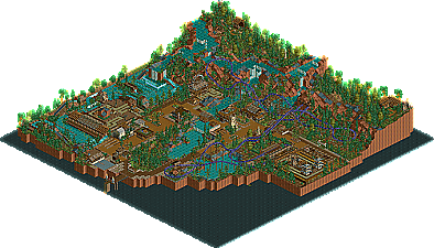
-
 35.77%(required: 65%)
 Design Submission

posix 60% Liampie 55% Casimir 50% 5dave 40% Maverix 40% Phatage 40% tyandor 40% Dimi 35% turbin3 35% CedarPoint6 30% Roomie 30% wheres_walto 30% inVersed 20% K0NG 20% JDP 10% 35.77% -
1 fan
 Fans of this park
-
 Download Park
734
-
 Objects
152
-
 Tags
Tags
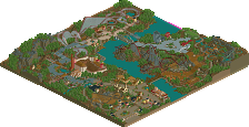
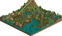
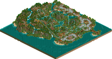
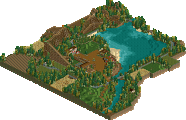
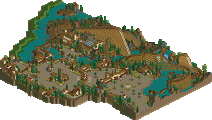
Shotguns, don't abandon this style please.
Echo.
I have not. I have a project of which I will not share that is much more spacious than from my previous screenshots.
My thoughts:
I can see both sides of the votes, Being 10-20% and 50-60%. The coaster was built around the landscape and thus bad and opposite of what you want for a design. Also, there was no interaction between the rapids and coaster. However, the rapids, for being NCSO, was really well made IMO. The landscaping and foliage are great as well.
I also tried to make "black tiles" with the wooden blocks. Sadly they are turned in the wrong direction.
I think your foliage could still be improved. Overall though I think the score is accurate, and the work is promising.
EDIT: I've looked through the park more now, and for one, you had dead flowers everywhere. I know 8cars works for you because of the foliage, so that (plus the horrendous ride reliabilities) is pretty much inexcusable. Also, no attention to detail on the rapids. You didn't even raise or color the water (vertical faces) to help it blend in, the water is just raised around it. Coloring the vertical faces behind waterfalls is another small but effective detail you can employ to make the park that much more immersive. The coaster itself was too fast in the beginning and way too slow in the middle - I'm not sure if you just didn't feel like compromising on the layout and so just adjusted the speed until it completed the circuit, but it looks a little sloppy. I think the whole setup and general idea was fine, but more attention to the coaster's elements, particularly to how they relate to the path and structures throughout the area, will help your design and composition immensely.
The little things killed it here. The Coaster's reliability was horrendous which I should have made reliable through 8cars.
No coaster can realistically speed through the station at 80mph, also the fact that some parts were going just over 20mph is just inexcusable.
The vertical faces is something i thought I did however. Whatever...
The rapids is still what I think is the strong point ridewise of the design, but it was just there. No interaction with anything whatsoever besides for some land.
It should have been maybe a 20% IMO. Its just that bad compared to what I can create now.
BigB Offline
And why no peeps ? they would bring so much more life to your design ^^
Every other things are said already
For the future you should use the zero clearances more often, there are so many little mistakes which are unnecessary.
For example:
You could place some walls under the roof.
Same here, I think in reality the roof would break down without any kind of support...
---------------------------------------------------------------------------------------------------------
Not important but just for the record, some floating objects, think you placed it from a wrong perspective,
I think this was quite a good submission and I'm really looking forward to see your current project(s).
who tagged this utter garbage? lol
i do not have a detail fetish.
The vote differential on this was ridiculous lol.