I love your attitude for ppl. haha you only call ppl a fucking dumbass well, when they're being a fucking dumbass. and if the other person gets offended by it. fuck it. you'll get over a few hurtful words a an online forum.
we're all here to build roller coasters and be in awe of some of the creations that get pumped out of some very talented people.
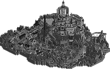
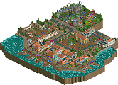
On that note I have to say that Hell's Kitchen's park did nothing for me. Don't get me wrong, I fucking respect the talent and time that goes into building something like this, I know I couldn't. the only thing that bothers me is when i'm looking at my screen and can't tell wtf i'm looking at. theres too many buildings all meshed together in blocks and colors and i can't tell where some stuff ends and others begin. Like i said, fucking amazing architecture and atmosphere just not my style.
RD's on the other hand. fucking great. I agree it looks better in color, but they were going for an overall effect on the park and the affect it would have on the viewer, which I know it did for me. but also I will say that theres places where the castle just got too massive and complex and it was hard to tell composure of certain parts. Overall an amazing idea that was executed very well in my opinion.
In the end my vote has to go for Frankenstein.
Both parks were great and hats off to the builders on each.
It still doesn't justify calling people "fucking dumbasses" when you don't agree with them or when someone was wrong, but whatever dude..
Hans, you've never been a man of peace alone on this site either...
Anyways, blah blah blah, respect for K0NG and all that (you know that through AIM, bro) but to get us back on topic, my vote goes to The Reservoir Dogs for Frankenstein. Some top-notch RCT there built around an interesting gimmick. The architecture wasn't the best from either of the builders I could discern from the work, and the atmosphere/architecture weren't the strongest once the gimmick was stripped away, but it was still an damn-good park.
Curryhanes (you're still that in my heart), your park was really nice as well. I think I can figure out who one of the builders on this was, and his stuff is some of the most underrated work on the site ever. The forms themselves were pretty excellent, and there were some good ideas. However, the colors pretty much killed it for me; I couldn't really focus on a lot of the interesting forms of the work because the colors were blinding. Had the color combos been a bit more thought out or subtle, or at least more complimentary of each other, this would have been as difficult of a decision as Match 1 was.
Probably doesn't matter to you at all, but I have to admit my respect for you has risen after that.
Actually, it does. Thanks man.
It still doesn't justify calling people "fucking dumbasses" when you don't agree with them or when someone was wrong, but whatever dude..
Yes it does, fucking dumbass.
I love your attitude for ppl. haha you only call ppl a fucking dumbass well, when they're being a fucking dumbass. and if the other person gets offended by it. fuck it. you'll get over a few hurtful words a an online forum.
Exactly. You have to realize that I'm 52 years old and I've been through pretty much everything that life can toss at you. I've developed my "attitude" over time from life experiences. And, I just don't have patience for idiots. Sort of like a Red Forman on steroids. And a full head of hair.
I vote Frankenstein! Reasons:
- really original, I never saw a rct2 game in black & white and I never though that would be possible;
- the architecture is excellent, very original and well executed;
- the layouts are good;
- landscape>perfect;
- scenery>perfect;
All in this park was thank really well and for me, is the most original park that I've ever seen!
Congratulations Reservoir Dogs!
Before anyone starts commenting on the unfinished state of our team's park, as captain, I feel obligated to say that this is NOT the final save that we worked so hard on to meet the deadline. In our haste to submit on time, we accidentally put the wrong save into the zip.
We realized the mistake almost immediately, contacted the other teams captain informing him of this...who in turn contacted the other two admins.
Unfortunately, we weren't allowed to replace the file with the correct one...so what you see, even though it's not what we worked so hard to produce, is what you get.
We're in no way trying to make any excuses here or cry "foul". It was our mistake, and we realize this. We just want it to be clear that our guys did not use our extension just to end up with an unfinished park.
We will also provide anyone interested the correct file once voting has taken place. Nothing on the file was touched after the deadline, so it's what you should be seeing here instead of a custom message that reads "8cars per Trainer terminated".
EDIT: After reading a comment here, I'd also like to add that not a single object was placed nor a single section of track was laid prior to the completion of the H2H6 draft. Everything on this map, and all of our ensuing arsenal was created once our team became a "team".
^ As soon as the voting is closed, we'll upload the correct save for whoever wants it.
Or, one of the admins can do it since we PM'd it to them while trying to get it into the contest.
Also...an explanation for why certain things that have been commented on are the way they are.
To tell you the truth, I'm glad I waited this long to review. This match is ( In terms of maps ) close. The real problem is that Frankenstein was skillfully hyped due to the "noir" full-map screen shown on page 1. The full-map of Atlantean Ark doesn't give it justice
LAYOUT:
The layout of Atlantean Ark was its worst part. It's really over the place. The best proof of this is here:
The archy takes up most of the true layout, but as you can see the layout in the mid section is bad. However, the outer part's layout was smooth and thoughtful.
The layout of Frankenstein is better than Atlantean Ark. The village part especially has a good layout. The castle's layout is not as good as the villiage.
In short, the layout is spotty in both maps. Parts of Frankenstein and of Atlantean Ark have really thoughtful layouts while in other places it could have been executed better, and it might have to do with what I'm about to talk about in the next section.
EDGE: Frankenstein
ARCHY: This is comparing apples to oranges here. Both parks I believe use architecture really well, but in highly different styles.
Atlantean Ark had really, really nice facades. The use of rounded edges is remarkable, and arches were really well constructed. The statues in the entrance looked amazing. The paths really helped the archy ( in places where you can actually see them ).
However, it suffers by the fact that adjecent buildings are sometimes styled very differently, as if someone else on the team had constructed. It would have helped to build slightly lower to make the park feel wider.
Also, I had one pet peeve. Control Station ( The LIM launched coaster ) completely ruined that building, and the building itself could have been constructed better.
Frankenstein has some really nice points to the architecture. The use of angles in general was fantastic and really did wonders for the castle. All of the castle for that matter was excellent, the tops of towers blown me away by how well they were constructed. Damn.
However, the woodie, IMO, ruined the look of the architecture. It didnt fit in with the angluar feel that the castle brought to the table.
Both Frankenstein and Atlantean Ark were top-notch when it comes to Architecture. However, I feel like Heavean's Kitchen executed their architecture just slightly better that Frankenstien did.
275 Comments
Corkscrewy Offline
we're all here to build roller coasters and be in awe of some of the creations that get pumped out of some very talented people.
On that note I have to say that Hell's Kitchen's park did nothing for me. Don't get me wrong, I fucking respect the talent and time that goes into building something like this, I know I couldn't. the only thing that bothers me is when i'm looking at my screen and can't tell wtf i'm looking at. theres too many buildings all meshed together in blocks and colors and i can't tell where some stuff ends and others begin. Like i said, fucking amazing architecture and atmosphere just not my style.
RD's on the other hand. fucking great. I agree it looks better in color, but they were going for an overall effect on the park and the affect it would have on the viewer, which I know it did for me. but also I will say that theres places where the castle just got too massive and complex and it was hard to tell composure of certain parts. Overall an amazing idea that was executed very well in my opinion.
In the end my vote has to go for Frankenstein.
Both parks were great and hats off to the builders on each.
Great fucking H2H so far boys, lets keep it goin.
robbie92 Offline
Hans, you've never been a man of peace alone on this site either...
Anyways, blah blah blah, respect for K0NG and all that (you know that through AIM, bro) but to get us back on topic, my vote goes to The Reservoir Dogs for Frankenstein. Some top-notch RCT there built around an interesting gimmick. The architecture wasn't the best from either of the builders I could discern from the work, and the atmosphere/architecture weren't the strongest once the gimmick was stripped away, but it was still an damn-good park.
Curryhanes (you're still that in my heart), your park was really nice as well. I think I can figure out who one of the builders on this was, and his stuff is some of the most underrated work on the site ever. The forms themselves were pretty excellent, and there were some good ideas. However, the colors pretty much killed it for me; I couldn't really focus on a lot of the interesting forms of the work because the colors were blinding. Had the color combos been a bit more thought out or subtle, or at least more complimentary of each other, this would have been as difficult of a decision as Match 1 was.
K0NG Offline
Yes it does, fucking dumbass.
Exactly. You have to realize that I'm 52 years old and I've been through pretty much everything that life can toss
at you. I've developed my "attitude" over time from life experiences. And, I just don't have patience for idiots.
Sort of like a Red Forman on steroids. And a full head of hair.
Corkscrewy Offline
RHCPepperfan Offline
BC(rct2) Offline
- really original, I never saw a rct2 game in black & white and I never though that would be possible;
- the architecture is excellent, very original and well executed;
- the layouts are good;
- landscape>perfect;
- scenery>perfect;
All in this park was thank really well and for me, is the most original park that I've ever seen!
Congratulations Reservoir Dogs!
olddtfan51 Offline
K0NG Offline
Or, one of the admins can do it since we PM'd it to them while trying to get it into the contest.
Also...an explanation for why certain things that have been commented on are the way they are.
Casimir Offline
Six Frags Offline
K0NG Offline
Dumbass is just dumbass though.
RHCPepperfan Offline
Marino Offline
Fizzix Offline
rct2isboss Offline
Vote goes to Heaven's Kitchen
Xeccah Offline
LAYOUT:
The layout of Atlantean Ark was its worst part. It's really over the place. The best proof of this is here:
The archy takes up most of the true layout, but as you can see the layout in the mid section is bad. However, the outer part's layout was smooth and thoughtful.
The layout of Frankenstein is better than Atlantean Ark. The village part especially has a good layout. The castle's layout is not as good as the villiage.
In short, the layout is spotty in both maps. Parts of Frankenstein and of Atlantean Ark have really thoughtful layouts while in other places it could have been executed better, and it might have to do with what I'm about to talk about in the next section.
EDGE: Frankenstein
ARCHY: This is comparing apples to oranges here. Both parks I believe use architecture really well, but in highly different styles.
Atlantean Ark had really, really nice facades. The use of rounded edges is remarkable, and arches were really well constructed. The statues in the entrance looked amazing. The paths really helped the archy ( in places where you can actually see them ).
However, it suffers by the fact that adjecent buildings are sometimes styled very differently, as if someone else on the team had constructed. It would have helped to build slightly lower to make the park feel wider.
Also, I had one pet peeve. Control Station ( The LIM launched coaster ) completely ruined that building, and the building itself could have been constructed better.
Frankenstein has some really nice points to the architecture. The use of angles in general was fantastic and really did wonders for the castle. All of the castle for that matter was excellent, the tops of towers blown me away by how well they were constructed. Damn.
However, the woodie, IMO, ruined the look of the architecture. It didnt fit in with the angluar feel that the castle brought to the table.
Both Frankenstein and Atlantean Ark were top-notch when it comes to Architecture. However, I feel like Heavean's Kitchen executed their architecture just slightly better that Frankenstien did.
EDGE: ATLANTEAN ARK
Attached Thumbnails
Luketh Offline
Geniuses; genius.
I always find it ironic when people misspell a word associated with intelligence.
Gwazi Offline
EDIT: By the way, it totally just hit me that Atlantean Ark looks a lot like Ge-Ride's work, if anyone even remembers him.
K0NG Offline
Yeah, but my misspelling was intentional.
BTW...why is the vote count still at 0-0?
pierrot Offline