Edit: Removed Kong's quote, he fixed stuff and it's all good I guess. Doesn't mean that I think the following post still has some value for this community:
So you're attacking an entire community (minus a few friends), of which you don't even know many, and of which many haven't even commented on this whole issue yet? Why do you feel the need to use some sort of ego-boosting statement to show your manlyhood? All very classy. Please stop insulting me and all my fellow forum members with me, because it's ridiculous. There's no need for it. It's a game y'know.
This really looks like a bunch of baby chimps throwing crap at each other. The sad thing about it all is that most of us are in fact (semi-) grown ups, and we're not a bunch of chimps but people. Why is it then that we can't treat each other in a normal sense and put stuff in perspective? I fear this statement is really aimed at a pretty large part of the community, probably including me, as things are getting outta hand. Just remember you're dealing wit a GAME and with real PEOPLE. Two things I believe some NE-members tend to forget every now and then.
For now I'm not going to comment on these parks just yet, as atm I'd be biased by some outrageous comments from your side KONG. I'd just like to say that it's a real shame this matchup of two great parks has been spoiled by the biggest show of disrespect and childish behavior (by multiple people/sides!) I've ever experienced at NE.
Let's just all count to ten and take a breather before commenting, voting, making statements or other disruptive crap, okay?
I already voted ,but good one Ruben ,i agree with you . Let's threat each other with respect here. It would also be better for a fair voting.
I really hope nobody gets DQ'ed or in KONGs case leaves the site. I enjoy some of the bantering because it shows how competitive H2H is, but at this point it just seems like two boxers just trading punches with no real purpose. Let’s all just chill out and appreciate the team’s parks. With that being said I'm going to rant about the parks now.
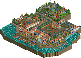
These parks were very contrasting when it came to color (obviously), but I really did not like either of them. Atlantean Ark was too bright and colorful, and even though I found it better than the gray of Frankenstein, it still didn't work for me. The big thing that killed me was the rides, the coasters had average or bad layouts and the lack of some custom supporting took away some of the appeal. The structures and buildings were fun to look at but eventually the colors were just too much.
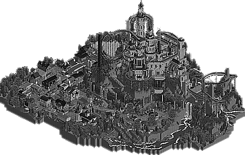
Frankenstein... well I applaud the RDs for making the whole park grey in an attempt to be unique and refreshing, it is grey though, and it became the biggest eyesore ever. The diver really didn't work for me and all the tracks catwalks and supports just made it look extremely messy especially with all of it being gray. While I can appreciate the sheer complexity, time, and skill that went into making this park, I can't vote for it just because the final product didn't make me say wow, it make me say WTF. And not the good WTF like "how did they do that!” it was more of a "why would you even do that". The park also lacked peeps filling it up. It just seemed so overboard in most places. The only thing I did really like was the cemetery and the village/town, it was beautifully executed and I could actually imagine the colors.
I'm not going to vote right now and I might end up voting for neither just because I didn't like either park. I guess looking at them for another 30 min couldn't hurt anything besides my eyes.
The Reservoir Dogs will not be disqualified for revealing the creators names here.
I haven't seen it myself, but if K0NG's name is in the park's name that's not a valid reason for a DQ. Putting your name on a bench is like putting your name on an object or object tab. It's not related to the actual park content. Clear?
and however obvious, nobody should've mentioned his name so much. It was too late and too much to undo those replies. I can't blame K0NG for not denying that he built this thing, after lots of people already mentioned it. The park creators are anonymous until the voting ends and you're not speculate here out in the open.
Again, no DQ for this. No need to talk about this any further. Shall we get back ontopic again? Please?
I am sorry but the I do not understand the praise for Frankenstein. It is as uninspired as it's colours. Lack of colour doesn't make something artsy or better. It makes it boring. It is a lazy way to make something look "better".
Besides, the little town is badly done and the castle rollercoaster is so unorginal. I do love the waterfall and the foliage. The castle on itself looks pretty, but the lack of colour ruins it.
Heaven's Kitchens park however, is a refreshing piece of art. The park looks like it is made of candy. Shame you guys didn't have enough time to make custom supports for the rides, but that is really my only problem with the park. Awesome job! My vote goes to The Atlantean Ark.
thanks liam, I hate the way this turned out for you guys, the admins didn't want this and we (the team) didn't want this either, I mean the way people are posting just calls us out, i know we've been trash talking and stuff like that aswell and very hardly even I must admit but the fact that people just want to see us get a DQ and openly debate who built this in the topic? that's a bridge too far, I think I can speak for myself and most teammates that this has only occured in this topic so far and guess what match-up it is, ours, I mean I can spot some builders on the other matches a mile away... will I post it? HELL NO!!! I mean if you're out to get us don't vote for us but don't call us out just to try and get us a DQ, plz a little dignity and the team worked it's ass off for this entry and it'd be disrespectful to not treat it as is, do you like it, fine I'm happy our team created something you can enjoy, you don't tough luck for us.
Also major props to heaven's kitchen for being so daring, the black and white the Dogs pulled off here was a risk but going that bright takes some freaking balls of steel aswell, although it's not my style and it frankly hurts my eyes a little when looking at it for too long, I can respect this and it's creative idea. Nice going guys!
RHCPepperfan, they designed it with colours, see Kumbas overview on the first page. They haven't been lazy as you said, they just did it to illustrate a "old" atmosphere.
Anyone who wants to view Frankenstein in color, here's how:
Spoiler
Open the file in ParkDat, then scroll down to slot 719. It's a dat called PALBLKWT. Click and replace that file with WTRCYAN.
It was obviously built in full color and transformed very gutsily to take the theme to unseen levels. How you can call it "lazy" is beyond me.
Making something look perfect in colour is harder then disguising it by changing a DAT-file. It may be smart, but it doesn't benefit the park in my opinion.
I liked the entry-statues in The Atlantean Ark a lot.
but my vote goes to Reservoir Dogs,
Frankenstein was just awesome, best park till now in my opinion.
275 Comments
Ruben Offline
Edit: Removed Kong's quote, he fixed stuff and it's all good I guess. Doesn't mean that I think the following post still has some value for this community:
So you're attacking an entire community (minus a few friends), of which you don't even know many, and of which many haven't even commented on this whole issue yet? Why do you feel the need to use some sort of ego-boosting statement to show your manlyhood? All very classy. Please stop insulting me and all my fellow forum members with me, because it's ridiculous. There's no need for it. It's a game y'know.
This really looks like a bunch of baby chimps throwing crap at each other. The sad thing about it all is that most of us are in fact (semi-) grown ups, and we're not a bunch of chimps but people. Why is it then that we can't treat each other in a normal sense and put stuff in perspective? I fear this statement is really aimed at a pretty large part of the community, probably including me, as things are getting outta hand. Just remember you're dealing wit a GAME and with real PEOPLE. Two things I believe some NE-members tend to forget every now and then.
For now I'm not going to comment on these parks just yet, as atm I'd be biased by some outrageous comments from your side KONG. I'd just like to say that it's a real shame this matchup of two great parks has been spoiled by the biggest show of disrespect and childish behavior (by multiple people/sides!) I've ever experienced at NE.
Let's just all count to ten and take a breather before commenting, voting, making statements or other disruptive crap, okay?
Arjan v l Offline
I already voted ,but good one Ruben ,i agree with you .
Let's threat each other with respect here.
It would also be better for a fair voting.
wheres_walto Offline
MikaRCT2 Offline
SupraSix Offline
These parks were very contrasting when it came to color (obviously), but I really did not like either of them. Atlantean Ark was too bright and colorful, and even though I found it better than the gray of Frankenstein, it still didn't work for me. The big thing that killed me was the rides, the coasters had average or bad layouts and the lack of some custom supporting took away some of the appeal. The structures and buildings were fun to look at but eventually the colors were just too much.
Frankenstein... well I applaud the RDs for making the whole park grey in an attempt to be unique and refreshing, it is grey though, and it became the biggest eyesore ever. The diver really didn't work for me and all the tracks catwalks and supports just made it look extremely messy especially with all of it being gray. While I can appreciate the sheer complexity, time, and skill that went into making this park, I can't vote for it just because the final product didn't make me say wow, it make me say WTF. And not the good WTF like "how did they do that!” it was more of a "why would you even do that". The park also lacked peeps filling it up. It just seemed so overboard in most places. The only thing I did really like was the cemetery and the village/town, it was beautifully executed and I could actually imagine the colors.
I'm not going to vote right now and I might end up voting for neither just because I didn't like either park. I guess looking at them for another 30 min couldn't hurt anything besides my eyes.
RRP Offline
Liampie Offline
I haven't seen it myself, but if K0NG's name is in the park's name that's not a valid reason for a DQ. Putting your name on a bench is like putting your name on an object or object tab. It's not related to the actual park content. Clear?
and however obvious, nobody should've mentioned his name so much. It was too late and too much to undo those replies. I can't blame K0NG for not denying that he built this thing, after lots of people already mentioned it. The park creators are anonymous until the voting ends and you're not speculate here out in the open.
Again, no DQ for this. No need to talk about this any further. Shall we get back ontopic again? Please?
turbin3 Offline
RHCPepperfan Offline
Besides, the little town is badly done and the castle rollercoaster is so unorginal. I do love the waterfall and the foliage. The castle on itself looks pretty, but the lack of colour ruins it.
Heaven's Kitchens park however, is a refreshing piece of art. The park looks like it is made of candy. Shame you guys didn't have enough time to make custom supports for the rides, but that is really my only problem with the park. Awesome job! My vote goes to The Atlantean Ark.
BelgianGuy Offline
Also major props to heaven's kitchen for being so daring, the black and white the Dogs pulled off here was a risk but going that bright takes some freaking balls of steel aswell, although it's not my style and it frankly hurts my eyes a little when looking at it for too long, I can respect this and it's creative idea. Nice going guys!
turbin3 Offline
wheres_walto Offline
It was obviously built in full color and transformed very gutsily to take the theme to unseen levels. How you can call it "lazy" is beyond me.
RCTER2 Offline
RHCPepperfan Offline
wheres_walto Offline
tdub96 Offline
I have to side with K0NG on this. And the RD's. The argument and the vote. Vote to Frankenstein.
In the end guys, its really just a game though, right?
BigB Offline
but my vote goes to Reservoir Dogs,
Frankenstein was just awesome, best park till now in my opinion.
SSSammy Offline
Reservoir Dogs cause this park wins at life.
verti Offline
Gwazi Offline