The Atlantean ark:
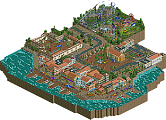
Wow. Colours. Everywhere. Upon first inspection the park looks a bit outdated in terms of object use and general composition. I felt like I was viewing a H2H4 park. The park was looking like one big cluttered structure with diferent forms and colours. I liked the University/Academy building the most. Seemed more original than the other structures. But then again I felt I've seen it again already. The coasters were kinda strange. Sure it was a fantasy approach to the theme but the rides looked semi-realistic and didn't really fit imo. More extravagant Mala-esque coasters would have been awesome here. I liked the circular layout of the park although you can barely see the water channels in there. The things that stood out the most for me were the outskirts, the statues and the aqueduct. Really can't find anything more to comment on. But still it was a nice park, although not as strong as it could have been.
Frankenstein:
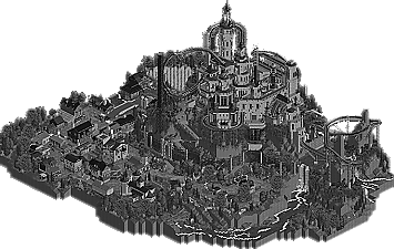
Crazy, just crazy. The castle structure is insane. I really liked that dive coaster and its interaction with everything. Maybe everything was a bit over the top but it was nicely crafted. What I didn't like was the hacks everywhere that didn't really add to the whole thing. Why was there track hacked underneath the B&M? It looked sloppy and unnecessary. Also be sure to check the park before submitting it. You seemed to forgot a lot - I know it was close in the end but unnamed stuff and such doesn't really add to the experience. I also don't know what you did to the guests of the park. If you want to make it peep-able check if it's working please. The landscape didn't convince me either - it was so rough and everything felt a bit random. All the stones and objects everywhere irritated me a bit. The town was great. While a bit strange layout-wise it had some lovely buildings like the windmill and the graveyard (gotta love graveyards in rct parks! ). Oh and I loved the color palette idea. Gets done way to rarely and doesn't always fit but in this case it does.
IMO both parks were a bit too overcrowded and almost exhausting to look at. There was too much going on everywhere.
Anyways, my vote goes to the Reservoir dogs. It clearly is the better park.
HOW? The RD's even changed the buttons and icons and menus for that park ONLY. HOW?
The whole colour palette in Rct is based around the water dat. By adding a water dat completely in black and white, the whole palette used on that map would turn black and white.
First off, I'm gonna be honest here: this was by far my least favorite matchup of the topic. I found both parks lacking.
Atlantis:
This park had an ugly aerial but actually came out quite nice in the little details. Statues, paths, etc. were all done quite nicely, and there were definitely spots of great architecture. However, I felt that a lot of the content was overshadowed by awkwardly colored (yeah, it's atlantis, but they probably weren't colorblind) and awkwardly shaped buildings. The rides were also sort of random and out of place, I think either it should have been a park or a full fantasy. This thing rode the middle ground that really reminded me of more classic rct2, but not really in a good way.
Frankenstein:
Well, I guess I'll just say that I'm amazed by the greyscale effect. HOW THE HELL DID YOU DO THAT?? actually don't tell me, I won't understand anyway. I felt like this park was the exact opposite of atlantis, in that it looked really amazing from the overview but showed badly up close. I thought it would be a wonderful atmospheric park full of nice european architecture with a great centerpiece castle but I really just found a mediocre example of both. The architecture was really bland, and while I generally liked the risky use of greyscale, I found that the architecture was extremely boring and simplistic. The castle was great in concept, but the execution was a bit off. Structurally, it was quite nice, but the wall texture was awful, and much worse, huge portions of the park were blocked off. I applaud the minimal use of rides here, as I felt that it fit the general feel of the park, and the coaster was a true centerpiece. Also, maybe I didn't look hard enough, but I really didn't find much reference to frankenstein. I guess I could have looked really intensely through the park, but theme should not be an easter egg... I should be able to find all the wonderful theming and inspiration (from more than the architecture) quite easily and have it be readily apparent. Easter eggs are fine, but don't make the entire referential content of the park hidden.
So as I said earlier, I didn't really enjoy either park that much, but one was slightly better than the other...
I vote Frankenstein by the Reservoir Dogs.
EDIT: wanted to say that I just took a look at the screen Kumba posted of the park in color. It just seems so much better... I appreciate the risk you took in making the atmosphere but I think that it worked so much better in color
Wait til you all see what we have in store for the Hurricanes in round 2.
I think you all underestimated us. This was only round 1.
It gets better...................
If your heart doesn't stop beating somewhere along the way, that is. You're getting old, chap. I suggest you sit your arse down into welfare, because you clearly can't handle any accusations nor the pressure of critique. You're bickering over a (with all due respect, fellows) 13 year old glitchy shite game and you're leaning into it as if your life depends on it.... Someone needs to learn to put things into bloody perspective. I was serious about the heart.
<In before another thousand calories wasted in an old man's pathetic rant.>
Atlantean ark: Well what a piece of work that is. I couldn't do it, I wouldn't have the patience. It looks impressing and I really like the colors. However, this style is more fantasy and that's not my thing. It looks like it's just a bit too much.
Frankenstein:Wow, just... wow. That's what I first thought when I opened the park. That gray filter is revolutionary and it really sets an atmosphere. But after that wow-effect was gone, I could see some things I didn't like. The supporting of the coaster is just an overkill. That coaster ain't that huge to give it such big supporting. Some parts of the village are ugly and don't have good textures. I think that would be really noticeable when you could see the park in color.
So, who will get my vote... Honestly, the way Kong reacts here in this topic (and pretty much all around NE) is very very very arrogant. Maybe that's accepted in the USA but here in Belgium we hate it. Plus, it's not fair Kong's name is in the park and won't get a DQ. The rules are the rules, and should be followed by anyone. It's team Kong's fault it's in there and should just accept it and admit they made a mistake. Is it that hard? Since for me, it looks like it has been built by Kong, I can't vote for Frankenstein. My vote goes to the Atlantean ark by Heaven's kitchen.
Like what exactly? A mediocre castle? A simple gimmick that has been done before and could have been done again in the very near future? A good looking town, but not the most amazing Rct ever?
I was missing some coaster supporting in Atlantean Ark.
Beside that ,it was beautiful. Amazing architecture.
Very colourfull as well.
Only the 2 'soldiers' seemed a bit colourless compared to the rest.
Frankenstein ,wat can i say
I'll try to keep it short.
AMAZING..
This one knocked my of my chair.
The idea ,the details, the greyness.
Really different from anything i've ever seen.
No need to say more.
Vote: Frankenstein by the Reservoir Dogs
P.S. :I don't know why there are so many struggles between each other here (I'm not registered here for that long).
But i'll put that aside. It's only about the 2 parks here.
Please everybody, be objective.
Everyone needs to stop calling K0NG out on this one. Turbin's right, in almost every submission so far there have been team member's names, but when K0NG does it there HAS to be a red flag? Everyone needs to chill out and just look at the parks for what they are, not who they were made by.
Frankenstein is my "aria"....the finale. It wasn't intended to be... but all this bullshit made it be that. I just don't need this crap any more.
All I wanted to do was build something awesome....and, I did. I did shit that you couldn't do....any of you.
I'm gonna walk away knowing this.
I'm tired of my favorite "hobby" becoming the most stressful thing in my life.
Those of you that have become my friends...you know where to find me.
The rest of you can go fuck yourselves.
Goodnight now.
OK, we get it, you made this park. It's very good. But you probably shouldn't have stated as much before the voting is over. You're asking to get DQed.
I'm not going to comment on either park before the voting closes, as i'm clearly biased.
FredD, in - nearly - every park so far there was the name of the builder.
There is quite a difference between 2 names named in the park title and staff named to all members of a team. The first one suggest the park is build by those 2 named, the other one doesn't suggest that at all. And it's not the first time the reservoir dogs violate the rules. It's not fair towards Heaven's Kitchen or any other H2H team that one team can disregard the rules. If you set up rules, you make sure those rules are obeyed. It's that, or just don't set up rules.
275 Comments
K0NG Offline
Louis! Offline
RESERVOIR DOGS' PARK - FRANKENSTEIN WILL NOT BE DISQUALIFIED.
everyone please carry on as normal.
Six Frags Offline
5dave Offline
Wow. Colours. Everywhere. Upon first inspection the park looks a bit outdated in terms of object use and general composition. I felt like I was viewing a H2H4 park. The park was looking like one big cluttered structure with diferent forms and colours. I liked the University/Academy building the most. Seemed more original than the other structures. But then again I felt I've seen it again already. The coasters were kinda strange. Sure it was a fantasy approach to the theme but the rides looked semi-realistic and didn't really fit imo. More extravagant Mala-esque coasters would have been awesome here. I liked the circular layout of the park although you can barely see the water channels in there. The things that stood out the most for me were the outskirts, the statues and the aqueduct. Really can't find anything more to comment on. But still it was a nice park, although not as strong as it could have been.
Frankenstein:
Crazy, just crazy. The castle structure is insane. I really liked that dive coaster and its interaction with everything. Maybe everything was a bit over the top but it was nicely crafted. What I didn't like was the hacks everywhere that didn't really add to the whole thing. Why was there track hacked underneath the B&M? It looked sloppy and unnecessary. Also be sure to check the park before submitting it. You seemed to forgot a lot - I know it was close in the end but unnamed stuff and such doesn't really add to the experience. I also don't know what you did to the guests of the park. If you want to make it peep-able check if it's working please. The landscape didn't convince me either - it was so rough and everything felt a bit random. All the stones and objects everywhere irritated me a bit. The town was great. While a bit strange layout-wise it had some lovely buildings like the windmill and the graveyard (gotta love graveyards in rct parks! ). Oh and I loved the color palette idea. Gets done way to rarely and doesn't always fit but in this case it does.
IMO both parks were a bit too overcrowded and almost exhausting to look at. There was too much going on everywhere.
Anyways, my vote goes to the Reservoir dogs. It clearly is the better park.
"MFG"
Brent Offline
K0NG Offline
111112oo Offline
My vote is for the Reservoir Dogs.
trav Offline
The whole colour palette in Rct is based around the water dat. By adding a water dat completely in black and white, the whole palette used on that map would turn black and white.
Cocoa Fan Offline
First off, I'm gonna be honest here: this was by far my least favorite matchup of the topic. I found both parks lacking.
Atlantis:
This park had an ugly aerial but actually came out quite nice in the little details. Statues, paths, etc. were all done quite nicely, and there were definitely spots of great architecture. However, I felt that a lot of the content was overshadowed by awkwardly colored (yeah, it's atlantis, but they probably weren't colorblind) and awkwardly shaped buildings. The rides were also sort of random and out of place, I think either it should have been a park or a full fantasy. This thing rode the middle ground that really reminded me of more classic rct2, but not really in a good way.
Frankenstein:
Well, I guess I'll just say that I'm amazed by the greyscale effect. HOW THE HELL DID YOU DO THAT?? actually don't tell me, I won't understand anyway. I felt like this park was the exact opposite of atlantis, in that it looked really amazing from the overview but showed badly up close. I thought it would be a wonderful atmospheric park full of nice european architecture with a great centerpiece castle but I really just found a mediocre example of both. The architecture was really bland, and while I generally liked the risky use of greyscale, I found that the architecture was extremely boring and simplistic. The castle was great in concept, but the execution was a bit off. Structurally, it was quite nice, but the wall texture was awful, and much worse, huge portions of the park were blocked off. I applaud the minimal use of rides here, as I felt that it fit the general feel of the park, and the coaster was a true centerpiece. Also, maybe I didn't look hard enough, but I really didn't find much reference to frankenstein. I guess I could have looked really intensely through the park, but theme should not be an easter egg... I should be able to find all the wonderful theming and inspiration (from more than the architecture) quite easily and have it be readily apparent. Easter eggs are fine, but don't make the entire referential content of the park hidden.
So as I said earlier, I didn't really enjoy either park that much, but one was slightly better than the other...
I vote Frankenstein by the Reservoir Dogs.
EDIT: wanted to say that I just took a look at the screen Kumba posted of the park in color. It just seems so much better... I appreciate the risk you took in making the atmosphere but I think that it worked so much better in color
MCI Offline
Liampie Offline
Mouse Offline
<In before another thousand calories wasted in an old man's pathetic rant.>
My vote remains blanco for now.
FredD Offline
Frankenstein:Wow, just... wow. That's what I first thought when I opened the park. That gray filter is revolutionary and it really sets an atmosphere. But after that wow-effect was gone, I could see some things I didn't like. The supporting of the coaster is just an overkill. That coaster ain't that huge to give it such big supporting. Some parts of the village are ugly and don't have good textures. I think that would be really noticeable when you could see the park in color.
So, who will get my vote... Honestly, the way Kong reacts here in this topic (and pretty much all around NE) is very very very arrogant. Maybe that's accepted in the USA but here in Belgium we hate it. Plus, it's not fair Kong's name is in the park and won't get a DQ. The rules are the rules, and should be followed by anyone. It's team Kong's fault it's in there and should just accept it and admit they made a mistake. Is it that hard? Since for me, it looks like it has been built by Kong, I can't vote for Frankenstein. My vote goes to the Atlantean ark by Heaven's kitchen.
turbin3 Offline
K0NG Offline
trav Offline
Like what exactly? A mediocre castle? A simple gimmick that has been done before and could have been done again in the very near future? A good looking town, but not the most amazing Rct ever?
Arjan v l Offline
I was missing some coaster supporting in Atlantean Ark.
Beside that ,it was beautiful. Amazing architecture.
Very colourfull as well.
Only the 2 'soldiers' seemed a bit colourless compared to the rest.
Frankenstein ,wat can i say
I'll try to keep it short.
AMAZING..
This one knocked my of my chair.
The idea ,the details, the greyness.
Really different from anything i've ever seen.
No need to say more.
Vote: Frankenstein by the Reservoir Dogs
P.S. :I don't know why there are so many struggles between each other here (I'm not registered here for that long).
But i'll put that aside. It's only about the 2 parks here.
Please everybody, be objective.
Pacificoaster Offline
Turtle Offline
OK, we get it, you made this park. It's very good. But you probably shouldn't have stated as much before the voting is over. You're asking to get DQed.
I'm not going to comment on either park before the voting closes, as i'm clearly biased.
FredD Offline
There is quite a difference between 2 names named in the park title and staff named to all members of a team. The first one suggest the park is build by those 2 named, the other one doesn't suggest that at all. And it's not the first time the reservoir dogs violate the rules. It's not fair towards Heaven's Kitchen or any other H2H team that one team can disregard the rules. If you set up rules, you make sure those rules are obeyed. It's that, or just don't set up rules.