Park / Wonder Showcase
-
 06-July 12
- Views 2,330
- Downloads 629
- Fans 0
- Comments 11
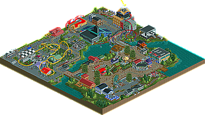
-
 47.31%(required: 50%)
 Spotlight Submission

Liampie 55% robbie92 55% 5dave 50% Casimir 50% chorkiel 50% geewhzz 50% Roomie 50% tyandor 50% wheres_walto 50% CedarPoint6 45% Maverix 45% posix 45% BelgianGuy 40% turbin3 35% Phatage 15% 47.31% -
 No fans of this park
-
 Download Park
629
-
 Objects
309
-
 Tags
Tags
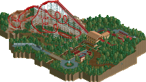
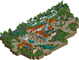
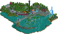
![park_2390 [H2H6] R2 - The Replacements - Tivoli Gardens](https://www.nedesigns.com/uploads/parks/2390/aerialt2133.png)
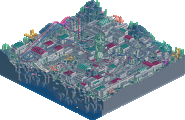
I´m not sure If I like the park or not.
There are some pretty good buildings wich I really liked
But one the other hand there were very... not that good buildings like those:
I also really liked some of the ideas in your park, like the note-lines, the guitar, the organ and the lightning impact around the LIM-Coaster. But the station of the coaster killed it for me. Ways to big, to much blue and to much glass. (IMO)
The idea of the stage was pretty cool, but seemed to be out of place to me
The parklayout seemed good to me and I really liked the foliage.
Last but not least I didnt liked the coasterlayouts. They were "okay" to me, but not good.
A very "negativ" review, but I think you´ve showed in H2H what you´re capable of and I´m really looking forward to your next project (besides the absolutely brilliant ncso park
Gruß
MCI
I really liked 'rock around the block' and it's surroundings, the notes and the guitar and evertyhing.
Qualifier had a cool layout too but felt a bit slow on some points. I did not like all the other rides really, they felt forced and mostly added for the sake of adding. Most of them had no or barely any theming which put this park a bit to a letdown. 500, drifter and wonderwheel for a good example.
The architecture was good but a little blocky in the shapes.
The foliage was really nice and fit really well most of the time.
All in all this was a bit of a letdown compared to the classic but I'm sure this was created on forehand and therefore this does defenitily show your learning process with cso.
Love the guitar
The scale of this was too small for me though, and some parts did seem a bit half-assed.
This really looks great though dude. I know you'll snag an accolade with your next attempt!
You should be proud of finishing this though and with a bit more refinment you'll land an accolade next time for sure!
The fact of the matter is, this was where I was at before building Th Classic. So this is one step behind that, and not an accurate gauge of my skill as of now.
MCI: Thanks for the critique! As I said, it was really a lack of planing that killed some of this stuff. Th bad buildings in the Race area were the last I built, and I rushed, excited to get another release.
chorkiel: You're right, it was built before The Classic. Thanks for all the critique!
Six Frags: Thanks, it really means a lot to me. I didn't think anybody would like that guitar, hah.
posix: Thanks, and yeah, a few things were rushed, or not re-done when they should've been.
In:Cities: No problem haha! Thanks, I know I'll win with my next one
Maverix: I completely understand the lack of flow, and overall awkwardness. As I said, this wasn't planned at all, and rather rushed to be honest. I was so pumped to be able to play, I just built this in a month. Thanks for the kind words!
Really, thanks guys. Please understand that this was really my first recent use of CSO, so everything I built was something new to me. With that said, I'm really proud of this.
Thanks for the votes, and Casimir for the maps!