Park / [H2H6] R1 - Heaven's Kitchen - The Atlantean Ark
-
 14-May 12
-
 The Atlantean Ark
- Views 51,220
- Downloads 1,294
- Fans 0
- Comments 275
-
 69.50%(required: 60%)
 Silver

RWE 80% chorkiel 75% Ling 75% Poke 75% bigshootergill 70% G Force 70% Scoop 70% Camcorder22 65% Cocoa 65% robbie92 65% Sulakke 65% posix 60% 69.50% -
 No fans of this park
-
 Full-Size Map
-
 Download Park
1,294
-
 Objects
336
-
 Tags
Tags
![Park_2373 [H2H6] R1 - Heaven's Kitchen - The Atlantean Ark](https://www.nedesigns.com/uploads/parks/2373/aerialm2126.png)
![park_3140 [MM2014 R1] 7 Little Sins](https://www.nedesigns.com/uploads/parks/3140/aerialt2704.png)
![park_4114 [H2H8 R3] Forum Caeleste](https://www.nedesigns.com/uploads/parks/4114/aerialt3853.png)
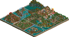
Atlantean Ark was an excellent display, I just felt it lacked something detail wise, compared to Frankenstein.
The question is.. Was the time extension worth it?
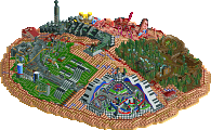
Reservoir dogs: The overview blew me away, I was extremely looking forward to seeing this ingame. Once ingame there were certain details (graveyard, the horse) that were still réálly good. Parts of the city were brilliant, parts were mediocre (and color did not make it any better I fear). The castle was impressive in size, but didn't do anything for me in terms of archy. The structure, back, coaster were all not really doing it for me. Don't get me wrong, it is a very impressive park indeed, but I think there was not much on the micro-level to it that made it better for me. Furthermore, even though a fun trick, the black/white did not fully win me over. I actually decided to check it out in color as well and that kinda disappointed me. After the gloomy effect is lost this park loses a lot of its initial appeal as well.
A very enjoyable park indeed, but to me not as mindblowing as apparently to many others.
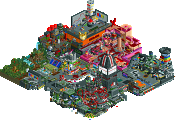
Heaven's kitchen: This overview disappointed me, I was really wondering what this was going to be. Then the readMe came, and I was starting to get interested. Once ingame I got intrigued. Even though I'm not a huge fan of the old-school fantasy blocky style, there was something to it. Some bits (Statues at the entrance, B&M diving, pirate ship, surroundings/small buildings at map's edge) were just beautiful, other bits hurt my eyes. Literally. But for some reason that could not make me lose my interest, I felt like I had to keep on discovering what was in there, how structures were connected and what kind of function they were supposed to have.
A very pleasant surprise, that was not always to my liking when it comes to archy, but that was extremely intriguing.
I thought I had reached a limit by preferring an LL park, Carsland, over Adventure Isle, but apparently it gets worse. In this case an old school fantasy park wins it from a very detailed park based on one of my favorite books. This one is, albeit extremely close, for Heaven's Kitchen.
Whitehawk Offline
Either way, the work presented is fantastic in both parks.
I really enjoyed Frankenstein, it's just my type of park: massive structures, bold coaster design, impressive composition, and some nice trackitecture like the meat buckets and the lightning chamber. The town itself was a little boring without peeps and there wasn't much to keep my attention there. I enjoyed the graveyard, it was very convincing and was well made. Foliage was great, I love the hanging shrubs, it really set the mood. I was not interested by the grayscale affect, it made it really difficult to enjoy the actual construction in the park. It did a lot for the atmosphere though, I just wish they could have achieved the same gloominess without relying on a gimmick. Overall the park is one of my favorites from round one, amazing job to the builders! Edit: something I ended up disliking is how it felt so much more like a design and less like a park. It also was reminiscent of Vampyre with the castle + black coaster and town outside. In the end I liked both parks so it wasn't a big deal.
I won't comment on our teams park, but I enjoyed it just as much.
I enjoyed the frankenstein park a lot and it was in my eyes better than the "The Atlantean Ark".
The landscape was great and the architecture fit really well with the theme. But the main argument was the change of the color to black white. Remember me of some old horror movies. Awesome!
My vote goes to Mr. Whites Reservoir Dogs.
First of all, there was the shock-effect. Seeing the overview in black and white (even though it's done before apparently) with a huge castle immediately got me interested. In-game the thunderstorm looked horrible but when the rain stopped I slowly got used to the black and white colour scheme. It did feel like an old movie, but I have to say that after while the lack of colour gets annoying and boring. It was very hard to ,concentrate on composition and details there were no different colours, like everything was built underwater. With colours the whole thing looked better, although not that special anymore, and less atmospheric. I wonder if you already decided about the black and white palette when you started building, and if you built on it in a different way knowing that everything would become black and white. Hard to figure that out.
On macro-level the castle itself was very impressing and beautiful, on micro-level not so. It was hard to see where towers started and ended, I couldn't 'understand' how the castle was composed, and that bothered me. The town wasn't that original and some buildings were clearly much better than others but overall it was ok. I didn't really like the foliage, it felt very rushed in places and the tree choices were sometimes rather weird. The macro-level landscaping was awesome though. Except for the ugly supports I also really liked the coaster. I loved how huge it was without occupying the whole view. There weren't a lot of little details to dicover, but I loved the lightning bolts and the graveyard.
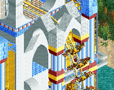
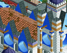
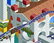
The biggest problem I had with The Atlantean Ark were the colours. They weren't too bright, the combinations were just ugly. Especially the yellow + white and yellow + bright blue killed it for me. Just like Frankenstein's castle the composition of the buildings, paths and the park in general was very hard to figure out, which I don't like. For example, it took me too long to discover that there were too concentric rings of water in the city. Too bad, because most of the buildings were very cool, even beautiful, but together they looked like a big mess of quarterblocks and too many tile path objects. The rides didn't appeal to me either. The layouts weren't very interesting, again I didn't like the colours and they seemed pretty random. Three things I absolutely loved: the huge statues, the clean corner with the swinging ship and the big building with blue holes in the roof (only shame about the prefab ship!), and all the landscaping and foliage around the map edges. With a different planning with more open space and more attention to colour combinations this could have been an instant winner, but this concept just didn't work for me.
no shade.
Frankenstein blew me away, good job guys.
vote: RD
I pretty much agree with this one. I enjoyed Atlantean Ark, despite the monotonous blaring colors, and the neglect of the rides, but it wasn't enough to make this as difficult as Match 1.
My vote goes to the Reservoir Dogs, Frankenstein. A masterpiece in terms of ingenuity.
Anyway, a lot of you don't understand my passion for this game. Being semi-retired (I now work from home at the same computer that I play RCT on) and having suffered a debilitating back injury a few years ago, this game has become my one and only "hobby". I can't play sports like I used to and all of the "recreation" that I now get comes from RCT. That's why I take this shit so fucking seriously. This isn't something that I'm going to "grow out of". It's something that I'll still be doing long after NE is just a memory. So, I'm real passionate about everything tied to this game. I know most of you don't get that...some do, but most of you I'm sure think I'm just some raving lunatic. Which is fine with me. I'm not here to live up to your expectations, nor you to mine.
Just try to understand that whatever bullshit I throw out at times stems from a deep passion for the game we're all here to "play". And try not to take it personally. I don't hate, or even dislike the majority of people here...even if it seems that way sometimes.
Just felt like getting that off my chest.
Same here. Nice to read such a honest and fair statement/reflection on the situation. Good stuff man.
For me it's the same ,i can't do much sports anymore. I have much pain most of the time and sometimes not, it comes and goes unexpected. I've lost my job during the crisis and can't find new work because of my disability. The point also is that i've always been busy creating or sporting. But now i have to take it slow so i put my energy in this game.
And i feel this is becoming a lifestyle for me to.
Not to much though or my girl will kill me
So you see you're not the only one who suffers.
I think we all do sometimes.