Park / [H2H6] Hurricanes - Zombieland
-
 09-May 12
- Views 51,123
- Downloads 1,206
- Fans 3
- Comments 264
-
 73.13%(required: 70%)
 Gold
Gold

BelgianGuy 85% Cocoa 80% inthemanual 80% tyandor 80% disneylandian192 75% 5dave 70% geewhzz 70% Liampie 65% posix 65% Xeccah 65% 73.13% -
3 fans
 Fans of this park
-
 Full-Size Map
-
 Download Park
1,206
-
 Objects
439
-
 Tags
Tags
![Park_2372 [H2H6] Hurricanes - Zombieland](https://www.nedesigns.com/uploads/parks/2372/aerialm2123.png)
![park_2420 [H2H6] R4 - Reservoir Dogs - Atlantis Resort](https://www.nedesigns.com/uploads/parks/2420/aerialt2160.png)
Emotional level
I feel like I spent a good amount of time reviewing each park.
Walto - I agree with your complaints about Valhalla. I disagree with your complaint about the invert. The colors fit the section IMO and it was a beauty to watch.
Sea of Sagas is a great park. My main dislike is that the front half of the park is clearly better than the back half, and you can tell where each builder picked up and left off. The front half though, is definitely some of the best work I've seen in a while, since its fairly obvious who built it! I really liked the architecture here, and the yellow looper in the corner was a pretty fun one to watch. From that point on though, I'd have to agree with wheres_walto. I also thought the back half of the map was very busy/disorienting. There was a lot going on in this one, which is good to the right extent, but for me it just came off slightly irritating. The biggest ride in the park (the invert) was also not that impressive to me (but that dragon was pretty sweet). Overall still a solid effort, and great job on finishing such a quality park in the first round!
With that said, I am still undecided. Both parks seem very equally matched in skill. Congrats to all!!
Also:
What? No it wasn't.
Honestly I'm quite impressed because two parks were much better then I expected.
and I'm still undecided too, fucking hard to choice..both parks have a very different styles like FK said.
solid work replacements
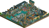
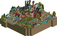
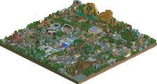
This was a nifty little park! I loved the movie and you certainly recreated the details quite well. I especially loved the kills of the week building, that was awesome. Some other little details were quite nice, like the backstage stuff (although it seemed a bit filler) and the midway game stalls were lovely. Overall though, I didn't really feel like it worked for a park... the readme also tried to make it more realistic than I think it should be, as its sort of a ridiculous (but awesome in rct) concept. My main beef, though, was that it didn't really feel like zombieland. The movie just felt more comic-y and whimsical, and while there is an element of this in the park, it feels more to me like a realistic style park with some a general zombie motif through it.
But overall great work, and thanks for a great matchup
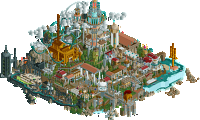
Sea of Sagas was just a beautiful park. I absolutely loved the invert, the layout was great and i really enjoyed looking at the queue line with the dragon. My only problems were that some of the smaller rides didn't seems to fit well and were a little random. Also everything got a little too brown in some places. But overall this was definitely a better park than Zombieland.
My vote goes to the Replacements' Sea of Sagas.
Wicksteed Offline
I first watched Zombieland, and it was great fun. All the small details are rally cool, though I did not get all of them because I don't know that film. Also the beheaded Zombie object is just hilarious. But I felt the whole park was essentially about these details, and sadly it didn't look very good on a larger scale.
Sea of Sagas then was just perfect. A lovely theme, a very good readme and a wonderfully executed park. Some parts of the park are among the most beatiful, picturesque and atmospheric places I've seen in this game. For example the area around the stranded ship. I might do a "little things" for this one once the match is over.
My Vote: Sea of Sagas
I never thought I'd feel sorry for the Hurricanes.
SoS for me is the winner. Zombieland is a brilliant park but its just been outclassed here. I agree with most of the comments so far but i would add that the return run on the invert in SoS feels a little forced.
So my vote goes to the Replacements.
I think I've guessed who had a hand in building it, and let's just say I'm surprised there's not a lot more water
Maybe against any other team, this would have won, but against the Replacements? Nah mate.