Park / Sea of Sagas
-
 09-May 12
- Views 51,919
- Downloads 1,719
- Fans 9
- Comments 264
-
 83.13%(required: 70%)
 Gold
Gold

5dave 95% no inthemanual 90% no MCI 90% yes SSSammy 90% no Liampie 85% no BelgianGuy 80% no Xeccah 80% no geewhzz 75% no Kumba 75% no robbie92 70% no 83.13% 10.00% -
9 fans
 Fans of this park
-
 Full-Size Map
-
 Download Park
1,719
-
 Objects
474
-
 Tags
Tags

![park_3226 [MM2014 Final] Ode to the Ood - MMFinale by Stoksy](https://www.nedesigns.com/uploads/parks/3226/aerialt2837.png)


![park_4178 [H2H8 Grand Finals] Heaven's End](https://www.nedesigns.com/uploads/parks/4178/aerialt3929.png)
Zombieland does make me want to build a studio that has some shred of accuracy, though.
+++ I agree, Also I believe not a lot of people actually dig deep in the parks and really get the whole atmosphere.
That being said, I have to post this screenshot, Its the most hilarious thing I've seen tonight.
RMM Offline
Because?
Absolutely. In fact, I was really surprised at how quickly some of the votes came in...
which signifies just that. If everyone took the time to really go through both of
these, I believe the voting would be closer.
Man...this is fucking H2H6. Give these works of art the attention they deserve, people!
Some of you have no idea how much thought and work goes into these creations in a very limited amount of time.
Zombieland: The park was pretty lifeless to me. The implementation of the "zombies" were neat but were just too static and repetitive. The studio backlot was good and probably held my attention the most. What killed it for me was the abundant use of gray tarmac, the redundant architecture that was created using corrugated roofs and white blocks, and the mediocre coaster layouts aside from Zombie Hunt which felt a bit forced for the space in my opinion.
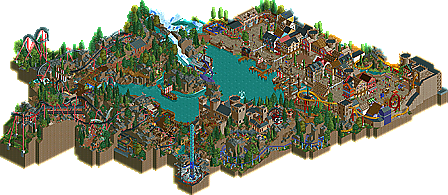
Sea of Sagas: This park struck me initially as architecturally aesthetic. The Hanse Port was great and held my attention for a good portion of time. I especially enjoyed the "Mutiny on the Baltic" show. I loved the facades along the structure for Stortebeker's Crew. I thought Fafnir was great. Sure the foliage could have been done better to establish a greater mountainous theme but the coaster layout was awesome. I love how the last turn of the coaster embodies a burning village and added to the theme of a fire breathing dragon. Lastly, I enjoyed the way the Octopus enveloped the shipwreck for the drop on Voyage to Vinland.
See this is what I hate. How do you know that people haven't looked around the park for as long as they need to to gain a good insight into the parks? I know I spent a good half an hour looking at the Hurricanes park and I just wasn't impressed by the repetitive details, ugly architecture and stale atmosphere.
Just because someone disagrees with you does not make them wrong, get over yourself. And that's to all the people who are butthurt because Replacements are winning. You're not better than the rest of the people who were voting, you do not know any better than them. Jeez.
KONG: Not everyone is like you. Really. Might be hard but it is so. After looking into both parks for a fair 10 mins each my first impression hadn't changed. Logical, because whether it's food, clothing or H2H6 parks I'm always very sure about what I do and don't like instantly. Digging more into something hardly ever changes that. I could have waited with posting my vote for an hour, but it wouldn't have made a difference 'cause I made up my mind. Just like some people need but 2 mins to know which one they prefer, and others need to look into it for an hour each, and recheck it the day after. Is it so hard to understand/respect that?
Not everybody's KONG/KONGclone. Just saying.