Park / Sea of Sagas
-
 09-May 12
- Views 46,806
- Downloads 1,583
- Fans 9
- Comments 264
-
 83.13%(required: 70%)
 Gold
Gold

5dave 95% no inthemanual 90% no MCI 90% yes SSSammy 90% no Liampie 85% no BelgianGuy 80% no Xeccah 80% no geewhzz 75% no Kumba 75% no robbie92 70% no 83.13% 10.00% -
9 fans
 Fans of this park
-
 Full-Size Map
-
 Download Park
1,583
-
 Objects
474
-
 Tags
Tags


![park_4178 [H2H8 Grand Finals] Heaven's End](https://www.nedesigns.com/uploads/parks/4178/aerialt3929.png)
![park_3226 [MM2014 Final] Ode to the Ood - MMFinale by Stoksy](https://www.nedesigns.com/uploads/parks/3226/aerialt2837.png)


Airtime Offline
Zombieland
At first from the overview I thought Zombieland looked awesome thats because of the layouts look great, espically the intamin in the back of the park. The layout looks brilliant but when you get in game I though the pacing was a little off, I mean it's still good though but not as good as I thought from the overview, still enjoyed it a hell of a lot. The best coaster of this match up probably? The studios tour is brilliant, probably the best part of the park. The wild mouse was real good as well but I think you should of used the tight turns instead of drawing them out, I was really impressed with the supports and catwalks etc. I wasn't too much of a fan of the woodie, heard of block brakes? lol
Sea of Sagas
I was wondering what everyone was going on about to be honest but when I opened it I was well really impressed. thought this seemed very much a "two halfs park" and the more I look at it the more I think it. The entrance area and ports (everything to the right of the overview on page1) seemt quite difference from the rest of the park. On the right side it felt quite spaced out but on the left everything felt on top of everything. Maybe it was due to the 1 tile paths, I'm not sure. The port architecture was lovely, so beautiful. I think you can see a mix of a load of people on the team that has their style written all over the architecture. The Eurofighter was really nice up until the launch where it kinda of died for me. The roll was taken too quickly as well as the turn around afterwards. The first half of the layout was brilliant. I loved the coaster wrapping the ship's mast. It was really good to see a powered mine train in there. The lighthouse was also really nice but I felt that area seemt really cramped and could of done with an extra tile of path running along the lake. The invert looked real good but the pacing was a little off, the loop was taken far too quick. My favourite part of the park was the shot tower. The little details in the station were amazing. I didn't quite understand it's placement but still.
Tough choice here. I really thought Zombieland from the overviews but once I opened them up my mind changed.
My vote goes to The Replacements with Sea of Sagas.
I'm starting to think the Hurricanes might not be as strong this season and The Replacements are the ones to look out for. It's the first round though, far too early to say but it's interesting.
Airtime Offline
Whitehawk Offline
I spent about 15-20 minutes looking over Zombieland. I immediately liked the concept, and initially liked the park. I found a lot of details, all the Replacements and zombie nin, and I found myself searching the park for the various rules. But after a while, the constant bloody corpses lost their touch and became too much, and everything started to get rather bland. I feel like the movie studio is the best part of this.
I spent about 30 minutes looking at Sea of Sagas. I opened the park and was immediately blown away by it - Just from a quick glance, I found myself wanting to go to that park! I absolutely love Fafnir, with the dragon bones and the burning village and a layout that looks incredibly fun. I also think the castle is very, very good, and I just about died when I found the mini-golf underneath (Couldn't get the readme to open
Yeah, I know, since I just posted "Sea of Sagas, hands fucking down," I must have only looked at the overviews, right, K0NG?
I came to watch H2H, not bitch fights.
Zombieland
Airtime Offline
Bitch fights and H2H goes hand in hand. It makes for entertainment.
First off, Zombieland. Honestly, I haven't seen the movie. This probably detracted a little from the park's experience, but then this is something you have to factor in when you make such a specific park theme. There are obviously going to be people who haven't seen/heard of the subject matter, and the goal then is making a park that is aesthetically and atmospherically strong enough to carry across the ideas without the need for a backstory. Honestly, I didn't think this park did that well enough.
It struck me as a generic theme park. For most of it, you could completely lose the Zombie moniker and it wouldn't make a difference to the park's feeling. You could call it Cedar Fair Los Angeles, and I don't think i'd like it any more or less. Take the Undead woodie for an example. The whole extent of the theming for this ride was the peeps climbing the structure. Admittedly, that's a cool idea, never been done before to my knowledge and was executed quite well. But that's it... nothing to show that this coaster should be called "Undead", it's just a nice woodie layout. I'm sure it's realistic, but that's not enough, for me. I guess i'm just not your target audience really.
The park was very solid, all in all, obviously a skilled person made this. But there just wasn't enough atmosphere for me, not enough feeling. The studio tour was my favourite part, but again, the expanse of grey textureless tarmac killed the atmosphere.
Having said that, the details were good, all the way through the park, and they really added a lot. I love it when someone takes the time to name staff and think about placement and things. Really nice. But details weren't enough to carry this park past generic, for me.
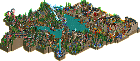
Sea of Sagas. From the overview, this just looked more interesting, but I thought I might be disappointed up close... I was pleasantly surprised. Interesting map shape, looked as if it was modified for H2H and cut down from something bigger, but it worked to be honest. The atmosphere in the town area was fantastic, very nice. Very 16th century Dutch naval town. Enough colour to keep it interesting, and just a nice place to be. The little vert coaster in the corner suprised me. The kind of thing I probably wouldn't have had the balls to put in there, I wouldn't have thought there was enough space, but it worked so so well. Really beautiful little ride. Especially the building in the corner, part castle, part town, lovely.
The boats throughout this were brilliant, especially the one with the show, and the one with the kraken. That kraken is fantastic, perfect scale and menacing shape. The dwarf coaster is very nice too, good use of space. Loved the castle... I read a post earlier (can't remember who by) that said the castle was weaker than the park... I disagree. Was a really nice shape and size, with good use of colour. The geysir ride was strange... to the point where it might actually have been better without it. Just didn't fit, for me.
The invert was good. The layout, once you strip away the theming, isn't actually that smooth. I found one view from which it looked really good, but the shape of the park means that I didn't view it from this angle until just now... However, the theming all through the ride is spot on. Best burned out buildings i've seen... something that's been attempted a lot, but never done well until now. Bloody good dragon in the queue too, not the best i've seen but still didn't look out of place.
All in all, just a far more immersive and interesting atmosphere and park, for me. Spotlight quality by far, on a full scale. Well done Replacements, think you've really scared people into stepping up their game. Amazing start to H2H6!
This was me. Honestly, I was trying SO hard to find faults in the park and that castle was the only thing that didn't blow my mind. Don't get me wrong, I still like it a lot. Unlike the Geysir ride in the back, I felt like the castle still fit.
I currently don't have the time to explain my reasons and do any in depth review so that will come later.
It was a very tough decision though as both parks were brilliant, just for me, one shone a little brighter.
Even after spending more time after my vote looking at all the details of the other parks, I'd still stick with the same vote, for the exact same reasons. If I wasn't 100% sure on my vote, I wouldn't vote so quickly, I'd definitely take more time to look before voting. It all the depends on the parks, and how they match up with what I like in a park, and what I enjoy the most. Contrasting styles, and my preference is heavily anti-dull generic theming.
And I won't tolerate any bitchfights in here.
Really?
Sonic rule 34?
I could tolerate the cutout penis you had as your avatar before, but now you've gone too far.
GTFO that avatar.