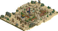
Park / [H2H6] revoLLutionists - Cars Land
-
 11-May 12
- Views 34,585
- Downloads 1,015
- Fans 2
- Comments 167
-
 73.13%(required: 70%)
 Gold
Gold

Kumba 80% ][ntamin22 80% chorkiel 75% Ling 75% RWE 75% Scoop 75% CoasterCreator9 70% posix 70% Liampie 65% Xeccah 60% 73.13% -
2 fans
 Fans of this park
-
 Full-Size Map
-
 Download Park
1,015
-
 Tags
Tags
![Park_2369 [H2H6] revoLLutionists - Cars Land](https://www.nedesigns.com/uploads/parks/2369/aerialm2121.png)

![park_2403 [H2H6] R3 - RevoLLutionists - Concrete Jungle](https://www.nedesigns.com/uploads/parks/2403/aerialt2138.png)

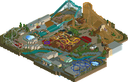
![park_2389 [H2H6] revoLLutionists - The Lost Samurai](https://www.nedesigns.com/uploads/parks/2389/aerialt2131.png)


'Roomie', on 16 May 2012 - 6:57 PM, said:
Winning doesn't matter to me, its seeing great LL get produced that counts
Great job both teams. I apologize for not voting, but I didn't feel right about voting without being able to open the LL park.
Can't wait to see how you fare against the canes!
Airtime Offline
I wasn't sure what to expect from the FGs but it was a very good match.
I loved the entrance to the PotC park.
Our park was about 70% up until the last day where I put a ton of work into it. In the end I worked a good 16 hour shift. There wasn't much rushed apart from the pre-show to the racers and also the show building. In the end the racers also become really out of sync. When I saved the game for the final version, after I reopened it to see if everything was ok I cringed at how out of sync they were. I didn't have time to sort it out so I had to leave it. Other than that it was great to work with someone I've always wanted to and someone any LL player would love to work with. Loopy did a great job with the tire stacks, Maters, the motels, Filmores and the hacking. I'd love to work with the guy again.
LLLL!
Adventure Isle:
The good;
I just love the details on this ship. Nice texture use and color choices. Nothing clashes really and it looks aesthetically very pleasing. Nice ride integration too to create the bottom.
I love the atmosphere in this screen! It totally reminded me when I was riding the real PotC ride in Disneyland Paris. The details on the burned structures add much dept and the main building looks very Disney-esque.
Love the texture choice here, and it's looking very much like the prison scene in the real PotC.
Totally reminded me of the opening scene of PotC 2! Nicely done.
Captains Jack's arrival in PotC 1 on the sinking ship. Again, nicely done, resembles the scene in the movie well.
Just a nice station, love the minetrain track in front.
Just a nice welcoming pirate sail thing, the round monorail track always gets me and looks aesthetically very nice.
I love how the minetrain goes through the wall. Nice supports and nice details.
The bad;
Seems like your mechanic gets lost after a while, maybe because of all the paths he has to cover.
Why is there no station on the PotC water ride?! Guests can't get on and off and it's detrimental for the park rating.
Didn't like the architecture there
Cars Land
The good;
Nice major mansion. I love the windows and the roofing details.
Love the terraforming here. While it's hard in LL, you managed to get it to look like the Grand Canyon.
Love this ride. The station, the power lines, the way the cars move, the bikes used as scenery, the barrels, the building on the left; it all adds to a wonderful atmosphere.
Gotta love the tire tower. Also, the cars are a nice touch.
Love this indoor part. The chopper carts are a nice representation of the worker crew. Also love the tires again.
Nice station and nice hacks.
Good idea.
The bad;
the 2 tracks just look very aesthetically unappealing imo. And as it is such a large part of the park it really dragged the overall appeal down for me.
Like posix said, the regular road would've looked way better. This just looks awkward.
Overall, Adventure Isle got my vote. I just felt it had more to offer and had a better overall atmosphere and ideas.
Good job to both teams though!
Cars Land, i've obviously watched this from start to finish, and I know you worked immensely hard on it, especially Airtime. I think that it could have been much more special had there been more time, but for a Round 1 park it really is incredible. The landscaping is brilliant and the shoestring hacks for the ride work perfectly, just a shame it's slightly out of time on the racers. Whilst some people think it lacks atmosphere I think it has quite a lot, something that is difficult to produce in Codexed parks. Anyway, I knew something special would come from the two of you, which is why I put you together, I can't wait to see what else you can produce this season.
Carsland – I wish I could get my LL version working again as I would really like to see this in game. Being a big fan of DCA, and having followed the actual construction of the real life version, I must say I can see a strong resemblance which for me and LL is saying something as I have a hard time seeing the intent of the objects sometimes. All in all, great park (based on overview alone)
Adventure Isle – At first glance, I was not sure how I would like it as it seemed a bit off to me. After spending some time though, I started to see the intent behind the park. To me it wasn’t the in your face detailing that can be distracting and really had a nice balance. Perhaps it was a bit to spread-out for the theme but I still enjoyed the look. The Pirates of the Caribbean was indeed my fav of the park. I could see the inspiration from the Disney version which is a good thing yet you made it your own. I would rate this as 7.75 on a scale of 1-10.
James
throwback! well earned gold