Park / Blue Devil
-
 07-May 12
- Views 3,374
- Downloads 591
- Fans 0
- Comments 23
-
 15.38%(required: 65%)
 Design Submission

K0NG 30% Roomie 25% BelgianGuy 20% CedarPoint6 20% tyandor 20% wheres_walto 20% 5dave 15% Liampie 15% Phatage 15% prodigy 15% Maverix 10% turbin3 10% Wicksteed 10% JDP 5% RMM 5% 15.38% -
 No fans of this park
-
 Download Park
591
-
 Objects
126
-
 Tags
Tags
![park_2403 [H2H6] R3 - RevoLLutionists - Concrete Jungle](https://www.nedesigns.com/uploads/parks/2403/aerialt2138.png)
![park_2373 [H2H6] R1 - Heaven's Kitchen - The Atlantean Ark](https://www.nedesigns.com/uploads/parks/2373/aerialt2126.png)
I've read the topic before and didn't wan't to put you down.
But here it comes: I assume you haven't played this game for years allready.
How much time have you put into this?
Probably not long.
Look at other serious parks to get an idea (don't copy) to realize a more pleasing setup.
It just doesn't give a 'wow' feeling.
But keep working on your skills (practice makes perfect).
If you really wan't to make it more serious then have patience ,you'll need it.
The park i'm currently working on now will probably take some months to finish.
Just to give you an idea on how long it can take to create something worthy.
Just keep practicing and think more about your work (Take the time for it).
Liam@: thank you! horrible because of the colors and brilliant because of the idea?
Thanks, that ride was something I built
We'll spend a lot of more time for our next parks, thank you for the comments
I'm looking forward to see it.
tdub96 Offline
As for the rest, you need more substance. A central coaster + two supporting rides and repetive foliage wont get you a design.
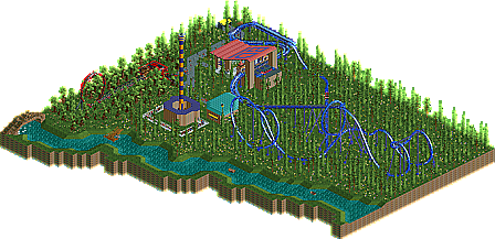
I absolutely abhor the layout. I question the use of wooden track for catwalk, especially on banked sections where riders are dipping down through it. Multi-dimension track on the lift/launch would have just been so much cleaner. The order of elements was fine, but the method of getting from one to the other was just insane. That tiny little hump and the small banked turn following the cobra roll produced extremely unnecessary G-Forces, and surely you could have though of a more creative way than zero-clearance to shoehorn a loop around the launch. The dive back through the second vertical loop could have worked if only you had moved the immleman back two grid spaces. But instead, more zero-clearance, which looked terrible. And then it just... ends.
There's a lot of design theory that goes into what makes a good roller coaster, and you appear to have just rushed from one "Oh wouldn't it be cool if" to another, not caring how it fits together as a whole. Don't try so hard to force it. In most cases, it's better to compact your layout. It's more realistic and it just looks better. Don't sacrifice decent G-Forces on a turn to fit something in. Find another way.
Also, why only one train? That was very... weird. It's like you set it to block section mode and forgot to change it back when it didn't work out that way.
it was really rushed, I can tell.
however, both of you are even younger than me, so your experience may grow exponentially.
RMM Offline
no disrespect, bc and mika.
When you look at designs on this site how do you think yours is going to win? Yours is no where nere the 65% mark, so why bother submitting?
Ill never understand.