Park / Machete
-
 21-January 04
- Views 4,666
- Downloads 2,049
- Fans 1
- Comments 31
-

-
 73.75%(required: none)
 Design

Poke 85% 5dave 80% Liampie 80% Coasterbill 75% Cocoa 75% alex 70% bigshootergill 70% G Force 70% geewhzz 70% csw 60% 73.75% -
1 fan
 Fans of this park
-
 Full-Size Map
-
 Download Park
2,049
-
 Tags
Tags
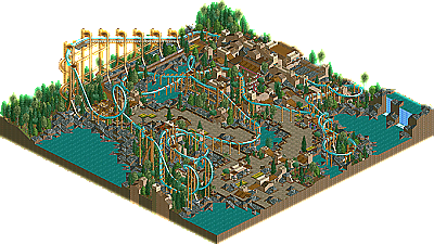
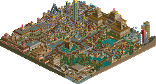
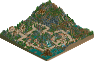
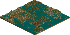
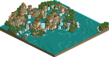
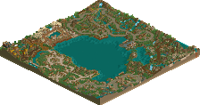
Machete by Posix
Finally we bring to you a new NE Design. Only one this time, and it's coming from a familiar face in these parts, the highly underrated and blossoming superstar Posix. He's really established himself nowadays, with a Spotlight, runner-up, several incredible H2H miniparks, a great Hi-Rollers entry, and more to his resume, added onto this newest NE Design that has regained my confidence in this floundering portion of the site. A beautiful inverted coaster with some terrific theming, proving that Posix' coaster skills are ever improving. Featuring a great layout, beautiful color scheme, some marvelous custom supports and some natural-esque, nicely landscaped, and classy theming, "Machete" is a no brainer. Excellent job Posix and thanks for your second NE Design. To everyone else, start sending these things in again! They will be updated more frequently...assuming that we get some good submissions. I know you good parkmakers are out there...somewhere..
I'm glad to see a new NE Design out there, and I hope there will be more to come. Heck, I might even try to submit something.
BTW, does anyone know when the last one was added? Just curious.
Posix, at the same time, you awe me, inspire me, and scare me. You're really becoming somewhat a fanatic about this "natural" stuff, eh? Nspheres was looking incredible, is that over?
Anyway the coaster was fantastic and the theming was beautiful, although I can't see why you'd need two info kiosks for a single rollercoaster...? Prey's color choice was a bit questionable, and the custom supports completely threw me off. Were they practice? Or was this realism, realism? I thought they totally blew off the calm, low tech feeling of the map.
So, I want to be this cool, but in a different way, but not that different. Great to see a design. Maybe that's what I need to do, in between parks...to sort of, prove myself, to myself.
Nice, Posix, and helpers.
1] I'm glad there are still parkmakers out there who have time to build things and release them. I have to congratulate you for finishing something like this. It's not to be taken for granted when a master parkmaker releases anything.
2] The coaster looks beautiful. You've been getting better for awhile and now you are one of the elite coaster designers. Perfect layout start to finish. All that time studying Schuessler's coasters has certainly rubbed off on you.
3] For all the trouble you give me about my parks not being perfect or naturalistic, it's tough for me to really like this. The reason I keep hacking my stuff and praising parkmakers who try new things is that I got bored with traditional theming. It just doesn't excite me anymore. And yes it looks great. You've used all the masters tricks in your architecture and theming making this one of the most polished pieces of work I've ever seen. Schuessler would be proud (and that's probably what you care about) but I've seen Khalma Cove already, seeing it again doesn't thrill me much. Yeah, that's probably a little harsh but that's the first thing that popped into my head when I looked at the park. It's naturalistic as can be and simple. I think you've achieved exactly what you wanted to. But you keeping pushing against me for my parkmaking choices and this is my opportunity to push back.
I like Speedy coaster
When you more scanery themeing I like it.
Nice Work!
NSpheres is either going to be finished by someone else or released unfinished. I can't help it.
I only had the two hand stamp desks for symmetry purposes, and yes, flat ride colour choices mean a big problem to me. I use to try thousands of combinations for ages and can never really get anywhere. I hope I'll manage to improve at that in the future.
Those custom supports, yeah, I mean, I made them about 5 or 6 months ago. They are a little tricky. I doubt you'll see me doing custom supports again soon
@Ed,
well observed, I wanted to do my own Khalma Cove since I'm so in love with that mini. Ripping off others is the best way to improve and RRP hopefully doesn't mind. I'd be surprised if he did.
It's true that something about this design lacks but it was more or less practice. Something I "allowed" myself although I had a long list of projects going on back then. I've also had another crisis during the making of this. So all of that is probably why. Anyway.
Remember our chat the other night? Harshness is exactly what I want from you
P.S.: Thanks alot to whoever made that logo and thanks to iris for the extremly nice and flattering text.
"...the highly underrated and blossoming superstar Posix." - I haven't yet managed to get over that
Posix, it's beautiful. I really wish more parkmakers would build something like this now and then. It's almost like you should learn to walk before you learn to run. I'm not putting down the 'Ed' and 'Mantis' style of parkmaking because I love it too, but more and more I'm appreciating what I'll call a minimalistic form of parkmaking. To make something beautiful and immersive without 'gimmicks' to me is the ultimate in parkmaking. Here's the catch....the truly great parkmakers who are going a little more over the top still have the quality landscaping and theming that this park displays underneath all the added bells and whistles. I really think everyone should take a good look at this tho and see that parkmakers don't need to use a ton of rides as scenery to make a beautiful park. When I look back at all the parks on my hard drive, I always come back to Moonlight Magic as my favourite LL park of all time. I just get so immersed in it and its where I go when I need inspiration (for RCT2 it's RoB).
Posix, you won me over with your ability long ago, and as a person I've never had anything but good experiences with you when talking. Go figure, you're now winning me over with your parkmaking philosophy. You'll have to keep working on the LL vs. RCT2 issue tho
I must warn you though. You seem to be slowly turning into a Schuessler & SA park addict, just like me.
Minimalism is what I'd call simplicity, and simplicty is the highest form of skill. I think I know exactly what you feel about Moonlight Magic. Look at IOAH intensively and once it grows on you you'll be lost forever.
I would never have expected you to have that attitude, seeing as you can't get enough custom scenery for your parks. And also MGM consisted more out of rides than anything else. (This is not meant devaluating by any means)
What also surprises me is how this design made you say that, because I find it rather not simplistic. It's rather wannabe
But anyway, I'm glad you liked it. If you should have become a minimalist, simplicist, traditionalist, realist, naturalist or whatever in a few weeks then please contact me because I'm going to be more than willing to do a collabo with you
OK..
This might not ever happen again, since I don't like Posix's work generally...
Good job. I loved this coaster. This is generally because I am more of a ridemaker than "park" maker. Very very nice coaster.
PAoD
§
Does this mean 5hine and NSpheres aren't ever going to be finished?
Ah well, who cares when you make cool stuff like this
Posx. As you know I love you work and I wish I could recreate it, however that isn't possible in Rollercoaster Tycoon 2, I don't think. The way that game works I think it would be very hard to make something simple, clean, and beautiful.
I try to do the same thing with my graphics work, clean, simple, something that gets the point across.
Blah, sorry about going off like that.
I think that what I love most about your work is your colors! Better even than mantis, whatever colors you choose you make them look good.
Overall amazing job Posix, I somehow managed not to comment on the park but whatever, I know my comments don't mean much because I am worthless as park making goes.
Oh, and Cork, you're best logo yet. Too bad iris never lets the NEgt(Me) do any work.[/font]
The Coaster was beautiful. Great layout that flowed beautifully. I followed the coaster along and it seemed that no matter what angle I chose, it looked good.
Theres not much more to say, but keep this stuff coming Posix.
BTW, I looked at your High Rollers recently, you go jipped man!
LL is soooooooooo much cooler than RCT2.
I guess I'll just build LL-ly in RCT2
Posix, the coaster was great, but the last cork was a bit slow, but that really isn't a big deal. I think you've got talent RCT that is well-rounded, and I applaud you for being one of the few to do that. However, all your parks have the same generic theming imo. It's nice that you really admire JS and those like him, but you're starting to imitate them, and in my eyes, that hurts your standing. You've got to go back to being your own parkmaker. The themes you do just have no difference between them. Each one has a beautiful look, and has a wonderful atmosphere, but I'm getting tired of seeing the same stuff over and over again with slight changes in textures.
I still loved this, but I had to get that off my chest.
-Freak
I mean, I'm not like Fatha'. If you don't see changes except for textures in my work then you can't have looked at it for more than two minutes.
And you can never play RCT the way you "should". I know I'm imitating Schuessler too much but I just can't help it at the moment. I'm kind of surprised you said that from this design. I wonder what comments I'll get for my new solo... heh -_-;'''
slob, why would you not just give LL another try?
Posix, great job on the coaster, great job on the theming, great job on everything. Grade_A work in my eyes. Buetiful, just buetiful.