Park / Falcon
-
 20-May 12
- Views 7,091
- Downloads 790
- Fans 0
- Comments 15
-

-
 68.08%(required: 65%)
 Design

Roomie 85% turbin3 80% 5dave 75% BelgianGuy 75% Phatage 75% Steve 75% Liampie 70% robbie92 70% prodigy 65% That Guy 65% Wicksteed 65% CedarPoint6 60% posix 60% RMM 50% tyandor 50% 68.08% -
 No fans of this park
-
 Full-Size Map
-
 Download Park
790
-
 Objects
333
-
 Tags
Tags
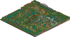
![park_4163 [H2H8 Semifinals] Allegheny Adventures](https://www.nedesigns.com/uploads/parks/4163/aerialt3904.png)
![park_4119 [H2H8 R4] Incident at Billy Wonka's](https://www.nedesigns.com/uploads/parks/4119/aerialt3859.png)
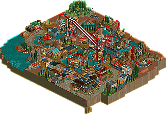
This was very good. Alot of nice details and ideas such as the camp fire in front of El Rio Loco's entrance. The architecture was balanced and the ride interaction was good. Your landscaping and foliage has definately improved, good job on that.
It was very nice and I did like it but there were some parts that with just a little more thought would've been better.
->
The foliage was quite nice but some parts like those trees in the upper corner of the map felt inferior to other parts.
The pacing, though this might have had to do with my laptop, felt a little slow for some of the inversions.
The entrance sign and the photo shop just felt extremely rushed.
There's no mcbr but yet there are 3 trains on the track. Not very likely to happen.
Apart of that I thought it was very good. I liked the little plaza with the fire in the middle and most of the facades.
One thing you should improve in my opinion though is your layouting for the whole map. I don't mean the ride design but rather the whole concept and composition could be a lot better in my opinion.
Again congrats and good luck for your future projects!
The path layout was pretty good but for a few places.
The coaster was good but was slow to start ( make a 5ft drop before the first innelman).
The theming was great. colors brought it out the southern/western look.
The supporting ride IMO was the best part. I liked how it interacted with the coaster and how you made it an important Part.
Well deserved design, If I were to vote, abt a 15/16
I really liked the risk involved. It wasn't like a normal design where half the coaster is all by itself, and your risk paid off.
I thought the ride was great although the pacing was just a little off. I loved the architecture and atmosphere from the buildings. The fire pit and the rapids ride were splendid as well. There is just one other thing Mav....STOP BUILDING DESIGNS AND MAKE MORE PARKS. Seriously your work is so good but I just want to see more parks like OPC. We all know you can churn out designs left and right so just build another park. I loved this design and its definately one of my favorites from you second to Cheetaka. Keep up the work though.
But good job, you're definitely improving, and congrats on the design
I thought you just needed the extra time to build in H2H... I was doing you a favour really.
In time you will understand
BigB Offline
FK