Park / Seven Seas Amusement Park
-
 09-June 12
- Views 3,034
- Downloads 572
- Fans 0
- Comments 9
-
 44.23%(required: 50%)
 Spotlight Submission

Phatage 55% Steve 55% wheres_walto 55% Dimi 50% Maverix 50% robbie92 50% That Guy 50% 5dave 45% Casimir 45% turbin3 40% tyandor 40% BelgianGuy 35% Roomie 35% CedarPoint6 25% JDP 15% 44.23% -
 No fans of this park
-
 Download Park
572
-
 Objects
249
-
 Tags
Tags
![park_2400 [H2H6] R3 - Flying Germans - The Adventures of Harry Potter](https://www.nedesigns.com/uploads/parks/2400/aerialt2142.png)
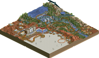
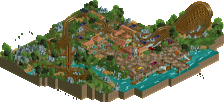
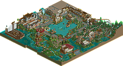
The theming is great overall and I really liked the NCSO-Asia-theme.
Cannonball´s Layout was awefull, but I really enjoyed the flying coaster.
The big ship had some very cool ideas, too but all those grave-stones killed it for me
Overall great job on this one, even if it didn´t got the bronze.
Hopefully I wont be the last to comment...
I really like the whole atmosphere of the park.
It is a very good NCSO-Park.
I salute the voters who vote for Bronze.
mfg. RWE
BigB Offline
Afterwards there's so much I would have done different, maybe you'll call this "improvement" ;D
The layouts and the location of the rides really let this down.
BigB Offline
Well, I was ever bad in layout construction, so I didn't expevt huge applause on the layoust
When I finished this, I was a little bit euphoric, maybe you know this -my-first-NE-submission-feeling where you are so happy and submit it without seeing the litttle mistakes you ahve in your park.
I already saw the missing roof and the missing wall at the station of Flogging Molly, also I saw that I forgot to change the name of the rides, but it was to late ... ;-)
Next time I know what to check so I hope that one will be better
Thanks to the latest comments
What I really liked is the facade in front of cannonball. The layout of the flying coaster ist very nice, too.
I liked the park overall a lot.