Park / PineHills Orlando

66 Comments

  • Corkscrewy%s's Photo
    while I honestly agree with seph on most of what he said I haven't opened this up yet to get the full understanding of it. but untill i do I only have one thing to comment on...

    vert.. that logo.. is fucking siiiiiick bro. keep it up.
  • FK+Coastermind%s's Photo
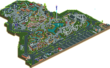
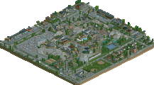
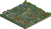
    I think my thoughts are the sames as everyone else. I thought this park was beautifully executed, but poorly thought out. I usually tend the same way as Posix, this park needed themeing. This is an Amusement Park, but not a Theme Park. You had some beautiful archy, amazing details, and even some flashes of themed brilliance (im talking specifically of the red building right next to the lake by the inverter, if this was a version of western theme, it would be incredible planned out). The coasters all didn't do anything for me, i mean, as an RCT viewer Coasters are a BIG area that you want to look at, but these were so small and trivial. Looking forward you need to tackle some theme areas. This was great, you have proven you can make amazingly details stuff, now show some imagination, when you mix these you will have a spotlight in ur hands. (looking at ur Drop Topic screens, it seems like ur remaking this kinda of park, so take a step back and think about it)

    ya, the 100% from Louis is weird. I would reserve a 100% for a perfect park, and this was amazing, but not perfect. The coaster's are enough proof of that. It's odd as i usually agree with Louis....heh

    FK
  • gir%s's Photo
    I'm looking forward to your next project, because you certainly have promise. However, the whole realism thing does not work for me when parks are so brutally generic. It makes the park seem very "corporate," as in its only purpose to fulfill the bottom line--to make money.

    Scaling and architecture in general is a bit of an issue. A good place to see this is in the duct work; it's quite clear that the ducts are severely oversized for many of the small buildings. In fact, many of these buildings would probably be ductless in real life. If you're striving for realism, I would put more thought into these types of things. It almost seems like your goal was to prove that this was realism by placing ducts and other mechanical systems everywhere, but you did not seem to put much thought in it. It's okay--I get it, it's only RCT. But, these are the little details that elevate a park.

    EDIT: Just wanted to add that verti did a great job on the logo--one of the best in a while!
  • CoasterCreator9%s's Photo
    Congratulations!
    Here are my thoughts as I went through the park:

    The urban landscape around the park is well detailed, but I felt as though the foliage was a bit lacking.
    The entrance buildings are quite cool.
    The custom kiddie rides are very cool.
    River Rapids has a cool station and landscape, but it could use more interaction with the paths.
    Boomerang was a good representation of such a ride and where they are commonly located.
    I thought swinger's location was a beautiful one.
    Same with Drop Tower, excellent placement.
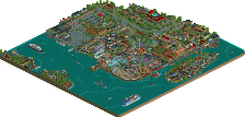
    The eating area along the lake is also a scenic spot.
    Condor looks like a fun ride. Speed gets a bit slow, but I like the Raptor layout inspiration.
    Desert Runner is really, really short, and I'm not sure how that transfer would work. (Top Thrill Dragster's is SIMILAR, but the switch is still on a block section.)
    Frisbee would be a whole lot cooler of the orientation was 90 degrees in either direction, would make for a more thrilling experience.
    I rather like the road through the center of the park.
    Circular restaurant is beautiful, but I'm noticing recurring brown-ness.
    Splashdown is cool, but I can't help but think the first ten seconds would be quite boring.
    Alright! An X-Car! I think more elements could have been added for a more thrilling ride. It is also very short.


    Overall, love this park. I would have given it a 7.5/10.
  • CedarPoint6%s's Photo
    This park was pleasant, though I thought it could use a bit of refinement. It didn't feel terribly realistic to me, just because it was missing a lot of the little things that really park a park whole. You certainly had a decent ride lineup for a park of this size, though it seemed odd they would be able to afford 3 relatively large custom designed coasters. All the buildings seemed so small-- for all the space you ended up having, the buildings just seemed awfully tiny. You had lots of great little details, though it seemed like you missed some of the large things that brought it collectively together. Everything seemed very gray or white-- actually I think a lot of criticisms in the park could be masked or fixed by a bit of accent color on the buildings or signage or something to give some uniqueness through the structure. Your forms in general were very nice, though like I've said, some extra square footage on the buildings or even queue lines or maintenance areas would be great. As more of a personal preference thing, I tend to dislike seeing these blocks used as path texture and roof texture... I just kind of find it distracting.

    All of that said, it was a pleasant park to look through and I think a gold is deserved-- I'd have gone between there or a high silver. I'm looking forward to seeing what you come up with next because it's clear you have a lot of skill. Congratulations on finishing this park.
  • Colorado-Fan%s's Photo
    I think this park was a really nice one. It looks like a better FunSpot USA. I liked the inverted coaster layout but a wooden coaster as the major coaster of the park instead of the purple coaster would have been amazing. The problem with this park is the theming. There are no real areas and everything has got a boring classic style. The rafting looks like some kind of a jurassic park style but without any dinosaurs. Some of them would have improved the ride a lot. The gas station was a nice detail but seemed useless in this area because of the other generic buildings. All in all the park is good but for me it was only a silver park.
  • Louis!%s's Photo
    I loved it.
  • disneylhand%s's Photo
    Louis, as members of this community we are subject to the voting of the panel and outlier votes like yours deserve an explanation. "I loved it" doesn't do it.

    -disneylhand
  • Xeccah%s's Photo

    Louis, as members of this community we are subject to the voting of the panel and outlier votes like yours deserve an explanation. "I loved it" doesn't do it.

    -disneylhand


    I can't see any park being worth 100%, much less this one.

    So, please Louis!, explain.
  • Midnight Aurora%s's Photo
    Oh, fuck yourselves. His explanation was perfectly sufficient for me, and considering his vote was dropped anyway, you don't need anything further. All things being subjective, you'd complain about his reasoning anyway.
  • Ling%s's Photo
    Actually inclined to agree with MA here. Even if the last post wasn't nearly two months old.
  • Dark_Horse%s's Photo
    I'm with MA and Ling. Nobody's vote deserves an explanation. If Louis! wants to vote a park a 100%, that's his choice. That's why we have the Accolade Panel in the first place, isn't it? So that parks are being restricted to a certain score because one person is judging. I realize there's more than one person involved, but it's the same concept. What's the point of the Panel if everyone is going to vote exactly the same?

    ONTOPIC: Gijssie, this was a decent park, but it was just built on too small of a scale for my liking. The entrance could have been a bit bigger or at least more recognizable. THe park showed great ride placement with the swinger and tower by the lake. The coasters were decent, but I think could have used some more breathing room. Again, this was a nice park, but it was just too small of a scale. Also, as others have said it was a bit too generic I would love to see you do a fuller park of this style with more theming incorporated.
  • dr dirt%s's Photo
    I think it's more the fact that Louis is sucking Gijssie's dick like every screen he posts, even the unfinished ones (which are all of them). This was going to be voted 100% even before the park was downloaded.
  • trav%s's Photo
    To be honest, I kinda agree with Dirt here. I think if you're going to vote at least 10% above what anyone else votes, and 25% above the average, you should give a couple of reasons as to why. Yes, his vote has been nullified here, but if he'd voted like 85% or something, that would have changed the average score, so his 100% (I also don't see how anything can be voted 100% if it has flaws) actually does make a difference.


    Let's put it this way. The lowest vote is 60%. The highest vote bar Louis' is 90%. That means Louis voted this 33% higher than anyone else did. That's a huge increase if you ask me.
  • turbin3%s's Photo
    [quote name='dr dirt' date='27 June 2012 - 05:43 PM' timestamp='1340811830' post='591565']
    I think it's more the fact that Louis is sucking Gijssie's dick like every screen he posts


    hahaha
  • Midnight Aurora%s's Photo
    Everyone has a different scale by which they judge quality. The reason our system averages scores out is so that those subjective differences even out after the entire panel has voted. The fact that you disagree with Louis's scale is not justification for demanding an explanation from him.
  • disneylhand%s's Photo
    Obviously everyone judges subjectively; we all know that's the point of the panel. This scale, however is far from subjective. There are clearly defined ranges for Spotlight, Gold, Silver, and Bronze that all panelists vote within. Universally, 100% means perfection, and with all the valid criticisms brought up in this thread, it'd be enlightening to hear how Louis could view them not as the flaws everyone else sees, but rather the makings of the perfect park. The same goes for Six Flags Washington, but that discussion probably doesn't belong here.

    I guess this is an expression of my larger uncertainty regarding the panel and some of the administration behind it. Midnight Aurora, I wouldn't expect you to have the same concern as someone who does not play this game nor submit parks. There is something greater at play here. For me, at least.

    -disneylhand
  • Dr_Dude%s's Photo
    If 0% can be given to parks that have effort put into them then 100% can be given to imperfect parks.

    And RE: dr. dirt, it makes sense that someone will like something they like
  • Ling%s's Photo
    Define "effort".

    Also, keep in mind you can manipulate the voting by how you place yours. You may not think it deserves a 100, but rather a 75. You can use your vote of 100 to bring the percentage up more severely than if you had voted 75. This isn't how it should work, and it's one reason the outliers are cancelled, I'm sure. But regardless, by making his vote the high outlier, he still brings the average up.
  • Xeccah%s's Photo

    If 0% can be given to parks that have effort put into them then 100% can be given to imperfect parks.

    And RE: dr. dirt, it makes sense that someone will like something they like


    Which again, is bullshit. If we were to vote on RoB, I wouldn't give it a 100%.