Park / PineHills Orlando
-
 25-April 12
- Views 18,727
- Downloads 1,481
- Fans 3
- Comments 66
-

-
 75.77%(required: 70%)
 Gold
Gold

Louis! 100% Airtime 90% RMM 90% wheres_walto 85% Dimi 80% SSSammy 80% Liampie 75% That Guy 75% Maverix 70% posix 70% robbie92 70% tyandor 70% 5dave 65% Loopy 65% BelgianGuy 60% 75.77% -
3 fans
 Fans of this park
-
 Full-Size Map
-
 Download Park
1,481
-
 Objects
315
-
 Tags
Tags
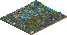
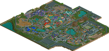
I was looking in your topic and I was waiting for it to be released finally! I think Gold is fitting good for this park
I'm looking forward to your next release!
EDIT: I got an ET after a while
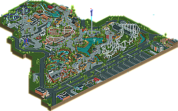
Overall a very good park, but it could have been just a tad better if you'd given the park some more rustique spots to diversify.
Congrats on the accolade though, looking forward to your next parks/designs
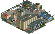
Your details are all pretty clear and I felt this added to the pakr a lot as everything was easily identifiable. However, I also felt as though you had pretty redundant details everywhere. Such as the fine terrain colour variations that I would deem totally irrelevant and unnecessary. It gives rise to my typical gripe with this style that everything becomes too "made" and can no longer be organic at all. I also agree with the criticism others already mentioned that it felt too cramped. The park layout was pretty strange. I think it would help if you did more planning and layout work before you start your next project.
I would also like to see you do an actual theme. Replicating amusement parks is nice, but it's pretty void of any kind of imaginativeness, which makes everything less interesting I find.
That's the thing. IMO there was more hype than substance here. No offense to gijssie1234 in
that regard because this was pretty good. It was just not Gold quality in my opinion.
What was there was extremely well done, although it seemed like I was looking at something nin
built in most places. Also, as has been mentioned...it did indeed feel very cramped (which I
think can be partially attributed to the way it was cut off so closely) and poorly designed/planned.
I didn't get a chance to vote on this, so I haven't really gone over it thoroughly. That being said,
I'd probably have given this between 65-75 tops.
Congrats on the accolade though. I hope you take these criticisms into account for your next project
as I think you could really benefit from what's been said.
Edit - Anyway, love this small scale style. One of my favorite parks from H2H5, Calypso Quay, had similar small scale architecture in it.
I think foliage is executed pretty poor. the color, type of foliage..witch makes extreamly lifeless.
Really love every single details in this park though.