Park / PineHills Orlando
-
 25-April 12
- Views 18,474
- Downloads 1,434
- Fans 3
- Comments 66
-

-
 75.77%(required: 70%)
 Gold
Gold

Louis! 100% Airtime 90% RMM 90% wheres_walto 85% Dimi 80% SSSammy 80% Liampie 75% That Guy 75% Maverix 70% posix 70% robbie92 70% tyandor 70% 5dave 65% Loopy 65% BelgianGuy 60% 75.77% -
3 fans
 Fans of this park
-
 Full-Size Map
-
 Download Park
1,434
-
 Objects
315
-
 Tags
Tags


![park_4090 [H2H8 R2] Feira do Flamengo](https://www.nedesigns.com/uploads/parks/4090/aerialt3829.png)

![park_4102 [H2H8 R3] Castles-n-Coasters](https://www.nedesigns.com/uploads/parks/4102/aerialt3848.png)


Pros:
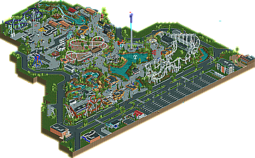
1. The ride & buildings scale ratio fit perfect for RCT2 guest.
2. Your park map actually looks like a blue print for an actual park.
3. Rides couldn't of been more realistic, love love love the layouts.
4. I cannot get over the ride & building scale! Its perfect. Most of the time in rct2 parks you get these buildings that just look too big for guest or you get rides that are just so huge in the air that it just donesn't have a flow.
5. Love the way you integrated outside businesses.
Cons:
1.
Foliage was a debbie downer in some parts, but realistically thats in every Amusement/Theme Park2. looks a little grey, but again realistically, there are some pretty popular irl parks that have nothing but blacktop for paths.
Well deserved gold.
I would of voted: 90%
edit: I going to retract my first con, after over looking again. This park has perfect foliage to go along with its atmosphere, it kind of reminds me of those Mini Florida Amusement Parks.
EDIT August 8, 2013: Got rid of the rant - robbie has it quoted a few posts down [as of this edit]. I still feel the same way on the topic, I just think that what I wrote wasn't very well refined.
That said, I thoroughly enjoyed the foliage. It really gave off that Floridian atmosphere. It was somewhat reminiscent of driving to Florida for vacation. The scale was unusual but refreshing. The style was very clean and enjoyable. That said, it was yet another bland and generic amusement park that I've seen thousands of times before. No offense, but it was boring and lost my interest quickly. Solid effort, and technically well-done, but not worth more than a 60-65% in my opinion.
I'd love to see you try something with a theme, a bit more semi-realism. I think it'd turn out wonderfully.
But what if someone really just "isn't feeling" the foliage? They don't actively hate it or actively love it, so why make them choose a side? I honestly find annoying how many self-important bastards there are at NE who feel the need to type out a manifesto to members complaining about their gripes with someone's opinion, or the need to dictate what people should or shouldn't say. If they're "not feeling" something, let them say it; a forum is a place for discussion, not a place to keep your mouth shut (unless you're posting completely off-topic random threads, but that's a different story).
By the way, I just wasn't feeling that lecture of yours. No offense...
One moment let me catch my breath.
I enjoyed this park. it was well crafted and i liked the coasters. However it was a high silver for me. An almost perfect example of the park type but not a type i particularly enjoy. If that makes sense.
To be honest robbie, you're response is quite the contradiction compared to many of your posts in the past.
but overall a very good park and worthy of gold for sure. good work on the 100% score too
+ Brilliant clean detailing
+ Unique scale
+ Custom 2x2 flatrides. Holy crap.
- Boring architecture, everything looks the same. No themes.
- Relatively boring rides... The small coasters were too small to be memorable and I didn't like the B&M that much.
- Poor planning
- Hardly any foliage, bare atmosphere
Pros outweigh the cons, anyway. 75% for the skills. Congratulations on finishing and winning. Please make a theme park now.
all was too small and felt unispired and highly reproductive of people like nin and other builders with a personal detailed style, this felt copied in a lot of ways
the entrance wasn't inviting at all to me, so was the rest of the park aswell, it all felt lifeless even with the peeps, almost no colours or whatsoever to make it have that fun factor, this to me showcases that skill to reproduce realistic details apparently goes over innovative ideas and actual own designed themed areas and less reproductive work that relies on creativity, something I was missing in this. I mean naming was weird to boot, the coaster layouts didn't do much for me, as robbie pointed out the boomerang was the best layout of the park and to me that's a shame really. also the fact that this was glitch: the park made it an eyesore at places.
The problem really was that it showed no purpose behind anything. I didn't think there was anything in the park that stood out at all. All the buildings were the same size basically and they were all very similar variations of a light brown house with some wood on it. The parklayout seemed really random in my opinion. Think, if you were to open a park in real life, why would this be the layout? Why would the park expand like this, after having started with some small rides? While it's supposed to be realistic, it's not realistic at all in my opinion. Aside of the color choices the main thing that destroyed the atmosphere for me was that there was NO interaction whatsoever. There is path, there are rides, but it all doesn't feel like one big unit. It feels like an assembly of a bunch of rides on a field. And WHY on earth were there no real queues anywhere? The longest queues were like 3 tiles long? Queue interaction can make the stalest parks so much better.
While I think everything was on a very high standard when it comes to object use and placement of detail, the composition was just not up to par. There seemed to be no ideas in the park.
Congrats though.
Anyways, congrats.
Anyway well done gjissie, Try a theme though because your work ... This and what i have just seen in the dump seems to be just generic, i think you will excell in a themed/partially themed park.
this park is void of any ideas. and I've seen better parks score way lower because they weren't hyped at all, I mean really this score encourages players to go for stale amusement parks with nothing else but realistic details for the sake of details instead of a decent concept behind them...