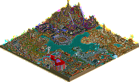
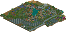
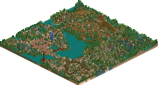
Park / IOA Hollywood

Park_2341 IOA Hollywood

327 Comments

  • Tom_Dj%s's Photo
    I love the daredevil screen and especially the DD sign ;)

    Good work
  • yeshli2nuts%s's Photo
    teaser.

    Posted Image
  • Ge-Ride%s's Photo
    It looks interesting so far. You've got my attention.
  • ACEfanatic02%s's Photo
    Just an observation: Anyone else think that thing's about to fall over?

    Looks good, though.

    Oh, and I don't like the DareDevil screen. Sorry, but it's just too dark for my tastes. And what's with the support things?

    -ACE
  • postit%s's Photo
    The supports are too weak for that.
  • tracidEdge%s's Photo
    the real hulk isn't suported by too much, either:
    Posted Image
    i could have looked for a better pic, but i didn't really feel like it.

    anyway, looks nice for a hulk clone. not much else to say, though.
  • yeshli2nuts%s's Photo
    when building it, i was afraid i had too many supports. the real hulk only has 3 sets of supports on the incline - http://pictures.rcdb...ible-hulk18.jpg
  • postit%s's Photo
    I stand by what I said.

    A thicker piece of scenery would be ideal. Or a brace connected to the bottom of the coaster compartment, like in the picture. Maybe try some coaster track. Point is, it doesn't aesthetically look good and if you are going for super realism, you can still make it look "more-supported".

    Edited by postit, 30 March 2006 - 09:35 PM.

  • tracidEdge%s's Photo
    use the slides. might be more of a pain in the ass, but it'll look like it's supported better.
  • Shamu%s's Photo
    I agree with tracid, but I think it's looks great. Maybe a little water?
  • ChillerHockey33%s's Photo
    I think you have too many supports, making the structure look unstable and requireing alot of supports. Try taking out some supports and it may look better.

    -Ryan
  • hobbes%s's Photo
    I swear there is a serious optical illusion going on with this picture.
    It appears entirely diagonal due to the fact that it is a flat image. Yet in my mind I know that it is just an inclined plane. Still, the support work and flat top of the tunnel make my eyes go bonkers.
  • Metropole%s's Photo
    I think it looks fine. I think you should take a few supports out and perhaps have a cross brace at the top connecting it to the tunnel. Good work, looking forward to seeing more of the coaster.
  • Titan%s's Photo
    Ditto. It needs fewer supports actually. I can't say I really care for the tunnel design, I would mess with it a bit more.
  • CoasterForce%s's Photo
    Yeah, I agree with what Titan said...fewer supports and fix the tunnel design a bit. At first look I really liked it but I think more could be done with the top of it. Try a few different designs.
  • sixflagsfreak56%s's Photo
    What about using some RCT1 themeing and use the covered waterslide for supports, since I think the supports you used are too skinny.
  • yeshli2nuts%s's Photo
    alright, i took your suggestion so besides for the obvious unfinished grass, what do you think?

    Posted Image
  • tracidEdge%s's Photo
    definitely better except for that shitty hulk statue there.
  • hobbes%s's Photo
    The optical illusing has disappeared, for the most part, though I think if you raised the tops of the green cross-sections above the purple one tile, it would look even better. Aside from the aformentioned hulk scenery, though, this looks very good. Great work on the sign, and I like how the supports dig into the ground.
  • Ruiz%s's Photo
    Ok, the statue is ruining it. I like the lift. Reminds me a lot of Hulk.