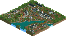
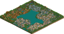
Looking good man, i have always loved heartline twisters, and the daredevil film is quite cool too- Its a winning combination! Im glad you have revived this, would be a shame to see it go to waste. Keep up the good work.
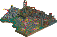
i know its only been two days but i gipped you on that other screen so i'll give you a real screenshot. as of now, i changed the name of the heartline to a Spin Through Hell's Kitchen. i never read any daredevil comics but from seeing the movie, im guessing the whole church/religious theme fits in with his character.
on a parkmaking standard, it's a great screen. awesome atmosphere. however, from a universal park standpoint, it still isn't marvel-ly. it's the brick that does it. i don't suppose you'd change it, though.
but it really is a nice screen.
On another note, I find it hard to believe that one Islands of Adventure park is enough to dictate what Universal Studios would or would not do in that type of park. Given, it's genuinely themed and pertains to the overall theme they're going for.
on a parkmaking standard, it's a great screen. awesome atmosphere. however, from a universal park standpoint, it still isn't marvel-ly. it's the brick that does it. i don't suppose you'd change it, though. but it really is a nice screen.
Ditto.
For a marvel area, I'd expect more vibrant and cartoony textures as opposed the ones you chose; marble, or castle maybe? I'm also not keen on the dull red. I was hoping you incorporated some of the brighter reds into this area, but you obviously didn't.
Don't get me wrong though, thats a really great screen. I love the Daredevil sign with the flames. However, I'm just not convinced on the theme quite yet.
That Daredevil logo is brilliant, and, unlike most, I really like the dark approach to the marvel area, just as long as it is cuntered with some brighter colors too. Keep it up!
It seems to me like you have found a texture/colour mix that you like and think works well; and now you're scared to try some other textures/colours in fear that you will lose the atmosphere and style you like so much. The trouble is, its too much of the same texture/colour.
Its completly up to you what to do about it, and if you like this keep it, but if you are to improve your parkmaking this is where you need to change.
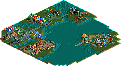
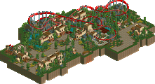
you're right that i found a texture/color mix that i like but i think thats where you being right ends. this is just one ride that i chose the texture/color for. and yes, i know the daredevil area doesnt really look like USF's marvel island but thats the thing i like about not making a recreation, i get to do whatever i want. look, right around the corner is the marvel you guys know:
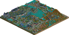
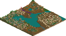
and right over a bridge is this:
i really dont see how im scared to try other textures/colors and how theres too much of it.
I'm just not getting the IoA vibe with this park. The rooftops are crowded with things the guests would never see. The clocktower is out of place. Perhaps the Marvel architecture is TOO cartoony, almost boring. I don't know, no offense, but even though you can slap brand names like Universal, Marvel Comics, etc., it doesn't really look like something Universal would do...
you're right that i found a texture/color mix that i like but i think thats where you being right ends. this is just one ride that i chose the texture/color for. and yes, i know the daredevil area doesnt really look like USF's marvel island but thats the thing i like about not making a recreation, i get to do whatever i want. look, right around the corner is the marvel you guys know:
and right over a bridge is this:
i really dont see how im scared to try other textures/colors and how theres too much of it.
I really don't see that either ,how you would be scared with such distinctive other areas around the corner already.
You just found a greatl texture/color mix and pulled it of excellently, so you would be nuts (sorry, you are already Yeshli2nuts ) to let yourself being talked out of that.
If I did not know better (read my words guys...eehm) I would get the impression some people are jealous and want you to make less nice things!!
Kudos on that beautiful part! i love it.
(oh...eh, that staircase should indeed better lead up to something I think)
I dont think anyone gets it really. Even though he is going for an IOA park, it dosent mean it has too look just like that. What we are seeing here is a parks name guiding our thoughts. If a recall, IOA does not have a dare devil ride, so maybe this is how it would look, you never know. He is mixing his own ideas up with Marvel chacters and an IOA park. It would get old for me to see the same IOA stlye for every IOA park. But in my case, not only do i see realism here, but a very high level of creativity. I find it great watching this park get a twist to it. Well done job.
-JDP
I dont think anyone gets it really. Even though he is going for an IOA park, it dosent mean it has too look just like that. What we are seeing here is a parks name guiding our thoughts. If a recall, IOA does not have a dare devil ride, so maybe this is how it would look, you never know. He is mixing his own ideas up with Marvel chacters and an IOA park. It would get old for me to see the same IOA stlye for every IOA park. But in my case, not only do i see realism here, but a very high level of creativity. I find it great watching this park get a twist to it. Well done job. -JDP
Great post. I agree 100% with you. Very creative, and to be honest, if IOA did have a Daredevil ride, this is what I imagine it would look like.
Guestking bob
Offline
The rooftops are crowded with things the guests would never see.
yeah... um the guests might not see it but you do...
i totally agree with JDP here.
your work looks great, only one suggestion. in the entry area the ticket building looks out of proportion with the rest of the buildings.
1) Universal only decorates their buildings enough that any given guest would see their work. Look at Google Earth at Port of Entry. It may look like the facade of a seaside village, but the rooves are gray and flat.
2) Universal doesn't make huge buildings generally, just huge rides. As far as IoA Orlando goes, Dudley and JP are the only rides with large buildings, which they only used to hide the track until the big drops. Why spend more money when the park already spent a billion dollars?
^Who cares? This park is better than 'Islands of Adventure' or 'Port Aventura'. Of course the buildings are too big, because the walls are twice as talls as the guests. If you wanted to make it realistic, you'd have to have all your building floors be two to three height meters instead of four, and be an absolute wizard with every piece of quarter tile scenery. Why doesn't one of you start a realism guide? I hear all sorts of complaining about a park not being realistic enough, and every park is different. There is no ultimate realistic park.
327 Comments
X250 Offline
-X-
JDP Offline
-JDP
yeshli2nuts Offline
tracidEdge Offline
but it really is a nice screen.
Ge-Ride Offline
BchillerR Offline
On another note, I find it hard to believe that one Islands of Adventure park is enough to dictate what Universal Studios would or would not do in that type of park. Given, it's genuinely themed and pertains to the overall theme they're going for.
Edited by BchillerR, 22 March 2006 - 08:43 PM.
postit Offline
JKay Offline
Ditto.
For a marvel area, I'd expect more vibrant and cartoony textures as opposed the ones you chose; marble, or castle maybe? I'm also not keen on the dull red. I was hoping you incorporated some of the brighter reds into this area, but you obviously didn't.
Don't get me wrong though, thats a really great screen. I love the Daredevil sign with the flames. However, I'm just not convinced on the theme quite yet.
Titan Offline
zburns999 Offline
Richie Offline
Its completly up to you what to do about it, and if you like this keep it, but if you are to improve your parkmaking this is where you need to change.
yeshli2nuts Offline
and right over a bridge is this:
i really dont see how im scared to try other textures/colors and how theres too much of it.
Shamu Offline
Emergo Offline
I really don't see that either ,how you would be scared with such distinctive other areas around the corner already.
You just found a greatl texture/color mix and pulled it of excellently, so you would be nuts (sorry, you are already Yeshli2nuts ) to let yourself being talked out of that.
If I did not know better (read my words guys...eehm) I would get the impression some people are jealous and want you to make less nice things!!
Kudos on that beautiful part! i love it.
(oh...eh, that staircase should indeed better lead up to something I think)
JDP Offline
-JDP
Valp Offline
zburns999 Offline
Guestking bob Offline
the guests might not see it but you do...
i totally agree with JDP here.
your work looks great, only one suggestion.
in the entry area the ticket building looks out of proportion with the rest of the buildings.
Shamu Offline
1) Universal only decorates their buildings enough that any given guest would see their work. Look at Google Earth at Port of Entry. It may look like the facade of a seaside village, but the rooves are gray and flat.
2) Universal doesn't make huge buildings generally, just huge rides. As far as IoA Orlando goes, Dudley and JP are the only rides with large buildings, which they only used to hide the track until the big drops. Why spend more money when the park already spent a billion dollars?
Just my two cents...
Ge-Ride Offline