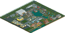
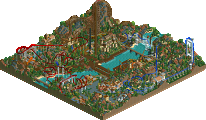
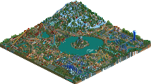
Ahh, these aren't things that you just cram in in 20 seconds to get better comments. I've been there and done that many a time myself and trusts me, it doesn't work. The new trees look bad IMO, the type you used looks awful and there's too many of them; not placed strategically enough. The buildings are a little bit better I suppose but they all look too similar. You need to learn how to put genuine, real thought into buildings. It's not something you can change in 20 seconds, I'll tell you that much.
Ahh, these aren't things that you just cram in in 20 seconds to get better comments.
are or aren't? or are you being sarcastic?
The new trees look bad IMO, the type you used looks awful and there's too many of them; not placed strategically enough. The buildings are a little bit better I suppose but they all look too similar. You need to learn how to put genuine, real thought into buildings. It's not something you can change in 20 seconds, I'll tell you that much.
20 seconds? you think i did that in 20 seconds? i had rct2 open for quite a while today trying to fix up the area. i also tried using a few differant types of trees (including the type wme was talking about) and i think the kind i used look the best. if you think they look aweful, well then its a good thing this isnt your park. the buildings look to similar? well besides for the obvious colors, each one has a distinct wall texture, shape, and outer design. if they were any less similar, the themed section wouldnt come together.
i normally dont act this way towards other people's comments about my work but the way you said that i didnt put time into it when you have no idea how much i actually did, kinda ticked me off. for anyone else, let the constructive criticism come.
are or aren't? or are you being sarcastic? 20 seconds? you think i did that in 20 seconds? i had rct2 open for quite a while today trying to fix up the area. i also tried using a few differant types of trees (including the type wme was talking about) and i think the kind i used look the best. if you think they look aweful, well then its a good thing this isnt your park. the buildings look to similar? well besides for the obvious colors, each one has a distinct wall texture, shape, and outer design. if they were any less similar, the themed section wouldnt come together.
i normally dont act this way towards other people's comments about my work but the way you said that i didnt put time into it when you have no idea how much i actually did, kinda ticked me off. for anyone else, let the constructive criticism come.
Actually, those two identical 2x2 buidlings have exactly the same color AND wall texture, shape, and design, so you are actually wrong on your statment, "each one had a distinct wall texture, shape, and outer design", because those two buildings are exactly the same. What CF is basically saying is that the buildings look as if little to no thought was applied to the structure of the buildings. How could you say that architecture took a long time to develop? The buildings are way too underdetailed and need some more creativity put into them.
Actually, those two identical 2x2 buidlings have exactly the same color AND wall texture, shape, and design, so you are actually wrong on your statment, "each one had a distinct wall texture, shape, and outer design", because those two buildings are exactly the same.
I personally find the screen very appealing. Its nothing overdone, but its still detailed enough to keep the viewer interested. The only thing I can complain about is the height of the buildings. To me, four or five stories is a little much. It kind of ruins the quaintness and makes it feel more like a city metropolis rather than an amusement park with a warm atmopshere. But nonetheless, its still a great screen. I especially love how each building has a specific purpose and are not just arbitrary structures. Can't wait to see more of this park.
It kind of ruins the quaintness and makes it feel more like a city metropolis rather than an amusement park with a warm atmopshere.
if thats the case, thanks a lot because thats exactly what im going for. i dont know if you've ever been to IOA, but walking through the park, you do not get the feeling of being in an amusement park. when you walk through marvel superhero island, it actually feels like you're inside the cities that the comic books take place in. just look at this picture - http://www.ioacentra..._twenty_six.jpg
thanks for the comments jkay, its nice to read something good.
I like this screen a lot. Very fresh colours and shapes that indeed give me a real cartoony feeling. So, very good job to achieve that!
I do not think the buildings are very, or too, huge either, in fact just the right height to give the feeling of "large" buildings, without being really high. (may be that is because I am not such a huge fan of the elf-sized buildings that are admired here -though some can be cute!)
Indeed I thought that the yellow building was one building, but only because of the small interlacing sun-shield. May be you could make one or some more (small/subtle) connection-pieces in between them to strenghten this idea.
I don't think the people get what you are trying to do. Or, maybe I'm wrong. But I think you are trying to make them cartoony as in the real IOA. I have been to IOA, and thats how the buildings look like. They are cartoony, and not supposed to have huge arches with waterfalls and tons of marble and brick on each side like most people want them to look like obviously. I for one like this screen, although I think you should change that tree that you have into a darker shaded one.
i normally dont act this way towards other people's comments about my work but the way you said that i didnt put time into it when you have no idea how much i actually did, kinda ticked me off.
Well I'm sorry if it came out that way. I never mean to be THAT extreme in my criticisms, it must've been 'cause of the shitty mood I was in yesterday. I still though have the right to say that I personally would like to see more detail in it. But yeah, next time I'll be polite at least...
*Color Scheme: Add some pastel tones in with the bright, cartoony colors.
*Building Detail: Maybe use the 1/8th tile blocks to add some vertical lines to the yellow building...
*Building Shape: Try an L-shape, or a stepped tower. Take a look at some real-life Art Deco buildings, and take form ideas from them.
327 Comments
Shamu Offline
CoasterForce Offline
yeshli2nuts Offline
20 seconds? you think i did that in 20 seconds? i had rct2 open for quite a while today trying to fix up the area. i also tried using a few differant types of trees (including the type wme was talking about) and i think the kind i used look the best. if you think they look aweful, well then its a good thing this isnt your park. the buildings look to similar? well besides for the obvious colors, each one has a distinct wall texture, shape, and outer design. if they were any less similar, the themed section wouldnt come together.
i normally dont act this way towards other people's comments about my work but the way you said that i didnt put time into it when you have no idea how much i actually did, kinda ticked me off. for anyone else, let the constructive criticism come.
][ntamin22 Offline
and 1 spidey > 2.
Jazz Offline
Actually, those two identical 2x2 buidlings have exactly the same color AND wall texture, shape, and design, so you are actually wrong on your statment, "each one had a distinct wall texture, shape, and outer design", because those two buildings are exactly the same. What CF is basically saying is that the buildings look as if little to no thought was applied to the structure of the buildings. How could you say that architecture took a long time to develop? The buildings are way too underdetailed and need some more creativity put into them.
Edited by Jazz, 21 November 2005 - 07:52 PM.
yeshli2nuts Offline
wow, i thought most people would realize that it is actually ONE building. something like this - http://www.ioacentra...d_area_nine.jpg
tracidEdge Offline
Evil WME Offline
Wicksteed Offline
Steve Offline
JBruckner Offline
JKay Offline
I personally find the screen very appealing. Its nothing overdone, but its still detailed enough to keep the viewer interested. The only thing I can complain about is the height of the buildings. To me, four or five stories is a little much. It kind of ruins the quaintness and makes it feel more like a city metropolis rather than an amusement park with a warm atmopshere. But nonetheless, its still a great screen. I especially love how each building has a specific purpose and are not just arbitrary structures. Can't wait to see more of this park.
yeshli2nuts Offline
if thats the case, thanks a lot because thats exactly what im going for. i dont know if you've ever been to IOA, but walking through the park, you do not get the feeling of being in an amusement park. when you walk through marvel superhero island, it actually feels like you're inside the cities that the comic books take place in. just look at this picture - http://www.ioacentra..._twenty_six.jpg
thanks for the comments jkay, its nice to read something good.
Dark-Daxter Offline
Emergo Offline
I do not think the buildings are very, or too, huge either, in fact just the right height to give the feeling of "large" buildings, without being really high. (may be that is because I am not such a huge fan of the elf-sized buildings that are admired here -though some can be cute!)
Indeed I thought that the yellow building was one building, but only because of the small interlacing sun-shield. May be you could make one or some more (small/subtle) connection-pieces in between them to strenghten this idea.
Keep it up, I am looking forward to more
Zooby Offline
CoasterForce Offline
Well I'm sorry if it came out that way. I never mean to be THAT extreme in my criticisms, it must've been 'cause of the shitty mood I was in yesterday. I still though have the right to say that I personally would like to see more detail in it. But yeah, next time I'll be polite at least...
trav Offline
Alpengeist Offline
ACEfanatic02 Offline
*Color Scheme: Add some pastel tones in with the bright, cartoony colors.
*Building Detail: Maybe use the 1/8th tile blocks to add some vertical lines to the yellow building...
*Building Shape: Try an L-shape, or a stepped tower. Take a look at some real-life Art Deco buildings, and take form ideas from them.
-ACE