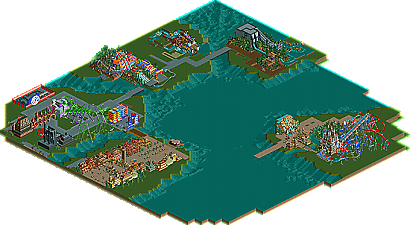
Absolutely MUCH nicer than your first screens.! Good work. I like the colours, as long as they will not be the only colours in the whole park.
I agree with Inversed on the ticketboots being out of proportion. Ticketboots normally are not that huge, but maybe they should be positioned elsewhere in the screen then, to make it more "fitting together", they look so lost now, with the path going around them.
It doesn't really look as if you're realising a vision you've had in your head, kinda looks a bit thrown together. Of course, thinking about it, how could I possibly know what "visions" you're having? That's just the vibe I get.
^Exactly my thoughts.
Interesting. The ticket booths aren't working at all with the rest of the screen, thier much more elegant and simple while the rest is heaps of jumbled 1/4 tiles, confused textures and sceanery. I don't know how you do it but you always manage to make whatever you're building look disorganized. It just lacks consistancy, solidity, structure. The changing colors and textures in the buildings would be fine with floorplans that seem thought out or the heaps of plants and other bits piled everywhere. And I agree with Tracid on the custom hedges and the spiril tree (over on the left), such silly custom folidge doesn fit here. Basically you seem like the mass of Foozy immatators right after he first released a screen or two of that never ending park of his. Of course he's still better, his architecture is planned, his theming is thought out and he incoorporates rides.
Sorry if I sound really negitive, I admit that I respect a lot of what you're doing with the color changes from building to building and such but the whole product just comes off as a mess for me.
How about you use those double windows that look almost exactly like the ones on XF's walls. That way you won't be able to see through the walls and the building will seem more realistic.
yeah but for like a simple small sky scraper building, theres nothing to really detail. and yeah i agree with the spider man. and why does there have to be another Halk? ones enough, use a different super hero.
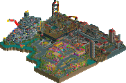
Now i like this, the buildings are simple but effective. And the simplicity really gives off that 'comic' cartoony feel to it. I like the Spidermen climbing up the building, however i would remove one- im pretty sure there was only one spiderman.
yeah but for like a simple small sky scraper building, theres nothing to really detail. and yeah i agree with the spider man. and why does there have to be another Halk? ones enough, use a different super hero.
use a different superhero. i qoute myself in saying, "Captain america, Iron man, heck, even freakin' NAMOR! just not another hulk!"
Like Iceman said I think the buildings are lacking some detail. Do something with the walls to make them more interesting. But you are improving, nonetheless.
It gives a bad name to the other IOA. On your first screens, ladders go to nothing. On the Marvel screen, two Spideys look bad; just have one. I don't know; it's just meh.
327 Comments
Carl Offline
The maroon, green and gold colors work well IMO
Keep up the good work
Emergo Offline
I agree with Inversed on the ticketboots being out of proportion. Ticketboots normally are not that huge, but maybe they should be positioned elsewhere in the screen then, to make it more "fitting together", they look so lost now, with the path going around them.
Ride exchanger, what does LOD mean?
Ge-Ride Offline
Emergo Offline
tracidEdge Offline
look, i just did it!
Ride6 Offline
^Exactly my thoughts.
Interesting. The ticket booths aren't working at all with the rest of the screen, thier much more elegant and simple while the rest is heaps of jumbled 1/4 tiles, confused textures and sceanery. I don't know how you do it but you always manage to make whatever you're building look disorganized. It just lacks consistancy, solidity, structure. The changing colors and textures in the buildings would be fine with floorplans that seem thought out or the heaps of plants and other bits piled everywhere. And I agree with Tracid on the custom hedges and the spiril tree (over on the left), such silly custom folidge doesn fit here. Basically you seem like the mass of Foozy immatators right after he first released a screen or two of that never ending park of his. Of course he's still better, his architecture is planned, his theming is thought out and he incoorporates rides.
Sorry if I sound really negitive, I admit that I respect a lot of what you're doing with the color changes from building to building and such but the whole product just comes off as a mess for me.
ride6
Xenon Offline
yeshli2nuts Offline
if you would read a few of my posts, you would see that the port of entry will not have any rides...just like the real IOA.
yeshli2nuts Offline
ChillerHockey33 Offline
Although Id go with only one Spiderman on the building...
Glad to see its still in progress!
-Ryan
Ge-Ride Offline
Highball Offline
JDP Offline
Rollercoaster FREAK Offline
X250 Offline
Nice job, this is looking good.
-X-
][ntamin22 Offline
use a different superhero. i qoute myself in saying, "Captain america, Iron man, heck, even freakin' NAMOR! just not another hulk!"
CoasterForce Offline
Shamu Offline
yeshli2nuts Offline
Evil WME Offline
(the trees that are dark green, short of shaped like the ones you have now but not tropical..)