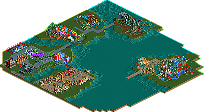
Park / IOA Hollywood

Park_2341 IOA Hollywood

327 Comments

  • yeshli2nuts%s's Photo
    no, I'm still alive. I took your comments and changed stuff. I don't have many pathing options to work with but I do think this looks better. I also toned down the blue (and now that I look at the pic, I missed a couple blocks)
    Posted Image
  • J K%s's Photo
    I must admit I thought the first screen was the best as it was the most believable.
  • Dotrobot%s's Photo
    Harry Potter Mosaics? Hip hip hooray!!
    Harry potter was one of my favorite parks ever.

    I salute you yeshli2nuts for building this awesome mess of colors which I actually gasped wow. But yeahh.. Damn you you gave me a heart attack, expect my hospital bill soon :lol:
  • nin%s's Photo
    Hmm, it's still not quite working. This path looks out of place and just makes the area clash. Those two buildings in the top right look a bit out of place as well, the textures and shapes just don't match the feel of the land.

    I know it seems like I'm just mentioning all the bad bits, but I really applaud you as you're trying out the theme, which is incredibly hard to pull off in RCT. You have however inspired me to try out the area in my IOA park. :p
  • Dotrobot%s's Photo
    Well nin don't you think it fits better then the screen before?
  • RCTMASTA%s's Photo
    Wait, this park is being built on again?! :D I was incredibly disappointed when the park was canceled/put on hold...the black brim looks kind of better than the white brim, though. The pink and turquoise building does not fit well at all, however.
  • Dotrobot%s's Photo
    Shame I thought there was a new update.
  • tdub96%s's Photo
    wow. Way to bump. I was excited...