Hmm, I like the station building I guess.. Only thing that bothers me is that original RCT castle tower in the middle on all sides.. I think you should try to keep it one style and make some custom towers instead of those RCT ones..
To detailise it more you could use some of those Toon castle 1/4 tile deco-kinda pieces if you know what I mean..
Alright, one more update of the castle (it will be the last, I promise). I took all of your comments and now the middle section is no longer symmetrical, the in-game castle pieces are out, and thel queue can now be seen comming out of the castle at two different points (its not just path for show, its actually part of the queue line).
This Wednesday morning I'm going back to Israel for the final two months of the year. I come back for good on June 12th, so until then, the park is going on hold again.
Its a one time year long program (Sept. to June). Its a thing a lot of Jews during the year between highschool and college. Theres lots of differant programs to chose from ranging from hardcore Jewish learning, army service, social working, traveling/touring, or taking college classes for credit. I'm doing a very relaxed Jewish topics learning program, its really great. I'm only home now for Passover/spring vacation.
Well I'm back from Israel for good and I finally just got some inspiration to open rct. I didn't do that much, just continued on around Dueling Dragons. Its been so long so I'm gonna show a small picture of the small amount I did. This is the outside portion of the queue line. One thing I like about the real DD queue is the outside part which is really well landscaped and gives some great views of the ride and near misses so thats what inspired this section.
(ps, give me some slack, its been a while since I've played )
Excellent queue interaction and theming. I think the landscaping could be improved as in some places it looks random and unrealistic, but overall i really like that screen.
Along with ^that:
-Your trees are very... oddly mixed
-That station looks GODLY
-The supports are great
-Try to use the ice vertical texture behind the waterfalls; it just looks more like a real waterfall IMO
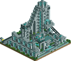
I think the station looks like a gaudy box. Make the footprint of the building into a cross and it will look better and more like a cathedral type building that you're going for.
wow, that is insanely detailed now. And I like how you offset the insanely detailed archy and foliage with wide open paths, nice balance. The shoreline seems alot less straight now. The path still seems alittle straight, but I can see how you wouldnt be able to change that now. I would just leave everything the way it is now if I were you.
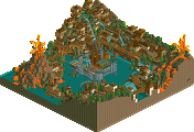
I really don't like the Dueling Dragons queue area. It seems like you landscape while you theme, which is not a good strategy in my opinion. Because seriously, that does not look like a natural, flowing landscape but rather flat land with a few juts in the ground and that the whole thing was an afterthought, which it was. Granted, it could be possible that the park added man-made hills, but I just don't think that's what you were going for or that that would even be too logical. The tree mix is also...juvenile? I don't know. Maybe there are too many 1/4 trees next to each other. I'll leave you alone on that screen because I know it was your first one since you've been back.
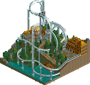
The Lost Continent screen is much better. On one hand, it is super cluttered, but on the other hand, I think that the composition is still nice with all the chaos. I would cut down on the arbitrarily placed trees in the middle of the path. The buildings have a nice bazaar feel, which is good, I guess.
Keep working at it. Maybe tidy up the Lost Continent a bit but it's your call, because as deanosrs said, it's proficient right now.
yeah the foliage needs a lot of touching up, the colors don't really work much for me either. that being said, i do appreciate the detail you put into the building. if you really want this park to be of any SRU quality though that foliage needs to be improved...just making everything look more cohesive.
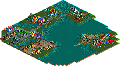
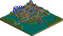
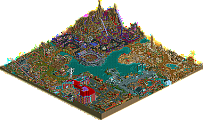
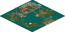
Well its been over 3 years since I started this park but I just never play RCT anymore so I'm sorry to disappoint everyone who wanted to see this finished but its not gonna happen. So here's what I got, its not much that you haven't seen in the pictures I posted but its something and IMO its the best work in RCT I've done. So enjoy: http://www.thrillnet...w.php?file=2911 (if someone knows a place where I can upload it where you dont have to be registered that would be nice)
Edited by yeshli2nuts, 24 December 2008 - 07:46 PM.
327 Comments
Six Frags Offline
To detailise it more you could use some of those Toon castle 1/4 tile deco-kinda pieces if you know what I mean..
SF
yeshli2nuts Offline
This Wednesday morning I'm going back to Israel for the final two months of the year. I come back for good on June 12th, so until then, the park is going on hold again.
][ntamin22 Offline
what's the purpouse of your visits?
yeshli2nuts Offline
Edited by yeshli2nuts, 09 April 2007 - 01:01 PM.
geewhzz Offline
yeshli2nuts Offline
(ps, give me some slack, its been a while since I've played )
Edited by yeshli2nuts, 08 July 2007 - 12:20 AM.
][ntamin22 Offline
Comet Offline
I don't usually like to see those type of supports but this is an exception.
eman Offline
Ling Offline
-Your trees are very... oddly mixed
-That station looks GODLY
-The supports are great
-Try to use the ice vertical texture behind the waterfalls; it just looks more like a real waterfall IMO
Edited by Ling, 08 July 2007 - 11:06 PM.
penguinBOB Offline
yeshli2nuts Offline
comments are welcome
Edited by yeshli2nuts, 16 July 2007 - 12:32 AM.
w33maniac Offline
deanosrs Offline
Carl Offline
postit Offline
The Lost Continent screen is much better. On one hand, it is super cluttered, but on the other hand, I think that the composition is still nice with all the chaos. I would cut down on the arbitrarily placed trees in the middle of the path. The buildings have a nice bazaar feel, which is good, I guess.
Keep working at it. Maybe tidy up the Lost Continent a bit but it's your call, because as deanosrs said, it's proficient right now.
Geoff Offline
Other than that I like what you have going on. I think a few more little stalls/kiosks would be a nice touch.
CoasterForce Offline
yeshli2nuts Offline
Edited by yeshli2nuts, 24 December 2008 - 07:46 PM.
nin Offline