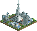
the awning in the upper right corner sticks out too much....but that's just a little thing. Overall it looks fantastic, I especially like the seeming steepness of the roof. And great use of the harry potter bridge at the entrance.
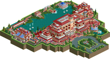
I think it looks too 'new' to look like something from lost continent. When I went there everthing looked crumbling, decaying, and like no one has been there in forever. This looks like it was built yesterday. It is really amazing, i love that waterfall on the building, but maybe make it look older. I really like it, even though it doesn't seem to fit the theme.
Going back a bit but I really think Fantastic Food would look so much better if the building had windows. I also think the Mythos resturant maybe has a little too much blue as the water and the roof seem to almost merge. I do love everything else though and I'm loving the sound of Marvel Superhero Island and I love the Hulks Tunnel.
I like that restaurant, although it looks kinda bulky, but I guess it's supposed to be like that because of the theme so heh. I'm not a fan of the light brown rooves, I mean, there's too much of that color. I like the way you made torches on the entrace, they are a nice touch.
Anyway, it's good to see this park is still going. Hope to see more from it soon. Keep us updated please.
It needs some hanging plants or ivy or something imo... just anything that is a different color than brown or blue on the building and it would have a more "lost" feel imo.... not sure if rct2 has any good plants to put on such steep sides tho... but maybe on some of the blue walls... the rest looks nice
I dont know if you've been to IOA but Mythos is quite a large building. And its not really a fine dining restaurant, its fine dining for an amusement park. The real Mythos has a lot more than 11 tables. http://www.islandsof....com/mythos.htm
Fine dining implies more than fancy food and an expensive meal. Not that it's fair to say that it's expensive anyway--everything in theme parks are expensive. And a $19 steak is pretty reasonable at those inflated prices...
I showed a picture of Dueling Dragons in the fiesta, but even if you already saw it, I took Metropole's comments and updated the screen. So here's the castle with a few changed details (and yeah, the queue goes a good amount up the building)
It's nice, not sure if I like the flames on top, it's a tad square at the moment too, but I like it. The supporting in the background looks nice as well.
Symmetry in a building rarely pans out well, you never stop to really inspect it because you know once you look at one part you have seen the rest. Symmetry in a square building that builds up works even less. I really think you would be better off redoing the castle and making it flow more. Make it have distinct parts rather than just a single mass. Towers, walls, a keep.... anything you can do to add interest because right now I see a lot of detail, but I really don't want to delve into it.
Yeah, that's exactly it. There's actually some really interesting parts to the structure, but you take one look and that's it, i don't feel the need to look over everybit incase i missed something.
I like the general feel of what you're trying to do though. Not sure about the flames, i do think fire should be included (no shit, one of the coasters is themed to it ) but not in the way you've used it. Maybe make some torches/lamps that could line the queue (the inside walls too, but we dont see them ) but not dominant features on the structure.
Also, i know you say that the queue is long leading up to the building, in true DD style, but i can't see much room for the queue inside the building itself. I think this is a vital part of the theming to Duelling Dragons, along with the well placed 'close encounters' throughout the ride.
327 Comments
Steve Offline
Genius638 Offline
dr dirt Offline
Alex Rider Offline
yeshli2nuts Offline
Genius638 Offline
Fisch Offline
Otherwise it's great!
Carl Offline
RCFanB&M Offline
I like that restaurant, although it looks kinda bulky, but I guess it's supposed to be like that because of the theme so heh. I'm not a fan of the light brown rooves, I mean, there's too much of that color. I like the way you made torches on the entrace, they are a nice touch.
Anyway, it's good to see this park is still going. Hope to see more from it soon. Keep us updated please.
][ntamin22 Offline
obvious improvement, though. keep up the good work.
Milo Offline
Midnight Aurora Offline
yeshli2nuts Offline
Kumba Offline
Also when I said add rapids I meant to replace ALL the water tiles, as they match the roves to much.
Midnight Aurora Offline
yeshli2nuts Offline
Louis! Offline
PyroPenguin Offline
Genius638 Offline
Lloyd Offline
I like the general feel of what you're trying to do though. Not sure about the flames, i do think fire should be included (no shit, one of the coasters is themed to it ) but not in the way you've used it. Maybe make some torches/lamps that could line the queue (the inside walls too, but we dont see them ) but not dominant features on the structure.
Also, i know you say that the queue is long leading up to the building, in true DD style, but i can't see much room for the queue inside the building itself. I think this is a vital part of the theming to Duelling Dragons, along with the well placed 'close encounters' throughout the ride.