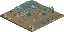
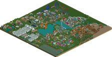
Park / IOA Hollywood

Park_2341 IOA Hollywood

327 Comments

  • postit%s's Photo
    I disagree. I don't like it. It could be so much more majestic than that. Sure it is close to the real thing, but it doesn't feel like the real thing.
  • Steve%s's Photo

    I disagree. I don't like it. It could be so much more majestic than that. Sure it is close to the real thing, but it doesn't feel like the real thing.

    Jesus, I was reading since the first JP screenshot he posted just waiting for someone to say that.
    Thing is, postit is right. Look at these pictures if you haven't, yeshli:

    http://www.universal...ADVENTURE16.JPG

    http://www.universal...ADVENTURE19.JPG

    http://www.universal...ADVENTURE30.JPG


    The entire building isn't just black and grey with some wood poles. There's access stairs, watch towers, everything. I know you are not actually doing a recreation of IOA in Florida but you could atleast take some of those ideas and incorporate them in your own ways. All I'm saying is that what you have there is okay-ish, but has the potential to be so much more. Good luck, dude. :)
  • yeshli2nuts%s's Photo

    The entire building isn't just black and grey with some wood poles. There's access stairs, watch towers, everything. I know you are not actually doing a recreation of IOA in Florida but you could atleast take some of those ideas and incorporate them in your own ways. All I'm saying is that what you have there is okay-ish, but has the potential to be so much more. Good luck, dude. :)


    Yeah, I have been looking at pictures of everything before I build it, plus I have ridden everything at IOA multiple times so I do know whats there. I did want to add a lot more detail into that small area but I didnt have much room. If you look at my first JP picture, there just isnt enough room for all that stuff like the stairs, watch tower, etc. I'll go back and make it bigger and add more stuff.

    http://www.universal...ADVENTURE30.JPG


    I don't know about you, but I think the second picture I posted is very acurate to that picture. Not to be cocky but I think I did a great job on that part. I also added a Jurassic Park symbol to the big building.

    As for the foliage, the look it has right now, is pretty much what im going for. The real ride is just a lot of jungle type bushes/trees: http://www.universal...RE/PB100100.JPG

    Everyone, thanks for the comments.
  • yeshli2nuts%s's Photo
    Just an updated picture of Jurassic Park River Adventure:

    Posted Image

    And on the original post, I put updated pictures of all the pictures that were shown.
  • eman%s's Photo
    Eh. Personally, I'd like to see the full-on JP logo with the yellow and all. Maybe that's just me though.
  • ACEfanatic02%s's Photo
    I gotta agree with eman here. The themeing is nice and subdued - like it should be, imo, but you've got to add some splashes of color in to draw attention. If this is the primary ride in the Jurrasic Park area, a big, colorful sign would really make it stand out.

    Also, you've got a nice flat roof to work with. Think of the kind of stuff up there - vents, HVAC's, perhaps? The detail on the roof of the lift is exceptional, but that same level of attention isn't paid to the larger roof (at least as far as I can see).

    The landscaping still needs work. Aside from the foliage (which looks a bit better) the actual land itself is a bit too rugged.

    -ACE
  • CoasterForce%s's Photo
    I like it, though some more vibrant colors should be added to the outside of the building, or some kind of 1/4 structure to make it look more interesting and break up the consistency if you know what i mean. also, the foliage seems sloppy and a bit rushed. nonetheless, i like the real immersion that you have going on there with the theme and the fencing system.
  • Segaman75%s's Photo
    I'm liking what I see so far. It does look a little too busy in some screens, but you've captured at least the essence of what IOA would look like. Maybe tone down the Port of Entry detail a little, and you've got something.

    Keep it up.
  • X250%s's Photo
    Hey thats pretty impressive. Only two suggestions to improve the screen; firstly make the atmosphere more dense by adding more foilage filling up gaps of land in the area. Secondly break up the path with a little shurbbery, fountain or something. Looks really cool though!

    -X-
  • RCFanB&M%s's Photo
    Nice...
    I agree with some previows comments...add some colors to attract attention...
    Anyway, the foliage is better than the previows one. Keep going.

    Edited by RCFanB&M, 30 July 2006 - 01:24 AM.

  • mantis%s's Photo
    I think it looks very impressive! And I quite like the jungle plants as they are. Nice to see the ride in action, too.
  • zburns999%s's Photo
    I agree, very impressive, and seems to fit in perfectly with the surrounding area, which was also nicely done. The only thing I'm unsure about (and I'm not sure if this was done to replicate the real JP ride) is the wooden structure in the bottom right corner. That looks a little odd to me but other than that, great work, especially those torches above the fence.
  • lucas92%s's Photo
    I really like this screen, specially the dinosaur touch. Are you sure that you can't put anything on the wall? Right now, it looks so plain in rct2, maybe some raillings?
  • Mike Robbins%s's Photo
    Don't worry about us both having IoA Hollywood parks! Their both very different. Yours looks great. A lot of detail. I'm not digging Marvel too much (Hulk's tunnel looks great though) but the rest looks fantastic.
  • thirstydeer%s's Photo
    To me, looks really impressive. If that large structure for the Jurassic Park ride can be spruced up a bit in terms of colour, it'd look that much better (especially, as mentioned above) if you could include the JP logo somehow.

    Perhaps add a little firestack if you have it on the first balcony over the boat drop where it comes out of the structure - just an idea.

    Anyway, regardless, it's better then what I can do. Looking forward to seeing more.
  • yeshli2nuts%s's Photo
    Its been a long time but I'm back from Israel and did a bit of work on the park. Its been 7 months so I was kinda rusty but I got back into it in no time. I went to do some work on the Lost Continent and started building Mythos, the fine dining restaurant. Heres the front of the restaurant:
    Posted Image
  • Kumba%s's Photo
    Thats pretty nice. The only id change is instead of the water tiles on the building use the 1/4 rapids so it looks more like it's flowing.
  • Gwazi%s's Photo
    I like it a lot. No suggestions, other than what Kumba said.
  • ][ntamin22%s's Photo
    yesss it's not dead. i'm finding it rather hard to tell whats water and whats roof. I mean, i can tell the difference, but the effect of the building having a waterfall on it is dampened by the fact that it doesn't jump out at you.
  • w33maniac%s's Photo
    Yet so simple and detailed. I like it a lot.