Park / IOA Hollywood
-
 16-September 05
- Views 31,627
- Downloads 568
- Fans 1
- Comments 327
-
1 fan Fans of this park
-
Download Park
568
-
Objects
385
-
Tags
inVersed Offline
inVersed Offline
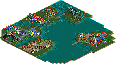
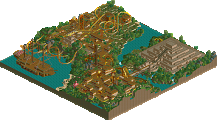
1) Inconsistency. Nothing seems to flow, it's just a large cluster of numerous textures and colors that don't work together.
2) Foilage. The foilage is subpar IMO, it's just the generic selection of tropical foilage. Maybe add some more whole trees in there, and nothing really seems to blend together.
However on a postitive note, there's definitely a cartoony feel as well as many water features, which sort of makes up for the negative factors a bit. Overall, it just looks as if it needs to be cleaned up and more organized, because nothing doesn't really flow.
~Jazz~
inVersed Offline
Looking forward to this one!
http://www.approcom....Adventure_1.JPG
ripsaw falls looks great, jagged rocks aside.
The foliage isn't all that good either. Put some thought into it, not just 'bush,bush,bush,tree,bush,bush'
-ACE
The foliage looks quite good. The ride is very similar to the real one.
inVersed Offline