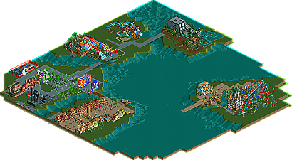
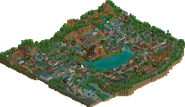
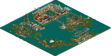
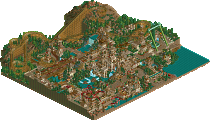
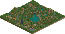
Park / IOA Hollywood
-
 16-September 05
- Views 32,814
- Downloads 584
- Fans 1
- Comments 327
-
1 fan Fans of this park
-
Download Park
584
-
Objects
385
-
Tags
Similar Parks
-
KnoxVegas
-
Disney's Imaginaria
-
Voodoo Loas
-
Disney's Beautiful World
-
Xuan Pu - a Chinese Myth
-
Rocky Mountain Mystique
Edited by yeshli2nuts, 31 May 2006 - 09:36 PM.
-X-
So good job, i wouldnt overuse the bright colours too much though it may ruin it, just now and then.
keep this going, its looking wonderfall
Definitely one my favorite screens of the park thus far. As mentioned, I love the bright playful atmosphere going on here. My only gripes would be some random-looking objects (i.e. those pots) and some iffy color choices, but otherwise this is stellar work.
Nice job Yesh!
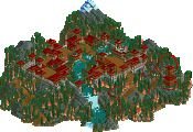
There's tons you could do with that in RCT. It won't be accurate because hey, show me someone who CAN do this sort of theme perfectly. But I mean, atleast in the real ride theres a set colorscheme, there's landscaping (fake mountains), trees, little signs everywhere. There's even a neat Mount Rushmore spin-off!
I'm not trying to say this negatively, I'm only trying to show that you could do so much more with it than just having a mountain of architecture in random colors. I think if you really went for it you could do it, probably just not exactly. And just for the record, I liked the older screen more, because the spanish roofs added some textures at least, the new one just seems so...flat? 'dunno.
anyway.
Everything about your Toon Lagoon, Yeshli, is so random. I don't really see a coherent style. I know it's supposed to be cartoons, but I don't see the connection between clashy crazy colors, mis-match architecture, and cartoons. Get a color scheme down, first and foremost; then work from there.
Can't a cartoon theme be aesthetically pleasing?
-JDP
Metro
You took all of the substance out of that screen.
Fatha' Offline
The second screen is ugly. The first one was better.
RMM Offline