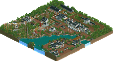
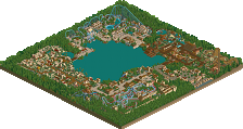
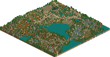
one park done, next park started. my new park is Islands of Adventure Hollywood. i really had fun building six flags colossal heights so i decided my next park will be a park that is similar in ideas. i chose islands of adventure because i will be able to do more theming and bigger and more elaborate buildings, while keeping the realistic atmosphere. and also like my last park, since this is will be a fictional IOA park, i will be able to pick and chose the parts i like from IOA orlando to put in the park, pick the parts i dont like to not put in the park, and add whatever i think fits that doesnt exist in the orlando park. heres what i got for ideas:
Port of Entry: arabian/mediterranean type architecture with shops and restaurants Marvel Superhero Island: Dr. Doom's Fearfall, The Incredible Hulk, Amazing Adventure of Spider-man, and more flat rides. Toon Lagoon: Dudley Do Right water coaster, Popeye and Bluto's Bilge-rat Barges and some kids interactive play areas. Jurassic Park: Pteranadon Flyers, a wooden rollercoaster, a dive machine (maybe), kids interactive area. Lost Continent: Dueling Dragons, flat rides, shows (probably Poseidon's Fury) Suess Landing: The Cat In The Hat, One Fish Two Fish Red Fish Blue Fish, Sylvester McMonkey McBean's Very Unusual Driving Machines, and Caro-Seuss-el
for now, i have the enterance area which is obviously in Port of Entry worked on. heres a picture of the enterance area, please leave some comments.
The ticketbooth looks very out of proportion and undetailed compared to all the enoromous, detailed surrounding buildings. It's detailed, yes, but it all seems very messy. I do like it though for some reason. Not very IOA, but still nice, you might wanna change the name like Aeroglobe advised.... I am liking this, especially to see how your older, more detailed style is back.
Not too bad, but there is something about it that just does not look right. Its very cluttered, and there are some objects that look slightly out of space (roman column, for example). But overall, looks like quite a nice start.
A note; when hacking objects onto paths, to avoid glitches put the objects down first then absolute clearance a path over them, i think thats the way its done... ask Kumba- he knows. Its important you get rid of those glitches though.
Anyway. I don't really like the screen at all. Way too much scenery crammed onto those buildings they seem to lose all meaning. It takes away the peaceful, relaxed, yet wonderful atmosphere the Port of Entry gives off. It just comes off as way too messy with scenery pieces that really aren't needed, I mean...why are there ladders leading onto another piece of rooving?
It just comes off as way too messy with scenery pieces that really aren't needed, I mean...why are there ladders leading onto another piece of rooving?
i was trying to make it like a busy marketplace. the things like the ladders and everything else that covers the buildings are there PURELY for looks. the real IOA does the same thing. look at these two pics http://www.ioacentra...ea_nineteen.jpghttp://www.ioacentra...twenty_four.jpg of course they arent as detailed as mine are but they did add on detail to make it look more like a marketplace. i know its messy, thats what i was going for. if you're not the one who likes this overly detailed type of look, wait for marvel superhero island, toon lagoon, jurassic park, and suess landing for the more organized stuff.
Where are the rides?
read my first post
Edited by yeshli2nuts, 20 November 2005 - 08:33 PM.
Yes, there are nifty details in those pictures, but they all make sense. It adds to the atmosphere. In your screens, it seems to pack as much scenery as possible into one square which really doesn't work a Port of Entry area...for me at least.
A note; when hacking objects onto paths, to avoid glitches put the objects down first then absolute clearance a path over them, i think thats the way its done... ask Kumba- he knows. Its important you get rid of those glitches though.
I got no idea about useing 8Cars to use zero clearance, I always use the SoB trainer, but what I find works best is you place the object, build the path, then if its not showing up right, place the object back over it again, then it should work, tho it mite not if theres another object right over it.
Screens look alright, kinda like fozzys old park meets Toon's IoA, just more messy in this case.
Sorry but thats not detailed, its a random mess of custom objects. EVERY single bit of the architecture has some 'detail'. It looks really tacky, and cluttered.
Yes, bit too much of different things together (textures, decorations etc. ) But if you are going for a messy look, ehh, well ..ok , you succeeded.
What worries me a bit is that I was sure I had seen this screen long before. Yet I know: it looks rather the same corner as around the Tilted Whirler in your Arabian times, only that was less messy.
Is that same look on purpose ?
I got no idea about useing 8Cars to use zero clearance, I always use the SoB trainer.
8cars has zero clearance!? You live an learn i guess...
Anyway, Steve has a point about the buildings looked like fancy pyramids. To me it does not create the market theme at all sorry, looks like an ancient scrapyard. To be honest, the building structures look like a fudge wedding cake.
crap i dont play RCT1 so i had no idea about that park. umm...maybe i'll change it to tokyo or something.
yeah, sure do. not only that ioah does already exist, it is also the best piece of rct work the world has ever seen. taking into account both rct1 and rct2.
so it owns this so badly words couldn't describe.
but change it to... "tokyo or something". shows how you don't give a shit about the location your park's set. i think the location plays an important role on the style of a realistic park. it's very interesting to see in how far surroundings influence a park. not for you, though.
327 Comments
yeshli2nuts Offline
Port of Entry: arabian/mediterranean type architecture with shops and restaurants
Marvel Superhero Island: Dr. Doom's Fearfall, The Incredible Hulk, Amazing Adventure of Spider-man, and more flat rides.
Toon Lagoon: Dudley Do Right water coaster, Popeye and Bluto's Bilge-rat Barges and some kids interactive play areas.
Jurassic Park: Pteranadon Flyers, a wooden rollercoaster, a dive machine (maybe), kids interactive area.
Lost Continent: Dueling Dragons, flat rides, shows (probably Poseidon's Fury)
Suess Landing: The Cat In The Hat, One Fish Two Fish Red Fish Blue Fish, Sylvester McMonkey McBean's Very Unusual Driving Machines, and Caro-Seuss-el
for now, i have the enterance area which is obviously in Port of Entry worked on. heres a picture of the enterance area, please leave some comments.
----------------------------------------------------------------------
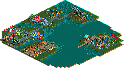
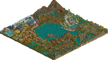
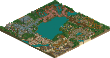
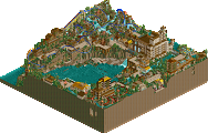
All pictures as of: 7/28/06:
Port Of Entry:
Marvel Island:
Toon Lagoon:
Jurassic Park:
Aeroglobe Offline
The main problem is that there's already been an IOA Hollywood. http://www.nedesigns...potlight&s=ioah
GigaForce Offline
inVersed Offline
yeshli2nuts Offline
X250 Offline
A note; when hacking objects onto paths, to avoid glitches put the objects down first then absolute clearance a path over them, i think thats the way its done... ask Kumba- he knows. Its important you get rid of those glitches though.
-X-
Metropole Offline
Anyway. I don't really like the screen at all. Way too much scenery crammed onto those buildings they seem to lose all meaning. It takes away the peaceful, relaxed, yet wonderful atmosphere the Port of Entry gives off. It just comes off as way too messy with scenery pieces that really aren't needed, I mean...why are there ladders leading onto another piece of rooving?
Metro
cBass Offline
yeshli2nuts Offline
read my first post
Edited by yeshli2nuts, 20 November 2005 - 08:33 PM.
Metropole Offline
RMM Offline
Where are the rides?
Hehe... .
Kumba Offline
Screens look alright, kinda like fozzys old park meets Toon's IoA, just more messy in this case.
Panic Offline
People need to browse the Spotlight page even if they don't own LL. At least to see screens and overview maps of the greatest parks ever built.
The screen looks all right, by the way.
tracidEdge Offline
also, a little too cluttered, blah blah, i have basically the same comments as everyone else. so yeah.
but i do like the ticket booth.
Steve Offline
Richie Offline
Emergo Offline
What worries me a bit is that I was sure I had seen this screen long before. Yet I know: it looks rather the same corner as around the Tilted Whirler in your Arabian times, only that was less messy.
Is that same look on purpose ?
Evil WME Offline
Uhmm.. i think it looks sorta nifty whaha.
X250 Offline
Anyway, Steve has a point about the buildings looked like fancy pyramids. To me it does not create the market theme at all sorry, looks like an ancient scrapyard. To be honest, the building structures look like a fudge wedding cake.
-X-
posix Offline
not only that ioah does already exist, it is also the best piece of rct work the world has ever seen. taking into account both rct1 and rct2.
so it owns this so badly words couldn't describe.
but change it to... "tokyo or something". shows how you don't give a shit about the location your park's set. i think the location plays an important role on the style of a realistic park. it's very interesting to see in how far surroundings influence a park.
not for you, though.