Park / Nagas
-
 17-May 04
- Views 7,594
- Downloads 834
- Fans 3
- Comments 18
-

-
 74.38%(required: none)
 Design

Liampie 90% Steve 85% alex 80% robbie92 80% G Force 75% Cocoa 70% geewhzz 70% Poke 70% Coasterbill 65% 5dave 50% 74.38% -
3 fans
 Fans of this park
-
 Download Park
834
-
 Tags
Tags
![park_2847 [PT4 R5] I Am the Elephant Seal](https://www.nedesigns.com/uploads/parks/2847/aerialt2500.png)
![park_2848 [PT4 R5] #DATCREEKYBRIDGE](https://www.nedesigns.com/uploads/parks/2848/aerialt2501.png)
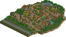
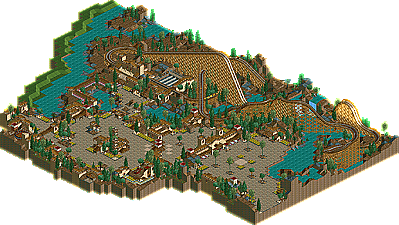
We bring to you two brand new NE Designs. Both are wooden coasters this time around. We have Posix making yet another appearance here with the absoultely brilliant "Nagas", and then Phatage makes his LL debut with "Fire Dragon". I'd like to thank everyone who submitted a Design even if it wasn't chosen....such as slob and deanosrs, the coasters were great too. Anyways, looks like Posix is doing his best to keep the LL spirit alive, and as Phatage emerges as a dual-threat in both games, it looks like he'll be wearing that Parkmaker title veeeerrryyy soon.
Posix's looks great, I love his work as much as Schussler's. That's a very good thing.
Phatage's is amazing, especially when you think that he's that good (or better) at RCT2.
You knew before how much I love your coasters and it's the same with this woody. Absolutely astonishing job.
Also, I have never had so much fun checking banners
Can't wait for new Phatage work.
Richie Offline
The best bit about phatage' was reading all those signs, especially the one about mantis, rofl.
Phatage - damn! You got me
Well done you two!
Nice job Phatage and Posix.
Aérôglòbe
Phatage.....you make me sick.
Incredible work, with a speed that makes you actually credible.
Posix - Great layout just like with RM, just it seems to have no "perfect" angle, however the layout is solid. i loved the simple theme with the baron areas, you can make so little look great and that takes skill
Im very happy to see Design's active again, i plan to chip in an entry of my own later this summer if i get the time.
I really liked the layout of the coaster and area. It was a little awkward for a single design to have a large entrance and such, and it would have definitely made a hell of an entrance for LOS. The architecture was good, and I liked the placing of the flats. You get better and better at the bare look each time you do it, yet sometimes I feel that your work is emmitting a far too similar atmosphere to your previous works. Although maybe some of your own past works aren't too much to your liking now, I wouldn't mind you taking a break from the naturalistic style that you have near perfected and did something like Infinitum again. Although I love Raindrop Riviera and Kronecraft grows on me every time I look at it, I feel that to much of even the greatest things can in the end still be too much.
I liked the layout of the coaster and its mix of hills and turns. The one thing I didn't like was the pacing. It started out going around mid 30's above every hill, then got th mid 20's, and then finished somewhere in the 30's. With wooden coasters, I feel that since their layouts are less restrictive in ways compared to steel coasters due to different restraint systems that the pacing has to be phrased. My favorite combination I've found is to have the coaster's pacing start somewhat slower yet still dazzling the riders because of the tall heights they would be at and then pick up gradually with unexpected hills/turns/maybe even a little trick track into a finale of some sort of either a couple of huge airtime hills or a great moment of laterals. The pacing on Nagas sort of felt like a run on sentence with emphasis put on wierd syllables. It still nonetheless would have been a great ride to ride in real life, for the best thing about woodies are that each one pretty much is unique in terms of pacing, and differences are a good thing. I hope that the release of our designs gives us enough motivation to finish our PT's.
Posix -- Another great piece of work from you, and while your stuff tends to not be my personal 'liking' in style, I enjoyed this design. Had a real nice feel to it, was really well done.
Phatage -- Geez, like everyone else said, amazing asian architecture, as well as amazing woodie. You've quickly become one of my favorite soon to be parkmakers here.
I'm glad the community has somewhat moved away from the whole 'build a hotel and I'm a parkmaker' era we were in for awhile. Now we're starting to see more creativity in parkmakers, expecially with more innovation rct2 players in Jkay and Phatage, as well as those still in LL (Phatage again).
Good times.
Phatage- Dig it. I think I may like this more than what we've seen of your rct2 for the fact that this had beauty. Something I feel SFWoE doesn't have hardly at all and Unfriendly Invader, pretty? Please. This was simply wonderful. It seemed so polished and shiny. I loved the layout too, it was excellent.
Although I must correct you (Phatage) on one thing: Clockwork Dreams did not have the first wooden coaster=asian roof things, it was Joe Hollands Asian Adventures as Coaster Ed will happily inform you.
ride6
and I like top theme designs..
Every day I'm just as surprised Phatage's parkmaker page isn't up yet, lol.
Posix' coaster/entrance area didn't quite impress me as much. I found it pretty boring, brown and unoriginal. I can see what you were going for, I think, and I understand how it wasn't supposed to be a Design but part of a larger project, but I've seen too much of it lately, sorry.
Technically, it was great, but personally, I didn't like it much.
Maybe I should try sending in something, could be fun. Just need ideas
From what I've seen, I think Posix makes the best entrances around, in terms of layout and such.
The coaster wasn't too bad either
Surprisingly, I liked Phatage's too. The Chinese atmosphere was the best I think I've ever seen.
Such a hard theme too.
Congratulations to both and thanks for the great LL designs.
Thanks to iris as well for taking the time to post them.
You crack me up, phatage... I liked both designs, a bit odd for both to be oriental themed. I loved comparing the nuances associated with the theme, very interesting, both fairly original in pulling it off. I think Fire Dragon was the better coaster, but Nagas definately had a better/more original name.
Voted 100% to make it go up.
I'll check the design too.