Park / Helios

Park_233 Helios

18 Comments

  • iris%s's Photo
    Posted Image

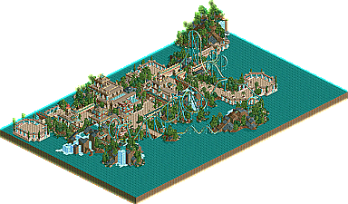
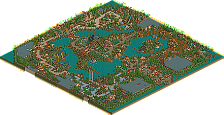
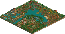
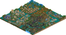
    Helios by Kevin

    With the outstanding cast of New Element Parkmakers currently on staff....with big names like Mala, Toon, cBass, Foozy, sacoasterfreak, Corkscrewed, Phatage, Butterfinger, aero21, WME, Meretrix, x-sector...and now John and slob, you would guess that the most creative stuff comes from there, right? Well, I must admit, our current RCT2 parkmaking line-up is untouchable, but there is a new wave of upcoming, unproven parkmakers that are really putting their stamp on things here on New Element. Led by the two newest parkmakers, slob and John, and including the revolution of parkmakers such as DarkJanus, voodoo, Metropole, and the person we're here to talk about...the mysterious Kevin. His screens have taken over the Advertising District. He's drawn comparisons to Foozy...only he builds more often. His skills are undeniable, the only question from this point is his work ethic. Will he be the next in a long line of inactive prospects? Or will he be the next big thing at New Element, taking the RCT2 scene over by storm and blessing us with his absolutely breathtaking theming and architecture in his every project? In my opinion, there is no in between with Kevin...he's either destined for the top of the list, or the very bottom. The talent is there, but the drive and determination is still to be determined....where do we go from here?
  • rK_%s's Photo
    Downloading Now.
  • MightyMouse%s's Photo
    Muahaha, he's on my H2H3 team!

    Oh wait, wrong forum :p

    GO EYEKONS!
  • rK_%s's Photo
    Ok, The Coaster was nice and so was the themeing, On some elements it was a little slow but the overall design was original and well placed, The architecture was nothing special in my eyes, not enough textures for an area with such a landscape.

    7/10
  • Turtleman%s's Photo
    The theming was good, the coaster, not good.

    The use of boosted lift hills to make it go faster, the flat turn after the brakes, the really long flat track underground are examples of what made this ride bad. The ratings are also not good, and that usually ticks me off.

    But overall it was good. The theming is really the best part of it.
  • cBass%s's Photo

    The use of boosted lift hills to make it go faster, the flat turn after the brakes, the really long flat track underground are examples of what made this ride bad. The ratings are also not good, and that usually ticks me off.

    But overall it was good. The theming is really the best part of it.

    I agree with Turtleman. Except for the turn after the brakes, I didn't mind that.

    The map looks great, but it seems like I've seen that type of thing a lot.
  • deanosrs%s's Photo
    Very nice, apart from the end section of the ride, after the two corkscrews on it seemed a bit artificial, like you were just finishing the ride off and that track served no other purpose. Actually, I don't think you build with the same detail level as foozy at all, not a criticism, just something I noticed. Still, it was excellent and PoD is certain to parkmaker-ize you, if you finish it.
  • tijlovic%s's Photo
    Scenery is wonderful, coaster is awful. Those stats really aren't good at all. Do something for the negative g's and the amount of inversions and it would be a lot better.
    Just my opinion...
  • Dixi%s's Photo
    On close inspection, I can tell this is you're first release, other wise it looks all good and pretty. The coaster and theming skills are obviously there, I was impressed by some of the theming, other parts just looked a bit rushed and plain. The coaster was good, its nice to see unique yet solid designs.

    There are alot of little things which bug me, nothing really major, but I just feel it looks a bit rushed in parts. Firstly the boosters are a big no-no for me, I can understand their importance, but they bug the hell out of me. Also some of the rapids track used for water tunnels were left white, changing them to aqua makes them look so much more natural, also, I found a random waterfall floating around in mid air just after the 2 corkscrews, if you rotate the camera so its facing the station from the corkscrews you'll find it. One of the things which I thought was odd (and made me think it was rushed) was that I clicked on the message tab and I could see loads of old messages still thur, also, no entrance note for when you opened the park.

    But like I said there only minor things, over all I thought it was a good entry. Well done! :)

    Edit: Thought the landscaping was brilliant btw.
  • Ride6%s's Photo

    The use of boosted lift hills to make it go faster, the flat turn after the brakes, the really long flat track underground are examples of what made this ride bad. The ratings are also not good, and that usually ticks me off.

    But overall it was good. The theming is really the best part of it.

    I agree with Turtleman. Except for the turn after the brakes, I didn't mind that.

    The map looks great, but it seems like I've seen that type of thing a lot.

    I agree completely with these two. The archetecture was beautiful IMO, it could've used another color or texture or something but the form and such was perfect. The custom supports were very, very nice too.

    ride6

    ps- Was it really nessary that the Halios have 9 inversions. That's what killed the ratings.
  • posix%s's Photo
    what is it? a spotlight? a runner up?
    and you must excuse me, i currently do not have rct2 installed.
  • Kumba%s's Photo
    Its a Design.

    Nice stuff Kevin, just the coaster needs to make its rateing, nice archy tho

    6.5/10 (yeah the rateing lowers it alot for me)
  • Jacko Shanty%s's Photo
    This was quite good. It's a shame about the stats, because I really liked your layout. The architecture was very nice and elegant. I like the scale you build in - very nice and big, unlike how others build who are often placed in your category which is with small little buildings scattered everywhere. Your supports were nice.. I think they might have looked better if you made the bases grey instead of teal. I didn't care for the waterfalls so much, though. Probably because of all of the rapids you made under them. I don't really like to use ice under waterfalls either (although it works in some cases.. just not here). One last thing.. one of the main things that sort of killed the atmosphere for me was the music. It was quite depressing.

    But anyways, good job and congrats on the design. Hopefully this will inspire you to get PoD in gear. :)
  • Zephyr%s's Photo
    Very nice design, but it's a little backwards to me. I liked the coaster, but the bad ratings and boosters brought it down for me. Everything else about the map was great. The emphasis seemed to be on the architecture instead of the coaster. RCT in general is going this way, but for a design I figured the coaster would be more important.

    Regardless, good work and congrats on becoming a parkmaker.
  • w33maniac%s's Photo
    It was good, but thats it.
  • natelox%s's Photo
    It's nice to see a newcomer to RCT(2) that has such potential. Judging by the screens you've posted in the Ad District of your upcomming park, you may have a winner. I will say however, that I'm not so much a fan of this. A lot of it is (seemingly) heavily inspired by SACoasterFreak's, "Rivers Of Babylon". The roller coaster itself lacks a awe-inspiring layout and it's speed is close to agonizinly slow in some spots. The supports were quite nice I must say. They were definetly the brightest spot of the roller coaster. The architecture has some bright spots, but the large, flat, matte roofs aren't working. I know you're going to be a great addition to NE, but I wouldn't say this is the greatest thing I've ever seen.
  • Toon%s's Photo
    Other than the obvious coaster faux pas's, this design was very nice. There was lot's of nice detail to enjoy. What I think you need to work on most would be developing a style that is truly all your own. What I see you doing right now is absorbing all the good ideas you see in the ad destrict and merging them together into your work. I doubt your doing it on purpose, most likely just a subconscious thing. That is fine, but I really want to see your personality come thru in your work. The best parkmakers out there aren't scared to explore their own ideas and create their own unique looking work. If you can find that something special, your skill will propel you to the elite in no time.
  • mantis%s's Photo
    I enjoyed it, but not a moment goes by when I don't wish you'd return to the audacious styles of your old Atlantis park. That was stunning, and (I expect) would have been much more satisfying that this design.

    Saying that, I loved the architecture, especially the flat roofs wrapped around the midriffs of some of the buildings.

    On reflection, I find your latest Atlantis screens just as wonderful as the old ones, so I take exactly what I wrote up there back. However, the sentiment remains the same...those golden, mindbending structures you were making really did make me take notice.

    Congratulations on your parkmaker spot too - I look forward to PoD with baited breath.
  • Panoramical%s's Photo
    Holy shit. This has to be one of my favourite coasters so far. I mean everything about it is just so perfectly intertwined and esquisite. I love it to bits. Btw. Kraken is a far better username than kevin!