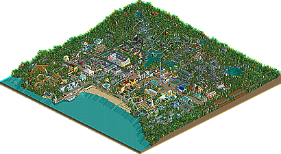
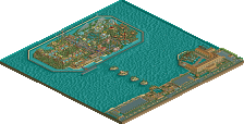
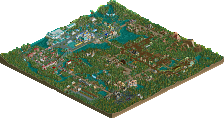
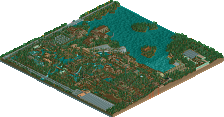
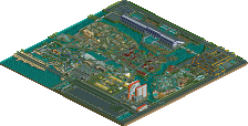
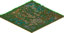
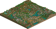
I really enjoyed this park which I hope was reflected in the readme. It's a one-of-a-kind, really, and although the coasters weren't entirely my cup of tea, I managed to skirt round that and enjoy the main focus of the park - the buildings! Well done to Mama Bear, Mike and Roger on another VP winner, and hopefully you (Mike) can use this as inspiration for more projects, because we certainly don't want you to stop!
I just looked at the park.
I liked it alot some good coaster layouts the wooden was my favourite the only section i wasnt to kean on was the medival area but otheriwse the rest was good.
nice park,
Notice how he links to the VP page rather than the actual download...
Mmm anyway, I find the architecture blocky at times, although I do like the colours. The coasters are meritable also.
Notice how he links to the VP page rather than the actual download...
Ah of course. It'd be far too much to ask for you to read the walkthrough I spent quite a while writing. Far too much to ask you to perhaps take a few minutes out of your incredibly busy schedule to take a look at what the site has done for the park.
Very nice and sort of refreshing park, though I agree with mantis about the coasters, the yellow one and the suspended really cluttered the otherwise beatiful theming. However, the smaller, red coaster that went in and out of that building was really cool and there was nothing wrong with the dueler and the woodie.
The architecture, as well as the enviroment and atmosphere of the park as a whole, was the strongest parts, with each building and garden being unique and colourful but still realistic and accurate (some was more beautiful than others though). All the little details like the castle ruins in the forest, the Welsh naming and such made the park very alive.
Good job
^ Never knew you were Dutch. Cool...... I still haven't been to Amsterdam though (plan to go sometime in 2005).
come by sometime. since three days, i live in amsterdam =).
i liked the park. The duellers (although some ugly scenery) reminded me somewhat of busters.. wasn't that in a corky park? anyways, they had the same colors i think and the same feel to them. Basically i liked all the colorful archy but despised the castle... And what's up with the weird names? I liked the station of "Yr Uncorn - 2000 Vekoma" the most.. but don't you mean unicorn?
113 Comments
Mike Robbins Offline
And thanks to Mantis for a great review.
Will a mod please pin this topic.
mantis Offline
Leighx Offline
I liked it alot some good coaster layouts the wooden was my favourite the only section i wasnt to kean on was the medival area but otheriwse the rest was good.
nice park,
Panoramical Offline
Mmm anyway, I find the architecture blocky at times, although I do like the colours. The coasters are meritable also.
mantis Offline
How silly for me to even think you could do that.
Panoramical Offline
KaiBueno Offline
Please...
Nice walkthrough mantis on a "different" park that turned out wonderfully.
RCTM is on a roll...next stop: The Art Gallery!
Bueno.
Panoramical Offline
Mike Robbins Offline
mantis Offline
Janus Offline
The architecture, as well as the enviroment and atmosphere of the park as a whole, was the strongest parts, with each building and garden being unique and colourful but still realistic and accurate (some was more beautiful than others though). All the little details like the castle ruins in the forest, the Welsh naming and such made the park very alive.
Good job
Evil WME Offline
i liked the park. The duellers (although some ugly scenery) reminded me somewhat of busters.. wasn't that in a corky park? anyways, they had the same colors i think and the same feel to them. Basically i liked all the colorful archy but despised the castle... And what's up with the weird names? I liked the station of "Yr Uncorn - 2000 Vekoma" the most.. but don't you mean unicorn?
Mike Robbins Offline