Park / Portmeirion Village
-
 01-July 04
- Views 13,149
- Downloads 717
- Fans 0
- Comments 113
-
 No fans of this park
-
 Download Park
717
-
 Objects
418
-
 Tags
Tags
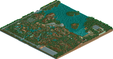
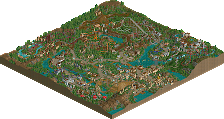
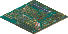
And thanks to Mantis for a great review.
Portmeirion Village
by Mike Robbins, Mama Bear, and Rwadams.
(flag of Wales. Wales is also known as Cymru in the Welsh language)
The first historical reference to Portmeirion was by Gerald of Wales in 1188: "We crossed the Traeth Mawr and the Traeth Bychan. These are two arms of the sea, one large and one small. Two stone castles have been built there recently. The one called Castell Deudraeth belongs to the sons of Cynan and is situated in the Eifionydd area, facing the northern Mountains."
Portmeirion Village is situated in north Wales in the United Kingdom. The site, located on the coast of the Snowdonia Mountains was privately purchased by Clough Williams-Ellis in 1925 for under £5,000. For over 50 years, he privately built this village with unique architecture designs and importing statues and artifacts from all over Europe and Asia. Most of the architecture is designed to look like an Italian village. The village now is open to the public for visiting and to stay at the sites hotel or in one of the many cottages. Though it is a full village, no one actually resides there.
I visited this village in January 2003 and was fascinated by it. Northern Wales is well known for its 1,000 year old castles and in the middle of it all was this 'new' 75 year old village. If anyone gets a chance, especially the many British in the RCT community ever gets a chance to visit this village, do it. You won't be dissapointed.
So when I returned to my home, I was inspired by the architecture to model a RCT park after Portmeirion Village. I began in early January 2003 doing some minor architecture and after a while, this project fell through the cracks. A few months down the road, I decided to start this park up again as an RCT Masters project. I decided to contact Kai. He liked the idea and liked all of the pictures I showed him, but he already had several park projects going on. I then contacted Mama Bear about it. She was interested so now she was in! After a while and more delays, we finally started this back up in the scenario editorto add in some more modern scenery. Also at the time, we brought in rwadams to be the third member of this project. We were under way after a year of delays.
This park isn't meant to be a recreation of the village. yes the basic map design is the same as the village and a lot of the building are recreated too. But to make this into a theme park, it isn't 100% accurate as far as building placement goes. This is a representation of the village. Some buildings we made from pictures and tried to replicate them... some are made up to go along with the theme. Either way, this is a very colorful park with the same type of interesting architecture as the village itself.
English is the primary language in Wales. Welsh is the old language of Wales and is the secondary language. The language is making a comeback and is being taught again in the public schools to try and separate ties with England. All road signs are billingual as well as signs around towns. More and more TV stations are also showing Welsh shows. In southern Wales, the old Welsh language is hardly spoken, but it becomes more fluent the more north you travel.
To make this park more interesting, I've decided to translate ride names and everything in the park to Welsh. Though it may not be 100% accurate of a translation, the basic idea is there.
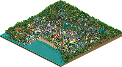
The first screenshot is of the coaster Neifion, which is Welsh for Neptune. The coaster is named after one of the cottages in the village.
Enjoy and comments are welcome.
As for the park, I don't know if I like it. There seems to be too much going on, with too many drastic colours everywhere. For a coaster named Neptune, there seems to be very little that has to do with the ocean.
The colors dont go at alk, the coaster stiks out awfully.
Sorry
Marshy
It seems like you people are missing the point to this park. Please read the description before tearing into it.
And here are a couple of websites about the village:
http://www.virtualportmeirion.com/
http://www.portmeirion-history.co.uk/
http://www.portmeiri...om/en/index.php
It's so realistic. the village looks very nice.
I agree with you Mike, I'm tired of all the tan coloured, TT-scenery everywhere style parks. But unfortunately, I don't see this as being the fix to that problem. Some things just aren't meant to be made into parks, and I think you are trying to build a theme which isn't compatible with the game. I think it's great you're trying though.
Maybe some different screens might sway some opinions here.
Cheers?
75% of this architecture isn't mine.
That's the challenge and the fun about this RCT project. (Uh oh, I said fun and RCT in the same sentence! You don't see much of that lately).
IT BUUUUURRRNNSSS.
i feel the same way about the park.
Rog
Coasterking2k Offline
From what i can remember.
like the original survivor stuff, only 10x's better.
I like it, but the layout of the coaster looks a bit iffy.