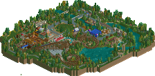
Park / CoYoTe

Park_2313 CoYoTe

23 Comments

  • Comment System%s's Photo
  • rct2isboss%s's Photo
    Shit Scotland this was amazing and you were so close. IMO the layout could of been better in some places.
  • Casimir%s's Photo
    Ah, damn, I thought this was a Design, got here via the Facebook page. Good work! Impressive to see how much you've improved.
  • ScOtLaNdS_FiNeSt%s's Photo
    Yeah man it was close :SA: Next time ;)
  • Liampie%s's Photo
    Very close. I think it could've scored over 70% if the layout was better. Next time get a strong layout before starting anything else and you'll win guaranteed. You're improving so fast! :)
  • posix%s's Photo
    Robbie and I talked about your entry on AIM, Finescot. Here's what I wrote.

    wow, certainly an improvement
    he's got good ideas. roto drop crashing into the roof was amazing
    also the coaster's entrance bridge with the track interaction
    he sometimes reminds me of 5dave a little

  • K0NG%s's Photo
    ^ Pretty much sums up my thoughts. I was really impressed by this...thought it was juuuuuust short of design because of the layout.
  • RCTER2%s's Photo
    I like this park. :)
    But I dont know how will you improve the layout.
    I just think that it's already a good design... :)
    So which factor will you improve?
  • ScOtLaNdS_FiNeSt%s's Photo
    cheers :)

    rcter2: I think it was the bit of the layout behind the lift hill that let it down the most, What am i going to do to improve it ... Nothing its all ready been released so it won't make a difference now :p

    I would also like to know why cp6 voted so high and why Airtime voted this 15% more than the 30% he voted for my first ever park on here.

    Overall i really enjoyed building this and thanks goes to Liampie for helping me along the way :mantis:
  • Levis%s's Photo
    well this maybe didn't made a accolade but it might got you some attention from captains for the h2h and improved your chance of getting into the h2h ;).
  • In:Cities%s's Photo
    Excellent job buddy!
  • Louis!%s's Photo

    Ah, damn, I thought this was a Design, got here via the Facebook page.


    High Five!!!!


    Anyway, I thought this was great, I think the surroundings could have been more inspired but still thought it was design worthy. I always had faith in you :p
  • ScOtLaNdS_FiNeSt%s's Photo
    Why thank you louis, The surroundings where supposed to be like part of utah-ish region except with foliage :p I obviously thought it should have been a design, I was gutted when it wasn't but hey thats life :) Hell of an improvement from 30% since my last design :D
  • Louis!%s's Photo
    The layout itselft was brilliant, there was only one spot that I thought wasn't too good. Just work on the surroundings and you'll get that design.
  • ScOtLaNdS_FiNeSt%s's Photo
    Let me guess the spot ? was it behind the lifthill lol
  • Louis!%s's Photo
    No lol, it was the horrible double down after the second turnaround.
  • ScOtLaNdS_FiNeSt%s's Photo
    Really, Wow. I thought that was quite a nice peice of the coaster with the coyote sign behind :p Plus it was over the main entrance to the square like a statement, Oh well :)
  • 5dave%s's Photo
    I quite liked this.
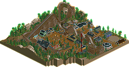
    I think you only need to work on the layout a bit (it wasn't bad, but it has room for improvement) and also on your general ideas. I liked some of the theming ideas (the crushed barn, the gallows on the square, the shootout and the show) but the overall wild-west theme is too generic nowadays IMO. If you look at wooden coaster releases, nearly every ride has a wild west theme and they all have similar ideas. I prefer more creative themes or at least generic themes with a twist. ;D

    What I liked most about this was the square and the ride placement around it. Added a lot to the atmosphere and it shows talent that you really build from a peep's perspective.

    Keep it up and I'm sure you will be picked at H2H!

    "MFG"
    PS: What parts did Liam do?
  • ScOtLaNdS_FiNeSt%s's Photo
    Thank you dave :) Liam did some landscaping executed the barnstorm idea perfectly i think, And built the corner building along with picking colours for stuff. The layout of the square was me and the shoot out was an idea of liam but i put it down along with the gallows and the rodeo arena.
  • BelgianGuy%s's Photo
    Keep refining, espescially the foliage was a little messy in places and get some more serious hacking skills to make everything cleaner so you have more options so you won't have to hide those ugly huts in buildings everytime...