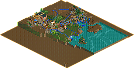
Okay so I didn't really like it that much. Here is why. The beginning of the layout made no sense to me what so ever. The landscaping (the little that was there) did not look so good. There was no main theme you were even trying to achieve in the first place. The second lift hill and drop were terrible. The two smaller hills going over the path looked silly. The one building with the red outlined arches looked good except you put in red windows. In essence, your layout had no flow, there was no theme and landscaping, and the architecture could have been better.
sorry, I always leave out bits of info.
anyways, the layout was just for fun wasn't anything set in stone & as for the landscaping it's suppose to have a rocky forest-y type feel if that makes sense?, but like i said it's unfinished. As for the buildings and such I kind of like them. Thanks for the criticism bossman
Outside the coaster I like it a lot actually. Reminds me of Turtle and Steve a little. I know you like them so that's not entirely a coincidence. Anyway, are you working on something else these days? Would love to see more by you. Apparently you've improved greatly since your bronze park.
7 Comments
Comment System Offline
Nokia Offline
there's a long back story as to why I'm not posting screens (computer issues)
enjoy, and yes it's unfinished
Attached Files
downloads: 209
rct2isboss Offline
Nokia Offline
anyways, the layout was just for fun wasn't anything set in stone & as for the landscaping it's suppose to have a rocky forest-y type feel if that makes sense?, but like i said it's unfinished. As for the buildings and such I kind of like them. Thanks for the criticism bossman
posix Offline
Nokia Offline
Liampie Offline
Nokia Offline