Park / Outlaw
-
 20-April 12
- Views 7,645
- Downloads 837
- Fans 1
- Comments 14
-

-
 67.31%(required: 65%)
 Design

CedarPoint6 85% Liampie 80% Wicksteed 80% wheres_walto 75% Airtime 70% Louis! 70% robbie92 70% Steve 70% Dimi 65% Maverix 65% RMM 60% tyandor 60% 5dave 55% BelgianGuy 55% JDP 55% 67.31% -
1 fan
 Fans of this park
-
 Full-Size Map
-
 Download Park
837
-
 Objects
295
-
 Tags
Tags
![park_3229 [MM2014 Final] Cavumus](https://www.nedesigns.com/uploads/parks/3229/aerialt2949.png)
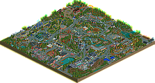
Overall an enjoyable design which would have been boarderline with me if I were to vote.
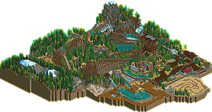
This design had lots of little things and ideas that really added charm to it; the people having a picnic in the mountains, the little queue buildings, the neat cabin near the river, the rock climbing wall, the caves in the mountains. And I loved the Wilderness Express and all the little details put in and around that ride.
However the station was too brown and chaotic. Also, your foliage was a little repetitive.
Aside from that, this was a very nice design and I can't wait to see upcoming work
Btw lovely logo, verti.
This reassures me of your skills, and I'm glad you're on the Replacements.
I have to say I really like the ride and the Shoot the Chutes. The Trestle style exit ramp was a nice touch. And hats off to the creator of that fabulous logo!
Criticisms I can think of have been noted already, but something I really liked was the station detail - the two bins for a rider's loose articles - that was cool.
overall quite a nice design. the architeture was OK overall, it certainly got the job done, and your foliage and realistic detailing are quite nice. the landscaping was really the highlight here.
Whitehawk Offline
Gratz on the first, and hopefully many to come
111112oo - Thanks, dude!
Xtreme97 - Yeah, I wanted to do some cool things with the foliage but there was just a lot of space to fill. Some parts of foliage were more carefully selected than others based on where people would really be paying attention. Glad you liked it, though!
nin - Yep, something went wrong very early on when I was building Iola and the peeps couldn't enter. I will be bringing peeps into all of my other creations hopefully, that was just a fluke.
Angroc - Yep, the railway was a big piece to this design, I thought. I had some really good interactions before I cut down the map, it was just too far out of the way to leave in unless I wanted a huge map for the design.
SoCalCoasters - Thanks!
CC9 - Yeah, stations or architecture just in general isn't my thing. I'm glad that somebody liked it though.
Cocoa - Yep, and that was the main focus. Thanks, bro.
Fizzix - I agree with all of your points. I really just wanted to get this the fuck out of the way. And I submitted it just before H2H was announced so it worked out great.
Whitehawk - Yep something happened and I couldn't get them in, otherwise I would've. Thanks, though!
chorkiel - Thanks, chorkles.
posix - Haha I figured you would like it, I too was disappointed you didn't get the opportunity to vote on it, you were one of the names I was waiting for.
Jazz - Thanks, means a lot.
Thanks to everybody that commented on this on the topic and thanks very much to Verti for the kickass logo, couldn't have asked for a better one.