Park / Beowulf
-
 24-May 07
- Views 4,049
- Downloads 658
- Fans 0
- Comments 14
-

-
 63.75%(required: none)
 Design

inthemanual 75% Liampie 75% geewhzz 70% Cocoa 65% MCI 65% 5dave 60% Fisch 60% Sulakke 60% csw 55% nin 40% 63.75% -
 No fans of this park
-
 Download Park
658
-
 Objects
257
-
 Tags
Tags


![park_3800 [NEDC4 1/15] - The Junkyard](https://www.nedesigns.com/uploads/parks/3800/aerialt3456.png)
Congrats RCFanB&M!
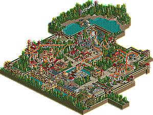
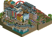
EDIT: Uhhh... wow? Dude, this is insane. The total amount of little details you put in these buildings is amazing, I'm wondering how long that took you. The coaster design was new, and a nice, fresh break from the usual designs. Supports looked a bit half-assed in some places, especially near the end. The go-karts were awesome, and reeeeally fun to watch. Anybody who has to follow this up is going to have to work pretty damn hard to beat this. Amazing work, dude. Now do a solo! And don't lose it this time!
Oh yeah, almost forgot... 700th post!
Edited by zodiac, 24 May 2007 - 05:51 PM.
The architechture was beautiful, filled with art deco class. The coaster itself, well, the colours aren't what i associate with Beowolf but they worked perfectly. The layout was a little shorter then i expected, but still, it was good. It all flowed well, and the general atmosphere was great.
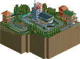
The go karts were crazy fun, glad to see some cool stuff like that.
Good job man, and good luck in the final!
-JDP
As for the design, here's my little review:
Design: Most important with designs imo, is the design itself of the ride.. The first thing I always do when viewing designs is pushing the buttons 1 and 4 on my keyboard to see what the design actually does without camouflage.. I thought it was a good design, although not super-amazing.. A couple of things bothered me kinda, like the double drop after the lifthill.. I always like a large adrenaline pumping start of a coaster after you have lifted up from the station.. Other things on the design that I noticed were the elements (2 vertical loops, 2 corkscrews, 1 dive loop, 1 barrel roll) what could be a personal pet peeve, but I like the largest/most intense element to be right after the lifthill.. Nothing big though.. Like others said, the transfer track isn't functioning, which is a pity (or I just can't figure it out
Pacing; Overall pretty good, although it's going slightly too fast through the 2 corkscrews, and too slow in the helix after that.. Rest of the lay-out flows well..
Architecture: This is you strongest point imo.. Nice use of the 1/8 and 1/16 tile architecture.. Watch out it's not becoming cluttered though.. Colour schemes are pretty solid and unified..
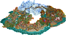
Landscaping/terraforming: Nice elevation changes from time to time.. Nice ride interaction with the landscape, although the part around the corkscrews was just a bare piece of land.. I also didn't really like the beige landtype you used there.. Foliage choice seems good, and fitting the theme.. At some points though, where you put a couple of trees it looks like overtreeing (try to get more space between them with for example more bushes in between).. And at some spots it looks too bare.. Try to be more consistent in your placement of the foliage..
Theming: I didn't really get a medieval feel of the whole design.. Maybe it's because of the deco pieces you've used.. I can see you build this all in kind of a fort though, so that's nice.. When I looked up 'Beowulf' though, it says it's an Old English heroic poem in which Beowulf, a hero of a Germanic tribe, battles three antagonists: Grendel, who is destroying Heorot and its inhabitants in Denmark, Grendel's Mother, and later in life (after he is King) a dragon.. I would've loved to see if you could've somehow put this story into the coaster.. I would've imagined a large Grendel trying to get Beowulf with his mother, and then later the coaster going through the dragon or something.. Anyway, I'm wandering off now
The theming you did have was great though; The coaster going through the different castly houses was amazing to watch, so good job on that! I also like the supporting job, although it was pretty inconsistent as there were some original supports still visible, which is kinda sloppy..
Overall, deserving the design imo, although not in the elite category as Arch Angel for example.. Looking forward to more of your work Juan!
SF
-JDP
Congrats, mate. I'll have a look now. From everything I've seen (Most of it) so far, its absolutely amazing.
FK+Coastermind
-JDP
That said, this seems well deserved. The ride was interesting, i actually like it when the biggest element comes later in the ride. Reminds me of Roundout Woodworks in my Chaos of Time wherein the woody drops to a good 70 mph half-way through the ride, although that might have been a bit more extreme. Of course, it does make the design pretty unrealistic, but who cares? When it's blatantly not trying to be realistic, anyways.
Although nothing was overthetop special, nor the design nor the theming (maybe those gokarts.. but did you notice they didn't work and your enterprise was named.. "enterprise 1"?) What this did have was a sure sign of some good fun going in. Everything looked alive, not perfect but nice to explore and look at. Again, very well deserved design as been said above, and hope to compete with you in the finals.
Think this is a very deserved design.
As SF mentioned it might not be "truly medieval" by the use of all the deco-pieces, but "fantasy-medieval" is also a good theme, the more so as you executed it with consistency and fine buildings, it all went well together and the good colour-choice made a nice unity of it all. (Lol! Hans introduced "realtasy", but "fantalism" seems a nice one too for it)
Also loved the bridges you did here and there, not overdone at all but very pleasant to look at.
I won't really comment on the coaster - although indeed I think for a design it should be one of he most important things- but I am such a nitwit on coasters that it would be ridiculous for me to do so, can just say that it looked fine to me and for sure would like to ride it, going through all these amazing spots!
I don't object at all to having the largest/most intense inversion near the end of the journey, for in reality I often think: "so this was the topmost experience of this one already, now it can only become less exciting........what a pity....." and I always wish they had brewed out something unexpectedly amazing for us towards the end.... Like with a movie, or music or theatre or opera etc: when the beginning is impressive but after that it slowly dies out piece by piece I feel a bit betrayed and disappointed.
But in your Beowulf there is still something to anticipate on......
Nice landscaping here and there and I endlessly watched the go-karts, could not keep my eyes off from them and enjoyed all of it, great, funny found and very, very well done!!!
The only thing I really regretted, was that you had peeps in the park without caring for them in the least, LoL!! Parkrating was next to zero, just because you had not repaired that second entrance point where half of the poor ones where stuck now, and because they could not reach some shops and a ride....."peepfriendly" to me means "with happy peeps that don't get stuck or lost" (am one of the greatest fans of that, and except from two H2H parks I invest a lot of time in making all my parks peepfriendly, with the stupid little ones happily flowing around)
But yeah, this is a pet peeve of mine and does not substract from the design-quality as such.
Was nice anyway to see them riding Beowulf and the go-karts.
Thanks!!, and congrats again on this nice and well-deserved design, and on having earned your spot in PT3!.
Emergo
Really nice architecture all over. Its extremly detailed and you can tell you've put alot of time into it. I love the way you pulled off an extreme colour scheme. Nice go-kart ride as well. Keep at all the work and start a solo. I'd like to see some more work for you. Anyway you've moved up a notch now and proved yourself. Glad your in the pro tour.
Anyway I'm sure RCfan should get alot more comments than this, Again congrats on the design.