Park / THE REALM OF KINGS
-
 27-April 12
- Views 2,586
- Downloads 599
- Fans 0
- Comments 12
-
 40.83%(required: 50%)
 Spotlight Submission

RCTCA 70% Casimir 50% geewhzz 45% nin 45% Liampie 40% SSSammy 40% posix 25% Airtime 15% 40.83% -
 No fans of this park
-
 Download Park
599
-
 Objects
372
-
 Tags
Tags
![park_4221 [H2H8/8] Hitchhikers Harbour](https://www.nedesigns.com/uploads/parks/4221/aerialt3979.png)

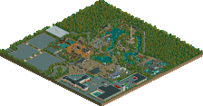
Wicksteed Offline
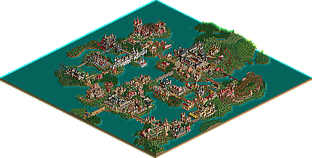
Again, like your previous park, the overview looks very promising. Can someone post screens?
Could we at least get a bigger overview of this? Looks pretty cool.
Thanks for your kind compliments, sorry for the late response, i haven't been online the last couple a days.
I really tried my best with this park. Unfortunately airtime voted as well
Please Airtime, if you don't like my style then DON'T VOTE, i don't even think you have taken this seriously ,because the vote was barely higher than the golden age, while this is surely an improvement.
But this will not put me down.
I'm already working on the next park
The architecture will even get better in the future...i hope
Here come the screens.
1
2
3
4
5
6
7
8
9
10
11
12
13
14
15
16
17
18
19
20
21
22
23
24
25
26
27
28
29
30
31
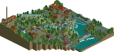
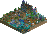
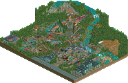
My favourite and in my opinion best architecture and detailing is in screen 26,(grey castle),27, castle with kiddy ride,the white castle in 25 and 18 and the less detailed ones on 21 and 22 (the tower) and last but not least the big castle on 14 ,15 and 16. I know my delails on the last mentioned and the rest should have been better.
But it's hard to accomplish good detailed architecture. Also my workbench wasn't the best choice of items to use.
I have a better workbench for my next park and recently i started to use parkdat for the convenience
I hope you liked the screens.
You also might as well have just removed the WW/TT objects so everyone could see it, both because you were using customs to begin with, and because the few places I see those objects, they're some of the worst-looking bits in the park, which is a sad truth of the RCT2 expansions.
If I had to pick a favorite screen, I would say 28 or 13. Good atmosphere, nice colors, decent flow, and no rides. You clearly have a thing for architecture, so develop that. Look at details and use of varied textures, and if you can keep the same kind of initiative up for another project of the same size, your work could be very impressive.
I must admit that i have a hard time trying to combine different materials in one building(as you have noticed). I will try to work on that, i know about the foliage, it isn't good.
I can only hope my next park will be more pleasing(i think it will be
Posix, just wait for my next park as a serious comeback.
Trav ,thanks for the compliment.
I agree with you on the bronze.
And btw: I have tried to remove WW & TT objects/rides in the park i'm working on now but after removing the obj./rides and uninstalling the exp. packs the savegame won't work anymore
Thanks.