Park / Ghostliner
-
 25-March 12
- Views 9,440
- Downloads 1,058
- Fans 3
- Comments 29
-

-
 77.69%(required: 65%)
 Design

robbie92 90% 5dave 85% CedarPoint6 85% SSSammy 85% wheres_walto 85% Louis! 80% Steve 80% Dimi 75% Maverix 75% nin 75% That Guy 75% tyandor 75% Liampie 70% Airtime 65% posix 65% 77.69% -
3 fans
 Fans of this park
-
 Full-Size Map
-
 Download Park
1,058
-
 Objects
329
-
 Tags
Tags
![park_3348 [H2H7 R3] The village and the park](https://www.nedesigns.com/uploads/parks/3348/aerialt2985.png)
![park_3324 [H2H7 R1] Circus Circus & Adventuredome Atlantic City](https://www.nedesigns.com/uploads/parks/3324/aerialt2970.png)
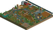
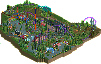
In contrast to Phatage, I think the track fences didn't work here. They had glitches all over. Moreover, I think you should go with curves for the whole park or don't do them at all. Now most of your park was in the traditional way of using the RCT grid and diagonals only, with some curves that only disrupted that flow. 'Eight directions building' and this new 'curvy style' are hard to unite, especially on such a small map. Another thing I didn't like was the foliage. The grassy patches didn't flow well enough in my opinion and the big tree objects are still horrible. I think you coloured a lot of trunks weirdly as well.
Something I like about your work compared to others' from the same genre is that your buildings are actual buildings with actual roofs and stuff. No boring blocks and shacks, but buildings with walls, roofs and room for distinctive details and styles. I also like the atmosphere here. It was colourful and there were things moving everywhere. It felt alive and pleasant. Good job on that!
Congratulations on design. I'm one of the lower voters but remember that 70% is a nice score. You definitely deserved this!
fixed.
also fixed.
The layout was nice, but could have seen some imporvement towards the end. The shops and restaurants dotted around were really nice and the Gift Shop was easily my favourite. Rides like Bayern Curve, Pit Fall and Half Pipe were very well executed too. I also liked the whole story behind the coaster and how it developed, which added to the realism of the whole thing.
Overall, this was definately Design worthy and I look forward to any projects of yours in the future
You do know that PR also has no looks or corkscrews, right? I think you got mixed up with the original design when it did have inversions and corkscrews and was known as Steel Phantom.
If only this could be on the same map as Joker's Revenge
My favorite thing about this ride was how raw it seemed. I don't know if that makes sense, but it just seemed very gritty to me. The whole ride really did look like a re-modeled and re-furbished arrow coaster. While parts of it were elegant and smooth (the turn at the bottom of the ravine, the swoop around the first gen free fall, etc.), other parts of the ride seemed so primitive. I can just look at that mess of track and path right around the start of the lift, and I feel like I can hear the sound of the chain gripping the train. I can imagine myself looking down off the queue path into the ravine and watching the riders below. Just awesome. I also loved the lift hill lights. It's a detail few people add, but it adds a lot of old school charm, in my opinion.
My only complaint is that this didn't have an old school woody down in the same ravine. That would have been badass.
Where ya been, man?
Xcars: Glad you liked this! Ghostliner was started last summer around the same time as I last built on Elitch's. Not saying that park is dead, but I would not count on it being my next release. I actually opened the park a couple weeks ago for the first time since last year just to mess around. Nothing serious.
rct2isboss, SSSammy, geewhzz, Xtreme97, Sephiroth, Ruben, RCTER2, MorganFan, CoasterCreator9, tdub96, Insanity: Thanks!
Phatage: I always appreciate your feedback since you are big on realism. I remember your feedback on Woodfall as saying I needed to break away from the grid-like nature of RCT, so that has been a goal of mine ever since. Good to hear you saw this the same way I do, as a Kennywood inspiration that is different enough to not be considered a recreation.
CoasterForce: The "wow factor" was my thoughts exactly about Phantom's Revenge when I first saw it in person. I've always thought large Arrow coasters like this look more impressive than most hyper and giga-coasters from B&M or Intamin. I thought the layout was a decent length considering this has no mid-course block section. While I can see why it might seem short, I wanted this to maintain speed up until the end, something I really enjoyed about Phantom's Revenge.
Louis: The second half of the layout (in fact the coaster as a whole) has barely changed from the initial layout. For an Arrow hyper like this, I understand why a bunch of turns might look out of place, since they are known for airtime hills. Great to hear you like Half Pipe!
Cocoa: I think this has a good balance of interaction. The intent was to have it built in the back of a park, but still go around existing paths and structures to make it more interesting. Like the large turn around Pitfall would have been designed around an older, now removed flat ride in that area. I thought about adding a woodie somewhere for that interaction Phantom has with Thunderbolt, but that would have just made it look too much like a copy of Kennywood.
trav: You are right about all that. I thought I had seen that idea for the benches used somewhere, but I could be wrong. Definitely adds one more peepable aspect to parks!
posix: Most parks here in the US I am familiar with have little to no theme at all, and definitely that "sterile" atmosphere by definition. This is something I have been trying to improve on.
Liampie: Those track fences were hard to get looking good because of the small gaps that needed to be filled. I prefer to look at the contrast of diagonal pieces with the track as the difference between fences and paths with a small curb. Still have not found a decent way to make curved paths with a curb look good. For the foliage, I wanted it to look like large areas were cleared out when the ride was built, but some foliage would have been cleared out again for the recent re-tracking construction. I used the larger trees because I do not really like the scale of the small trees that well. Normally, I color the trees just as the original ones were, but the brown trunks for the fir trees looks better than yellow in my opinion. Thanks for the feedback, and for the buildings, I think we can both agree this is a huge step up from Woodfall in terms of architecture and atmosphere.
Dimi: Thank you, and good to hear you at least liked the coaster. What could be improved on for all those aspects you mentioned? I think it is a bit harsh to say rest gives off a boring atmosphere when there are exciting rides like Chaos and Pitfall in the area. Though I can see how it might get depressing with Half Pipe breaking down every few cycles.
highroll3r: I understand why airtime hills would be preferable over turns. But I wanted this section of the coaster to have as much interaction with the terrain as possible and still have a few pops of airtime near the end.
zburns999: It's great you got around to replying this one since I knew you of all people would be able to appreciate this design's ties to Kennywood. I reminisced on my day at Kennywood last summer to think how that atmosphere could be translated into my park. Doesn't get much better than the clanking lift chain sound of a large Arrow Dynamics coaster.
As for future projects, there are several in progress, not much besides a few layouts though. Elitch's is pretty far along, but nowhere near the point where the end is in sight. I won't get into the details as to why I'm not building on it anymore, but much of it has to do with the time it takes getting the park to the level of accuracy and detail I want for the recreation. Whatever I end up building next, it will be another park where realism dominates with hopefully a less "sterile" atmosphere than this apparently had. I thought about signing up for H2H6. But there's really no time for me to build around this time of year. Also going to be out of town for a couple months during the summer doing field work to finish up my degree, so that would end up screwing over my team. Thanks again for the replies, and if there are any more thoughts from people still following this, don't hesitate to post.