Park / Fright Nights
-
 20-February 05
- Views 10,744
- Downloads 2,804
- Fans 5
- Comments 21
-

-
 79.38%(required: none)
 Design

Xeccah 90% 5dave 85% Cocoa 85% Stoksy 85% geewhzz 80% G Force 75% Liampie 75% Sulakke 75% trav 75% alex 65% 79.38% -
5 fans
 Fans of this park
-
 Download Park
2,804
-
 Objects
334
-
 Tags
Tags
Corkscrewed Offline
And these are a doozy.
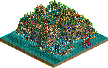
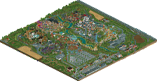
In salvaging an incomplete Quest for the Best: Xtreme entry, Phatage delights us with his incredible Fright Nights, a combination dark ride/roller coaster that simply must been seen. This thing is just unbelievable, and much better (IMO) than screens suggest.
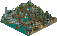
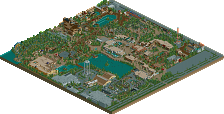
And not to be overlooked (though that might be a possibility) is Jacko Shanty's Toxygen, a nifty little design that's pretty darn neat on its own. It's not something you see everyday, but it does have some nice homages to RCT history.
So check them out today! Before the site goes down again!!
Phatage's.. i did like phatages. It was neat, and there were was so much to let your attention grab onto. A 5 min ride and i watched every second of it :P. I thought all the landscaping and supports really worked out great. I do despise the ratings. A creative ride like this, in my opinion, should have an intensity below 10. Minus that though, i loved it. Very, very unique, :).
Jacko, your entry was fantastic too. I have not seen the toxic theme done as well as that for ages, the coaster was neat, the architecture was fabulous. Especially the station and around the que-line.
Two great designs, but Phatages totally blew me away... wow.
-X-
But now i have a totally different opinion, it was amazing. The coaster was by far one of the best i had seen in rct. It had me thinking where is it going to go next? not many other coasters in rct have made me do that mainly because i can see their track
Hmm Jacko Shanty's entry.
It was nice and had a great coaster but apart from that the 2x2 buildings got boring after like 3miniutes, i usally like your stuff but this really didn't do it for me. It was too rct1 inspired and i think to do a theme like you were going for, you need bigger architecture.
It was a nice entry it just wasn't my cup of tea.
I thought we mainly saw the best the ride had to offer, but he actually did keep the eye-popping stuff for le moment suprème (while I was thinking he kind of started to over-advertise, how ironic
Awesome ride! Nothing else to mention... Except that Kraken sure scared the **** out of me when it jumped over the flooding part of the track near the weird cobra-roll thing
Jacko's B&M Speed coaster didn't really impress me that much, but by being released together with Fright Nights it's not easy to surprise someone, I guess. It was a fun ride and I liked the LL stuff (like those good old dome sculptures like they can be found at Butterfinger's Universal Park and TPM's Odium).
I love Jacko's, cause of his nice toxic Atmosphere and the Coaster....was okay...not the best but okay...
Phatages Park was brilliant!!
I dont like the Themin as much as the coaster...
The Hacks are great and the sea snake is very nice and a really good idea...
I hope u could understand my bad english.
Jay
RJ set out to build a realistic B&M hyper, taking elements from the three out and backs and mixing a little of Raging Bull's second half after the mcbr, and imo he did a very good job at it. The thing is that most people on this site would probably prefer a rocket compared to a B&M hyper, and that's what I feel is happening here. Things I disliked in the execution though were the first drop layout with the flat turn and incline before the drop, and the little drop before the mcbr. If you were trying to represent the slight slantedness of the mcbr with that drop, I think that the slant is too small to be represented by a 5 foot drop in rct and I think it would have been better just leaving it straight. The pacing was very good for matching a B&M hyper relative to the entire course, although maybe just a little too fast over the hills compared to the real things. The supports, although not the most realistic, were cool as Corky said because of the whole Nevis nastalgia (sp?) thingie, and the entire map really was like a fusion between ll and rct2.
Many people will disagree with all the 2x2 in the architecture, but I think it fits the theme here. It reminded me of a toxic dump, where the architecture represented the many different crates and things that you would find there, and they can pretty much be the same size and shape. There's no doubt that you captured the atmosphere, and I did find little ideas here and there that spiced up the entry such as the broken queue, the underwater barrells, and I especially like how the station was sort of on an island and the queue and exits were bridges across the toxic waste. My suggestions for you in the future are to use a smaller map and to make sure that your transfer track table woudl be functional if it were to be used.
Anyway, thanks everybody for the comments, wme I wish I could do something about those ratings but I'm pretty sure most of the intensity had to do with the length of the ride and some of the hacking. Anyway its great to have it done so I can move on to more projects.
Jacko's was great. I love his architecture, and his coaster is pretty awesome. Great work, dude. Just shows whats to come in Admin Wars.
but was there any reason for the white track under the invisible track. i deleted it and everything worked fine for me. that just confused me a little.
and the ghost confused me first, but i think i now got that one aswell.
just great work on that coaster. the ratings were bad, but it's really the hacking and that first drop. of the realistic coaster part. it was damn high, but nice to watch.
i enjoyed looking at it every second.
That coaster was fantastic, phatz. Probably one of the best designs ever.. I just don't know how you do such amazing hacks. Everything was so intricately detailed also. The supports.. wow.. the architecture.. everything was just brilliant. I hope you release a solo like this soon, because you are, by far, one of my favorite parkmakers.
As for mine, I actually built and finished it in the beginning week of June last year. I sent it to iris, but he said the coaster wasn't themed enough. So I just got too lazy and never themed the ride and it was just floating around on my computer. So I decided to send it to Cork to see if he would accept it, and he said the same thing. So I went back and themed the ride finally.
I'm sorry hardly anyone likes it, but I just wanted to try a new building technique I'd never tried before. It wasn't supposed to be a realistic B&M hyper or anything, just a ride with silly old skool supports and 2x2 buildings.
Wow Phatage, I never would have had a chance had this been completed for QFTBX. The coaster design was just brilliant and puts you at the #1 RCT2 hacker in my book . The theming was a little hit or miss for me. I felt there were a lot of textures / buildings that just didn't fit and more used just to fill space. The foliage really wasn't my favorite either. The colors were, well, crazy imo, but worked for me. I think my favorite part (besides the coaster itself) were are the supporting details you did with pieces of track and trackless rides; like that Kraken serpent, the stairway to the lighthouse and that spiraling ghost.....all awesome and completely original with the Phatage trademark. Although this is not my favorite of your work (SFWoE remains at #1), I can still respect and enjoy it.
Toxygen by Jacko Shanty
The theming did all the work on this design IMO. The coaster itself was a little lackluster, but still got the job done. The theming on the other hand was just amazing and pretty much flawless imo. Definitely a theme I could see myself doing too, although I think you did better than I could with it Jacko. The 2x2 architecture didnt really bother me, mainly because none of the buildings looked the same and therefore didnt really standout as a problem for me. The textures were incredible and really held the theme together. Awesome stuff Jacko. A great NE debut for you!
yeah, i saw that 3.25 or something like that... lateral G.
that WOULD put quite a clank in the intensity.
interesting coaster layout, but the intensity make me shake my head... pacing was pretty good though before the really fast parts
Corkscrewed Offline
Awesome design JS. The coaster wasnt the best but the theme was awesome
And Fright Nights was awesome too.
A brilliant update corky
but seriously, my favorite aspect of the ride was the supporting. it all looked so clean and fit together perfectly. i know how difficult that can be when you have to hack it all. really, fantastic stuff.
Jacko- Didn't like your design as much as Phatage's, but it really was a nice park. Sure, the architecture was a bit repetitive, but was still pretty nice. What I really enjoyed, was the way the music and everything else came together to form a cool atmosphere. It made it fun to look at. So overall, cool coaster. nice work.
Jacko, um, okay... I looked at it before Fright Nights so that I wouldn't have overly inflated expectations. I found it unusual and interesting in theming and exicution; except for the coaster, it was quite realistic and I found it entertaining thanks to my love of Raging Bull. Still I would argue that it's one of the weaker designs we've had in a while.
Hey corky, aren't you forgetting something?
ride6