Park / Chamonix
-
 09-May 05
- Views 12,653
- Downloads 1,898
- Fans 0
- Comments 45
-

-
 73.75%(required: none)
 Design

Cocoa 80% G Force 80% Liampie 80% ][ntamin22 80% trav 75% 5dave 70% posix 70% Sulakke 70% alex 65% MCI 65% 73.75% -
 No fans of this park
-
 Download Park
1,898
-
 Objects
192
-
 Tags
Tags
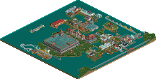
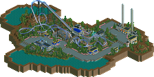
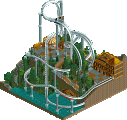
Thanks for the comments everyone. Marshy, you've heard my feelings on your design. A good NE debut for you and welcome to admin warz.
However, I'd say Marshy's was the worst of the two.
If you presented me with "X-Men", didn't tell me who did it, and then asked, I probably would have said "Jkay?", and then if you said there were two, I'd probably say "Oh, Jkay and Kumba?" But Marshy's is just like everything else everyone else builds, with nothing distinct about it, at all.
But, the pacing on X-Men was pathetic.
What happened to this site? Oh, yeah, it was always like this
Corkscrewed Offline
For example, in your park there's a brake run in the middle of the ride. Why?
"Because it's 'realistic'".
But it doesn't actually do what such brakes run are intended to do in real-life. So, instead of being actual "realism" it is "false 'realism'". Understand?
*scratches head*...
Sure it was cliche', but I found it to be a fairly well executed ripoff, personally. Failed to hold my attention for more than 30 seconds or so, but then again, few parks do. Short attention span, you know.
I would actually consider many of the game's alternatives much less realistic than the "fake" ones we come up with. Most real coasters arn't held up by the skinny little pipe-cleaner things found on RCT coasters. Therefore, we often choose to make our own, in order to better fit real life spefications. Thats not to say all custom supports are truly realistic, of course.
About the block brakes, they usually look realistic, even if they don't perform realisticly. Since most of our perception of RCT is visual, I'd say most block breaks are fairly realistic, even if their presence is completely pointless in terms of the coaster's performance.
I'm not trying to defend these, but you just seem to generalize all personal additions as being less realistic than their game counterparts, which I think to be false. But then again, you probably wern't, so, whatever.
BTW, are there any other designs you have to release, Cork? Or perhaps, did they just suck, and you are sparing the community by not posting them?
Here's a picture to show you what I mean, incase you didn't understand, or don't believe me.
See how they're about the same, in terms of scale? Maybe even a little BIG?
The supports look substantially bigger than the armspan of a human. Although it could just be a bad pic.
The pipe cleaner crap is really beyond the point though. What I was aiming at was that RCT is not the most realistic of coaster games, and our custom supports and the like are an attempt at catching a true to life look that RCT lacks in places.
This is painfully off topic (It barely even pertains whay cg was talking about to begin with), so I'll comment on the other coaster, I guess.
So, um.....
Perhpas not your best work, but had a few strong spots. Although it does err on the side of unorigonal, I wouldn't call it cliche', as aforementioned. While many builders now-a-days theme their stuff to something very vague (or nothing at all), this had, for lack of a better word, a specific theme. "X-Men". Not too generic or overly common.
Now the coaster layout I might call cliche'. I guess I am just so sick of these... what do you call them... "cookie-cutter" beemers. Yeah.
Marshy
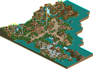
I didn't like this one that much. When I first opened the park, I was like...wow, this archy is good and looks nice. But it was that same exact style throughout the whole "park". Don't take this the wrong way, but I am getting sick of people like Marshy in this case, and Artist (with a few good exceptions), who use the "safe" theme with their rides. Nothing at all makes this stand out except a few nice interactions with the waterfall. I got sick of this after looking at it for two minutes, it was just all the same style, and what it is, is (what I call) the "safe, normal" style of parkmaking, and people are really overusing that these days. Also, the pacing on the coaster itself was pretty bad and seemed to slowly pass through those turns. I give you props to making a suspended coaster for a design, and I know it's not the easiest one to make, but I really am getting sick of that style. I know it may be "realism" but I wasn't feeling that, if that's what you were going for.
X-Men
Kumba and JKay
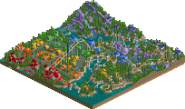
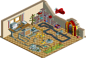
This design has became one of my favorities. The coaster itself had a pretty unique and untraditional layout, and that's always good. The pacing was great for the most part, and heck, I even liked the ending with the corkscrews. The theming worked great for me, and I thought in-game, it was one of the better JKay color-schemes I've seen. Also, the archy was very innovative and unique, but wacky at times. Very nice job both of you, and a well deserved design.
The layout was anything but unique and untraditional. Actually, it is very traditional, and not at all unique. Did you actually look at the layout, or just all those crazy colors?
The pacing was crap.
I'm not sure about you, but when I look at a rollercoaster's pacing, what I look for is a consistant, or consistantly increasing, high rate of speed through the peaks of manuevers, or a VERY good reason for this not to be the case (like a ride I'm building now which nearly STALLS at the peak of an inversion, before finally making it through, which was intentional, and builds exicitement by making the riders feel like something is going wrong.)
The pacing started out decently, but with each manuever it LOST speed, eventually crawling through the final few elements, and the only reason I can see for that is bad design.
Corkscrewed Offline
Anyway, to chime in on pacing, I don't think a coaster has to INCREASE speed through inversions as the layout progresses. That goes against basic physics. For me, there are target speeds for certain inversions. I never think a coaster should dip under 20 MPH unless it's going through brakes or at the end of the run, and most peaks of inversions should be between 25-30 mph (which is actually on par with real life coasters). Zero-G-rolls should be over 30 if you want some nice snap to them. Corkscrews should generally be under 30 to prevent excessive forces.
In terms of overall pacing, well, that DOES depend on what you want to give. You can have a crawly inversion... if it's clear that it's part of the story and such. But making a Batman the Ride recreation and having it go 10 mph through the vertical loops is just stupid.
I must congratulate whoever made the X-men logo...that is a really sweet logo!